Movie posters of the year 2018
Here’s some end-of-year eye-candy. Our columnist Daniel Benneworth-Gray picks his favourite movie posters of the year
So that was film 2018. As we tumble into awards season, it’s a good time to look back on the year’s posters before they get reworked “for your consideration”, cluttered with quotes and stars and laurel wreaths.
Below is my list of the top ten movie posters of the year:
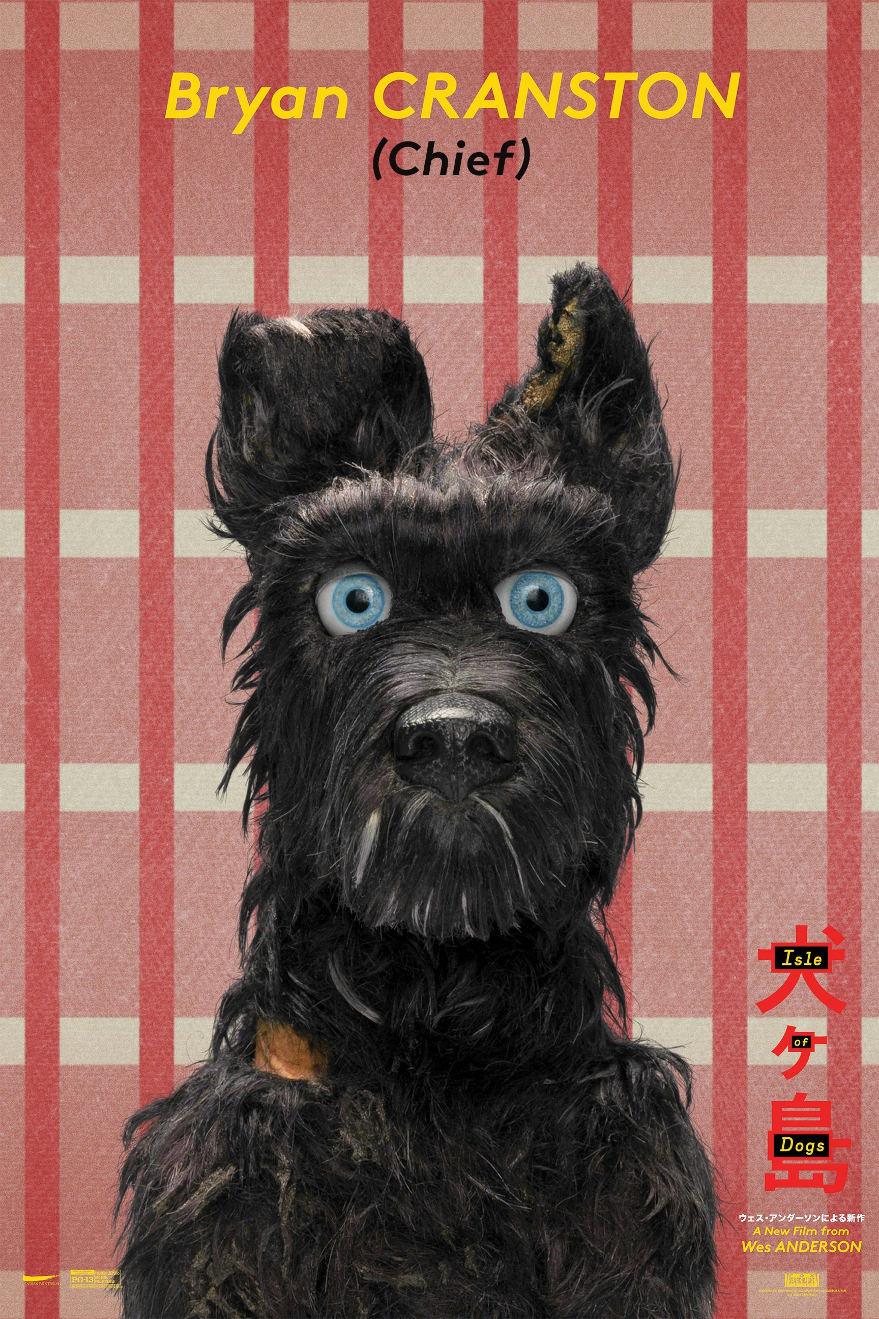
Isle of Dogs (BLT)
The nature and purpose of the poster has continued to adjust to meet the attention span of the internet. With the bigger releases, we’re seeing more of a diverse approach – multiple creative treatments drip fed into social media, each one another minor talking/sharing point to perpetuate the pre- and post-release marketing of a film. With some campaigns, it can seem like not a single idea was rejected; the consistent identity of a film diluted by a bombardment of jpgs. But when it works, it really works. Isle of Dogs successfully captured the visual language of Wes Anderson, particularly with a series of deadpan character posters.
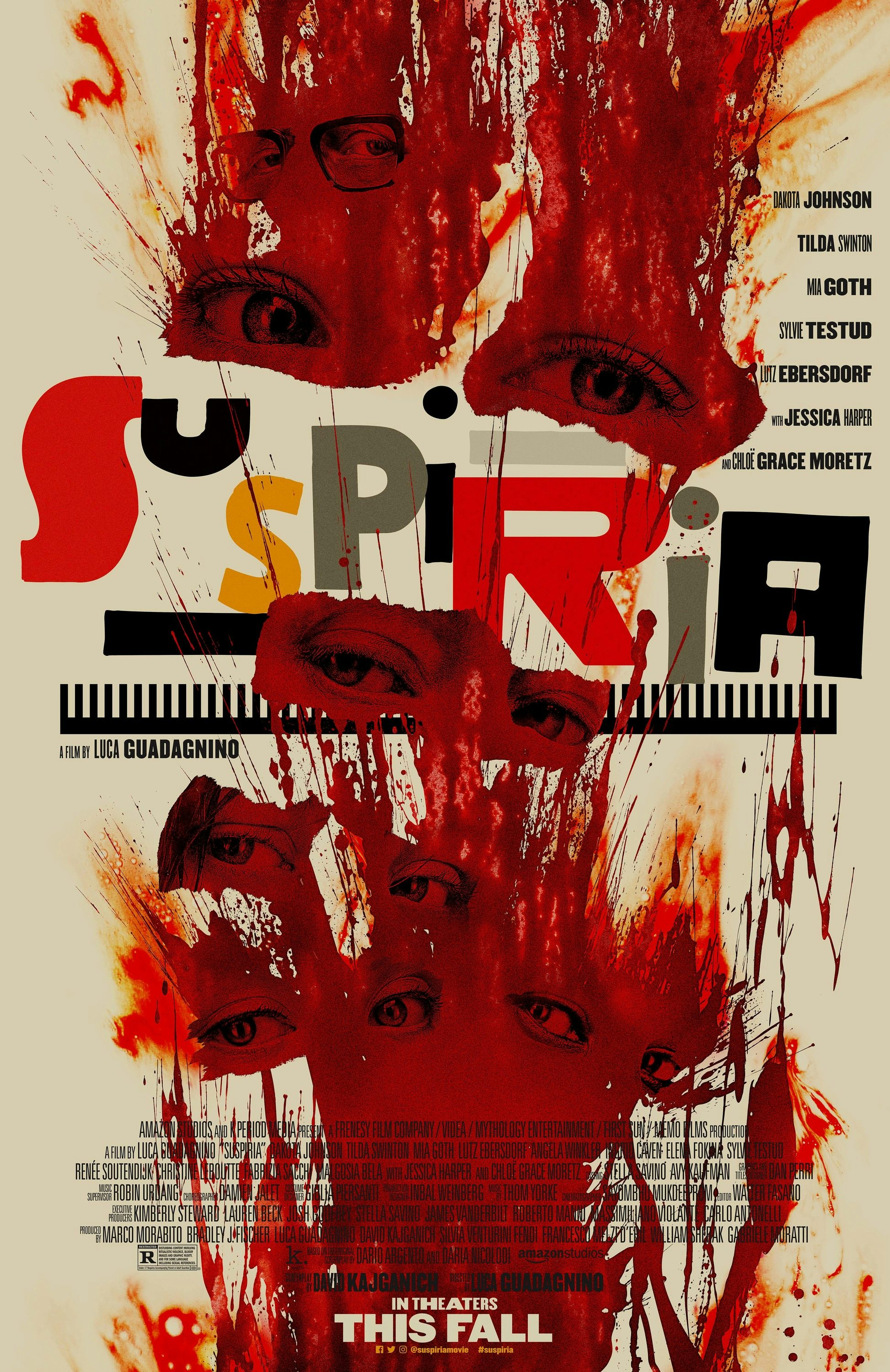
Suspiria (LA)
The gradual reveal of characters (and, more eerily, innocuous locations) also worked well for Suspiria, a campaign that echoed the film’s sense of encroaching dread. The only suggestion of horror was saved for the main poster, blood and eyes spattered over cinematic type veteran Dan Perri’s distinctive lettering.

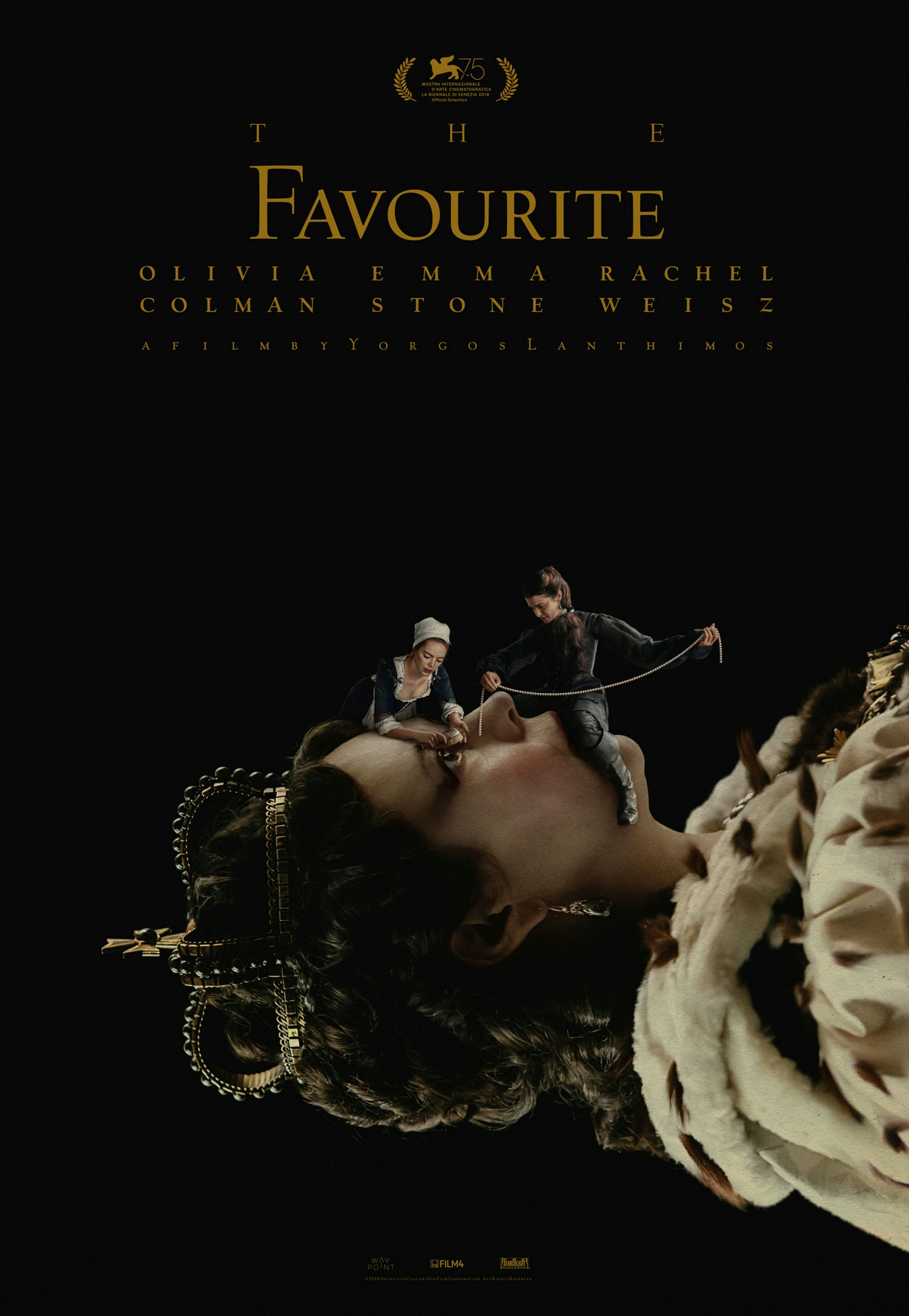
The Favourite (Vasilis Marmatakis)
Following striking campaigns for The Lobster and The Killing of a Sacred Deer, Yorgos Lanthimos continued his collaboration with designer Vasilis Marmatakis for our favourite Oscar favourite, The Favourite.
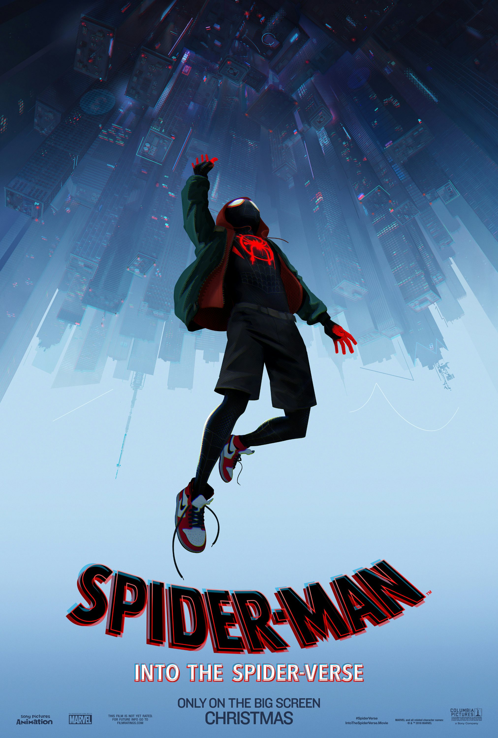
Spider-Man: Into the Spider-Verse (BLT)
It was of course yet another big year for superheroes, the genre finally seeing some meaningful diversity of race, gender and style. Marvel just about managed to stave off homogeneity with strong campaigns for multiple films, and one suspects a documentary about the playful marketing of Deadpool would be just as enjoyable as the films themselves. Avengers: Infinity War is notable for squeezing ten years worth of characters into a rainbow-hued ensemble, like some kind of Cyberdog Sgt Pepper’s. But perhaps the most striking comic book poster of the year goes to Spider-Man: Into the Spider-Verse. Rather than throwing the film’s frenetic style and multiple personalities at the page, we see the new Spidey in a simple, seemingly archetypal heroic pose (also the money shot from the trailer). But is he jumping or falling?
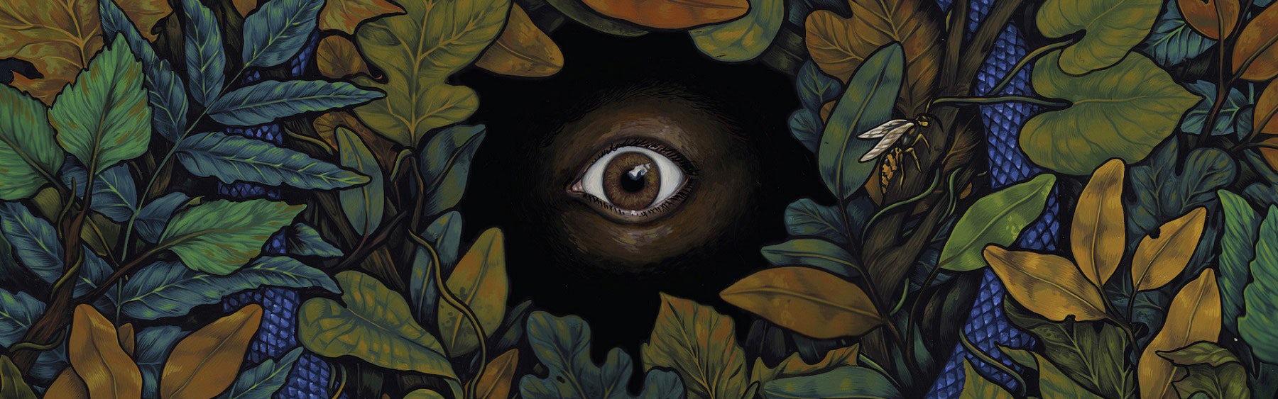
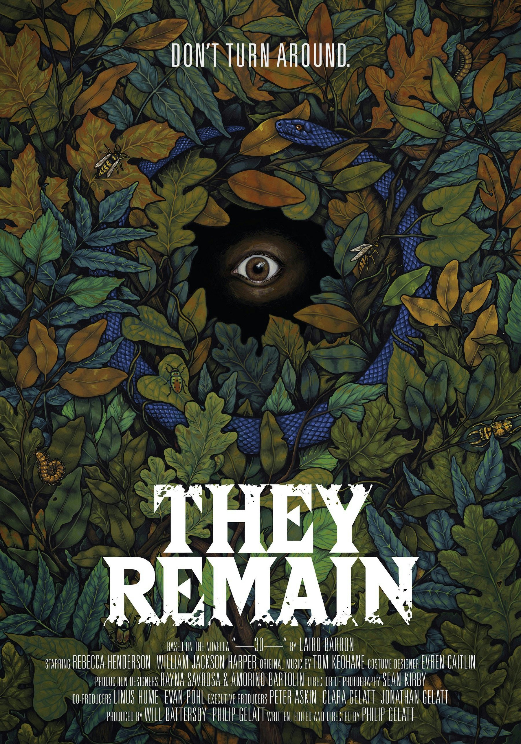
They Remain (Jeanne D’Angelo)
Smaller films relied on fewer, more striking images. The poster for Philip Gelatt’s They Remain is all about Jeanne D’Angelo’s cryptic, arboreal artwork. Beautiful yet terrifying … it’s looking at you.
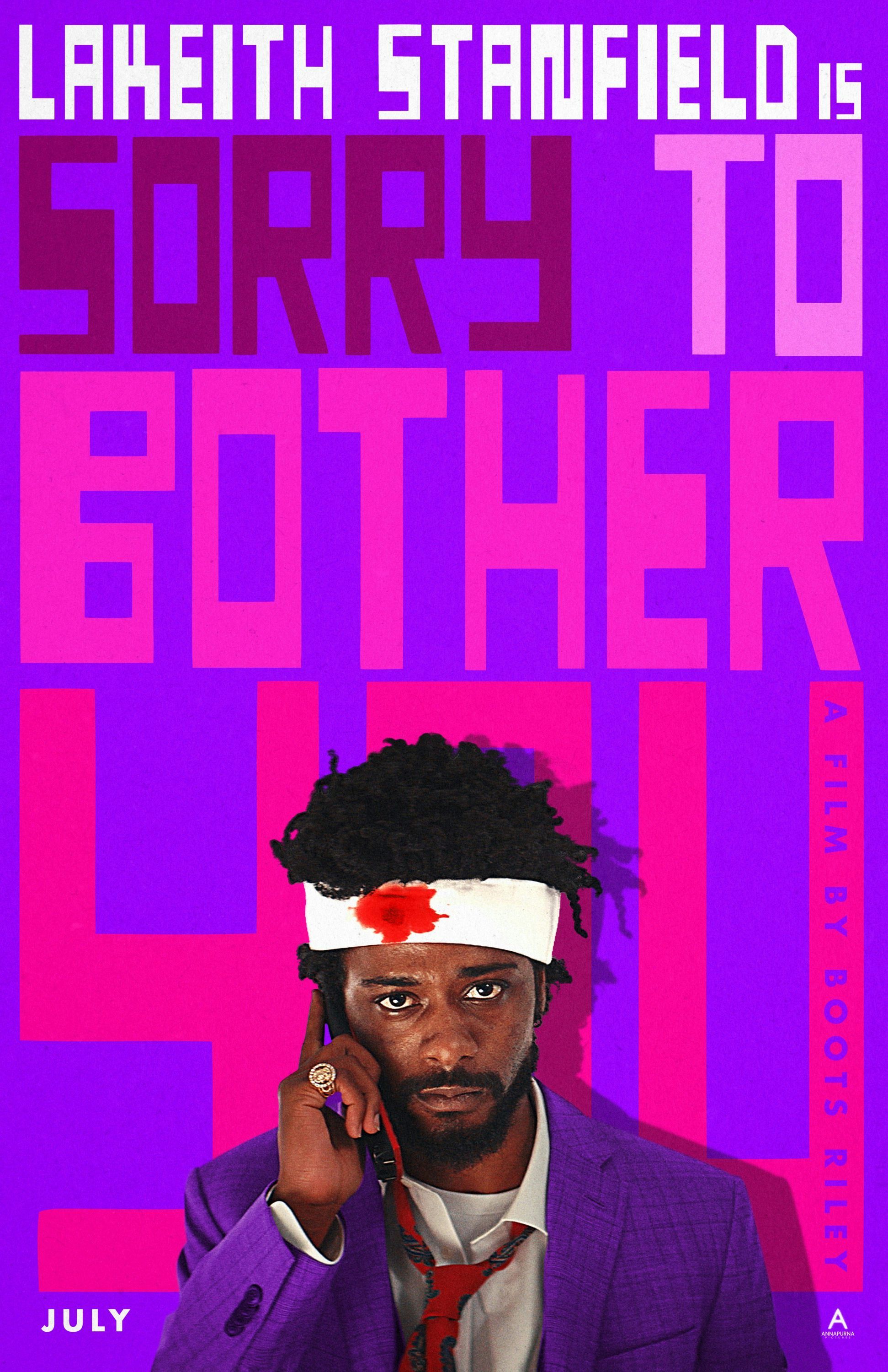
Sorry to Bother You (Gravillis Inc)
Sorry to Bother You harnessed illustrator J. Otto Seibold’s lettering (also peppered throughout the film and its wonderful array of earrings) to fantastic effect, just about managing to sidestep garishness. Despite the reticence of the title, this film successfully screamed for attention.

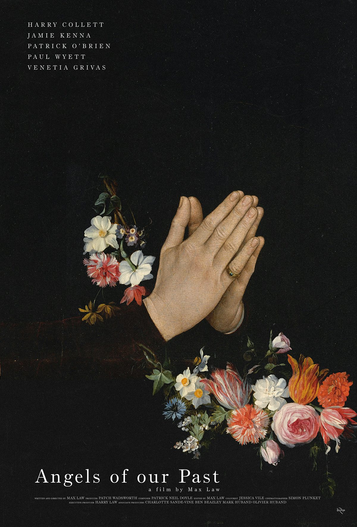
Angels of Our Past (Midnight Marauder)
Great design isn’t just for feature-length films – Max Law’s short Angels of Our Past was blessed with this poster by Midnight Marauder, who has also been producing some fantastic work with illustrator Tony Stella as Alphaville.
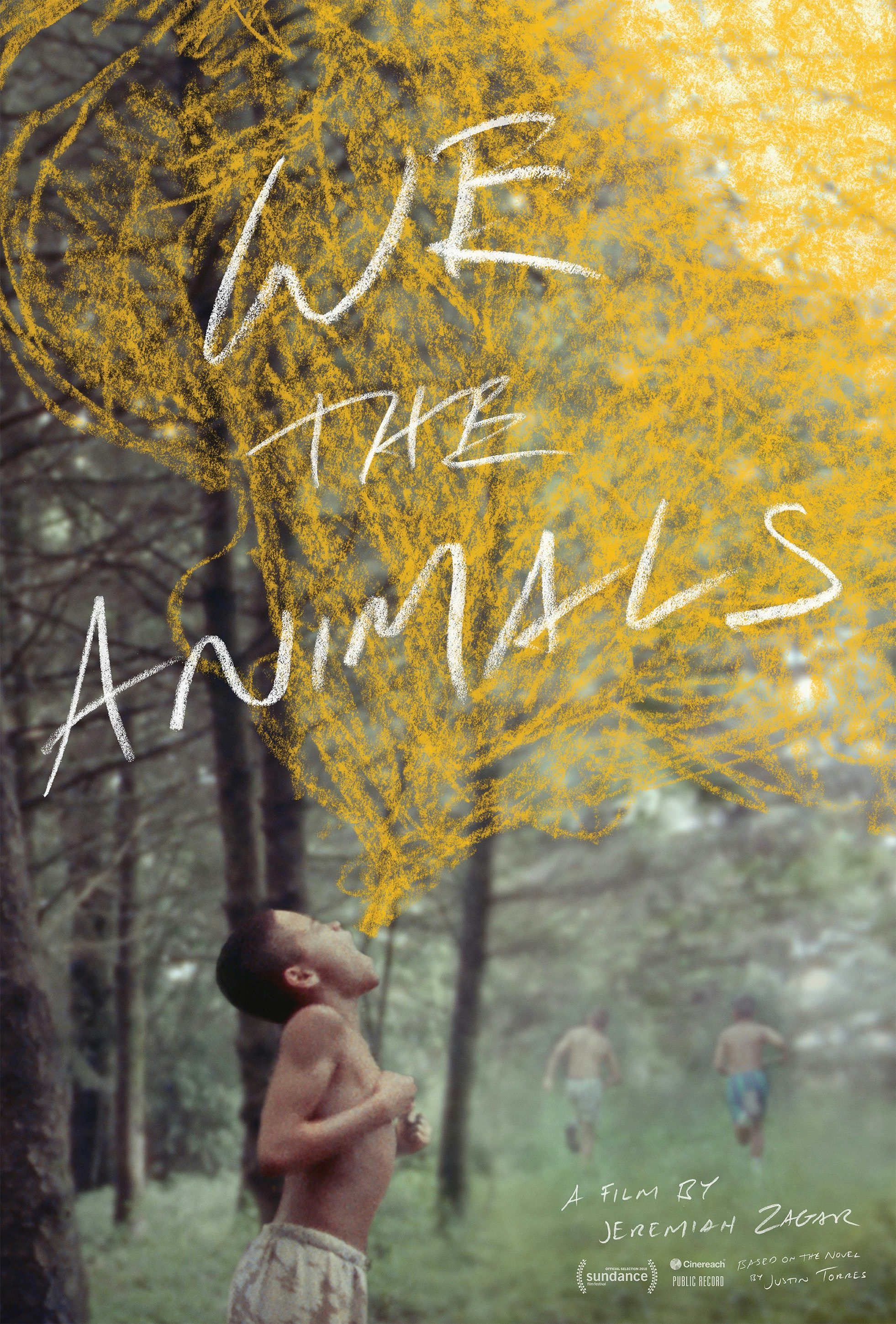
We The Animals (The Boland Design Co.)
No longer required to work at any particular fixed scale, posters are taking more design cues from other forms. Eschewing the once-standard credit-block and tagline, The Boland Design Co.’s poster for Jeremiah Zagler’s childhood drama We Are Animals could/should be a book jacket.
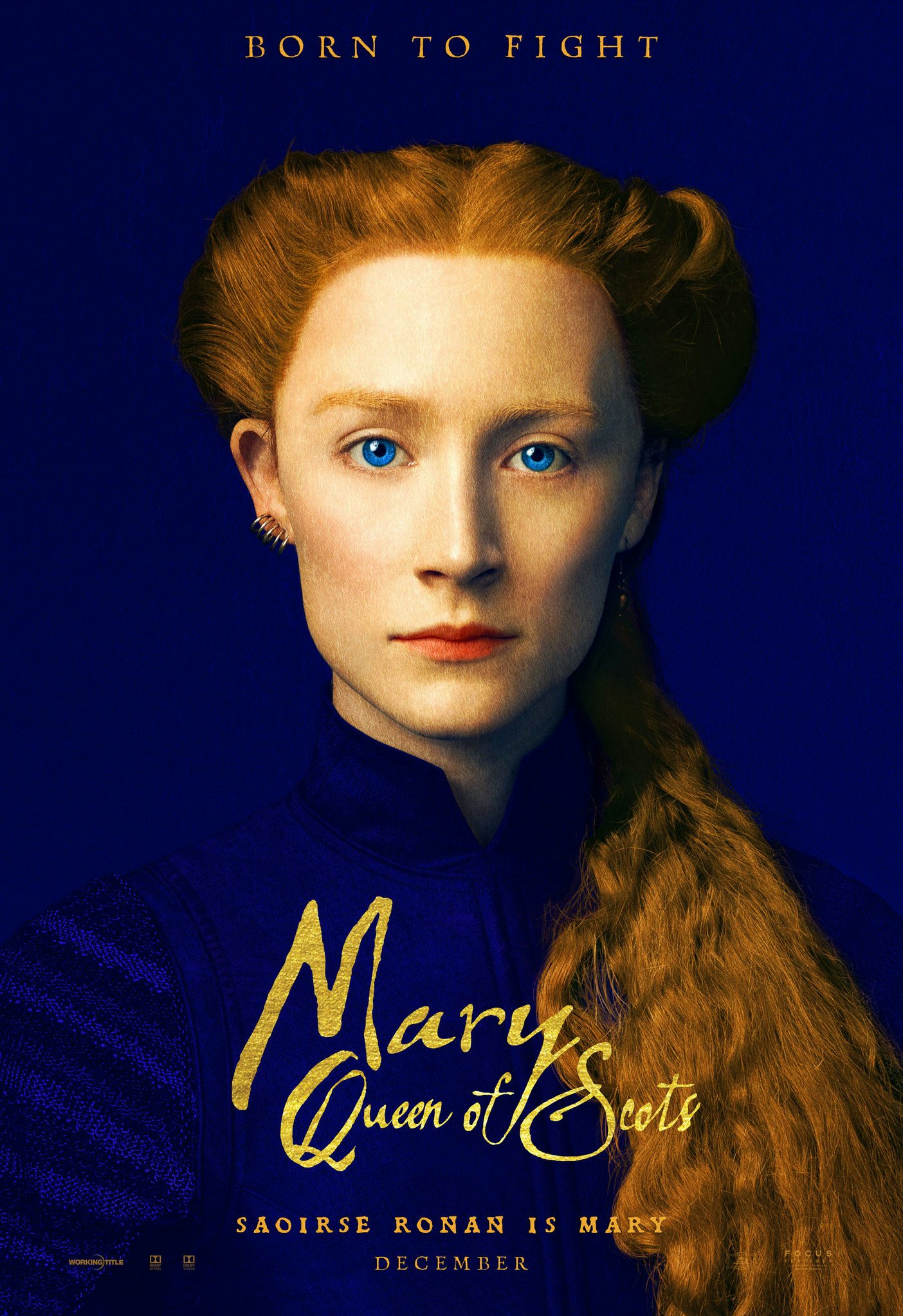
Mary Queen of Scots (Bond)
The bold-colour-plus-headshot direct approach (here’s the star, here’s their role, here’s the Pantone swatch) is ideal for a medium that is now as much about the thumbnail as the billboard. Mary Queen of Scots deserves special mention simply for that vibrant blue, the image of Saoirse Ronan falling ambiguously between photograph and painting.
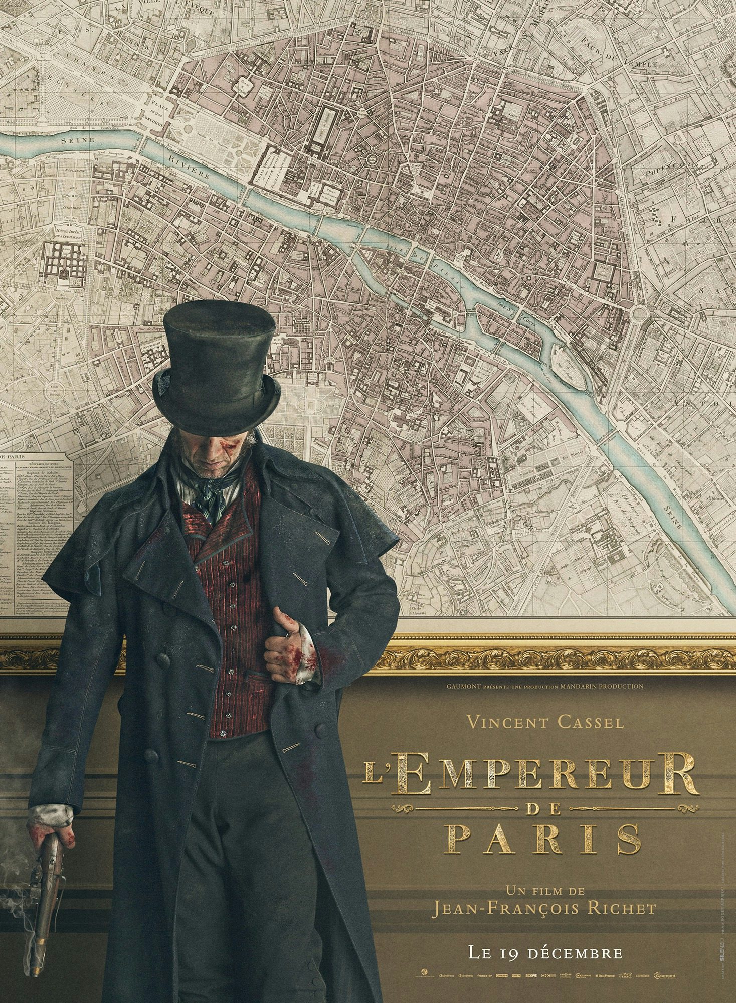
L’Empereur de Paris (Silenzio Communication)
A particular treat for cartophiles, the poster for François Vidocq biopic L’Empereur de Paris made great use of Charles Picquet’s 1804 Plan routier de la ville de Paris et de ses faubourgs. Who knows, maybe antique maps will be the big trend of 2019?
Daniel Benneworth-Gray is a freelance designer based in York, @gray


