
Book covers of the year 2019
Mark Sinclair, Senior Editor at Unit Editions, takes us through the year in book covers, spotting trends for 2019 plus highlighting his picks for the ten best covers of the year
It’s more or less a given that the contemporary book cover needs to work across a range of different environments — from the bookshop to the online store, on social media as a gif or a shareable animation, and beyond. In terms of visibility, one of the hardest working covers this year was undoubtedly Noma Bar’s distinctive design for Margaret Atwood’s The Testaments (Vintage). The book’s ubiquity was hardly surprising given the hype behind Atwood’s follow-up to The Handmaid’s Tale, but it demonstrated how our interaction with design created ostensibly for a paper object now often begins on screen.
This doesn’t necessarily diminish the power of encountering a great cover in a bookshop, of course. From different paper textures and finishes, to embossing and die-cuts, even the way that the pages fall open in the hand, a book’s physical attributes remain a key part of why people who like books still enjoy them.
If anything, this year the power of a single book cover to occupy the visual landscape for a time was outweighed by the impact that series designs have made from both large and small presses. Faber & Faber can be singled out here. While its neat Faber Stories series, launched as part of its 90th anniversary celebrations, showed how economy can still produce an enticing range, there were fantastic Jean Genet and Thomas Bernhard reissues (the latter by Leanne Shapton was covered by CR earlier in the year), alongside a Greatest Hits collection from Faber Social, designed by Luke Bird, that reframed some of its best music titles in an eye-catching neon palette.
Someone has added fake book covers to #DavidCameron’s book in Foyles, Charing Cross Road! ???? *????credit to Alex Bray pic.twitter.com/1ZrVhjtVd7
— Greg Owen (@Greg0wen) October 19, 2019
Similarly, there were strong Japanese and Irish Classics collections and a new set of Kurt Vonneguts from Vintage Classics (not to mention a fine range designed for the author’s work by Jack Smyth for 4th Estate); while Clare Skeats gave Eiderdown Books’ Modern Women Artists range a smart, covetable direction. Penguin’s second international short stories collection (Italian) received another classy treatment from Tom Etherington, while the publisher’s ad campaign for its Classics saw well-thumbed, much-loved copies photographed for a set of compelling posters. In the US, New Directions should be lauded for its sheer range of approaches to cover design this year.
House-style minimalism also triumphed in 2019, and following Olga Tokarczuk’s Nobel Prize in Literature, it was great to see some much-deserved attention given to the work of Fitzcarraldo Editions who published her Drive Your Plow Over the Bones of the Dead in translation. The London-based publisher hasn’t strayed from its striking type-only cover formula since its founding — beautifully designed by Ray O’Meara, its essay collections are white with blue text, while fiction is blue with white text.
One project that received a lot of interest online, though existed originally as a handmade initiative, was Oli Beale’s guerrilla remodelling of several copies of David Cameron’s For The Record memoirs. Beale added fake covers to several copies of the book in various bookshops and waited for customers to notice. Smartphones and the internet then did the rest — @greg0wen’s original tweet (above), with photos of Beale’s brilliant fakery by Alex Bray, has since been shared 9.6k times.
In terms of more general visual trends, the desire to set cover text in large, centred caps shows little sign of diminishing, while collage techniques and the use of found imagery seem to have remained popular with many designers this year. The continuing prevalence of nature writing and books about the great outdoors has also ensured that there’s an increasing amount of illustration of landscape, flora and fauna on the nation’s bookshelves.
As far as stand-out designs go, here are ten of my favourite covers from this year (including two series designs):

Mothers, Chris Power, FSG (Farrar, Straus & Giroux)
The cover of Chris Power’s collection Mothers uses a painting by Spanish artist Lino Lago (from his Pintura Sobre Pintura series). A case of seeing the right image for the right project, Grace Han’s treatment of the painting and the addition of white type, makes for a striking cover. Is the woman hiding, or has she been partly erased by the swathe of pink that divides the cover in two? This sense of mystery counteracts the innocence of the soft, maternal pink and blues. Art director: Alex Merto.

Nell Zink, Doxology, Fourth Estate
Working with an author’s name as distinctive as Nell Zink’s, it’s no surprise that designer Jack Smyth gave it equal cover billing alongside the title of the US writer’s Doxology collection (also nicely eight letters) from Fourth Estate. Mixing the punchier Z, K and X with a run of Os, there was clearly an opportunity to create something with impact using type alone, which is exactly what Smyth achieved.
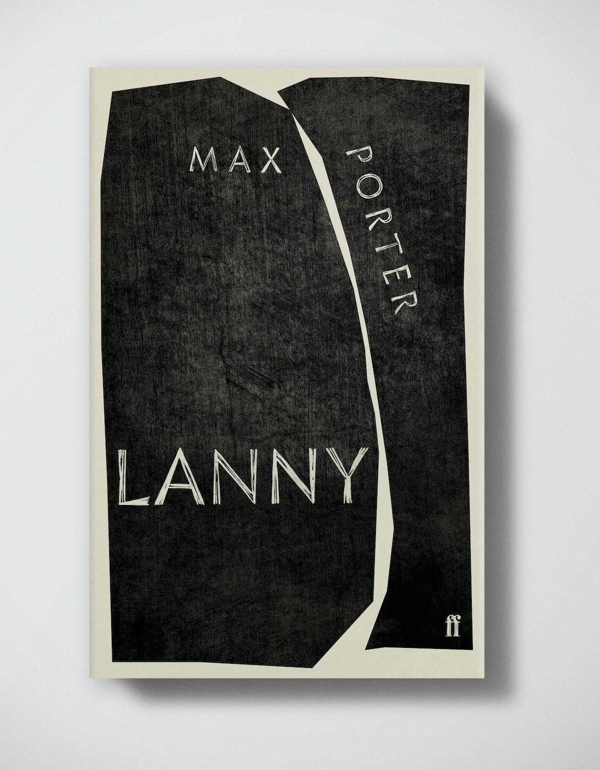
Max Porter, Lanny, Faber & Faber
No doubt one of the more recognisable covers on my list, Jonny Pelham’s sparse linocut design for Max Porter’s Lanny sets the tone perfectly for a story that is anything but minimalist. Pelham’s earthy slabs of textured black echo the crack in the surface world that emerges during the course of the novel, while the linocut lettering (by Pelham, based on the Infini typeface by Sandrine Nugue), hints at some of the typographic adventures readers are in for beyond the cover.

Colson Whitehead, The Nickel Boys, Fleet
Oliver Munday’s design for Colson Whitehead’s The Nickel Boys already feels like a bit of a classic — a bold design based on framing a block of colour, installing a small illustration to lead the eye, and an excellent treatment of type which varies subtly between a hand-written font and large strident caps. It has power from afar (the bookshop test), but also rewards on closer inspection.


Outspoken series, Pluto Press
Outspoken is a new series of titles aimed at younger readers from publisher Pluto Press and its first four offerings feature some beautifully-crafted covers by Jamie Keenan (two have been released so far this year). The books’ series design adheres to a neat structure, but each cover has individuality enough through colour, shape and type to be appealing on its own. Art director: Melanie Patrick.

Hallie Rubenhold, The Five, Doubleday
Jo Thomson’s cover for The Five, Hallie Rubenhold’s study of the five victims of Jack the Ripper, cleverly avoids any grisly or salacious cliché. Thomson in fact runs the full names of the women on the hard cover beneath the dust jacket. While still hidden, recording them here feels appropriate and acts as a form of tribute — their stories finally emerging in the book itself.

Rachel Cusk series, Faber & Faber
As well as the aforementioned Thomas Bernhard covers by Leanne Shapton, two other series designs caught my eye this year. The first is Faber & Faber’s backlist set for author Rachel Cusk, the look of which first emerged last year in the form of her Outline, Transit and Kudos trilogy, designed by Rodrigo Corral and using images by Charlie Engman. For the latest reissues, the in-house team at Faber took Corral’s framing design concept forward using images by ten different photographers and employed a subtle colour variation to denote fiction and non-fiction. Clean, contemporary and with enough intrigue in the pictures to draw new readers in. Shown here are The Temporary, with photography by Mischa Keijser (plainpicture) and Saving Agnes, with photography by Kniel Synnatzschke (plainpicture).

Iris Murdoch collection, Vintage Books
The second series to really impress was Vintage Books’ Iris Murdoch collection, designed and art directed by Suzanne Dean and featuring artwork by LA-based illustrator Bijou Karman. The imagery hints at portraiture but has the protagonists out of frame, while a range of different plants enter into the cover design. It’s an interesting mix of subjects and, coupled with Karman’s knack for vibrant colour, these are a refreshing take on the late author’s works.
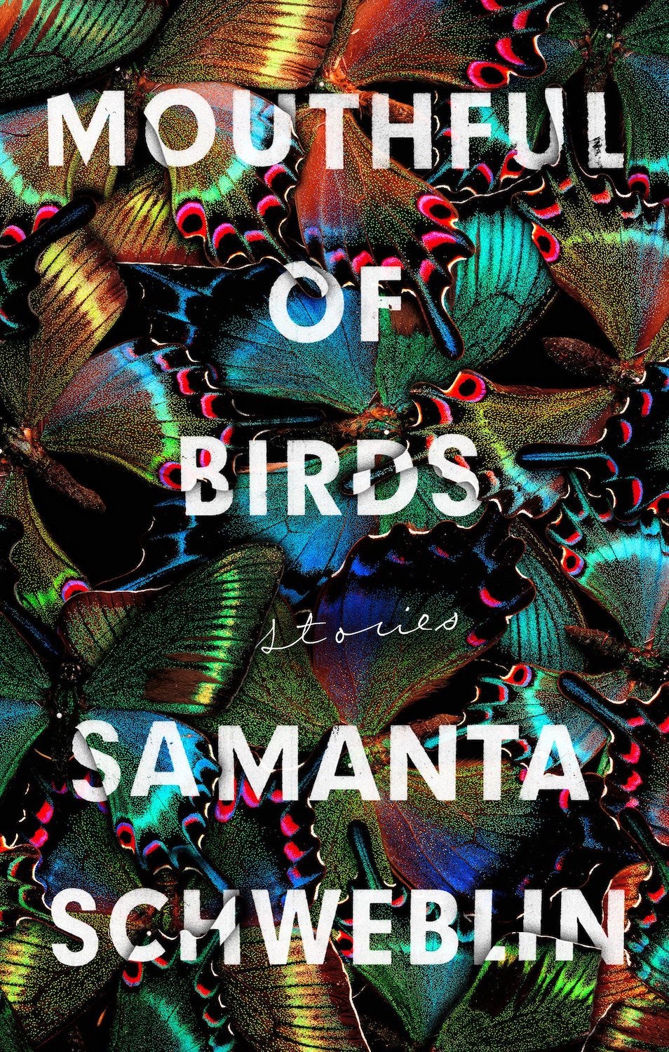
Samanta Schweblin, Mouthful of Birds, Riverhead
An early favourite from this year was Stephen Brayda’s full-on cover for Samanta Schweblin’s Mouthful of Birds collection of short stories. In a reference to one of the book’s unsettling stories, Brayda runs the book’s cover text across a heady collage of butterflies. Somehow, the effect of all those wings and colours on the cover creates a feeling of claustrophobia, rather than of natural wonder, again in tune with the disturbing nature of the stories in the book. Art director: Helen Yentus.

Heather Christle, The Crying Book, Catapult
Finally, Nicole Caputo’s cover for The Crying Book by Heather Christle just seems to set itself apart. With the texts pushed right to the top and foot of the cover, the rest of the space is given over to a torrent of dark blue tears falling from some thickly-drawn eyes. The tears are cut from a photographic image of what looks like deep space. It’s an unusual cover for an equally unusual book and one I’ve now seen in print, on Twitter as a gif (showing off its spot-UV) and as an animation where the tears fall down the book.
Mark Sinclair is Senior Editor at Unit Editions and a freelance writer and author; uniteditions.com

Latest from CR


