
03. British Rail (1964)
Design Research Unit/ Gerry Barney
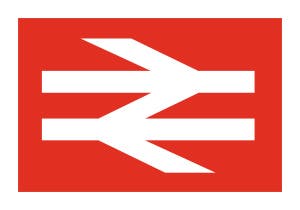
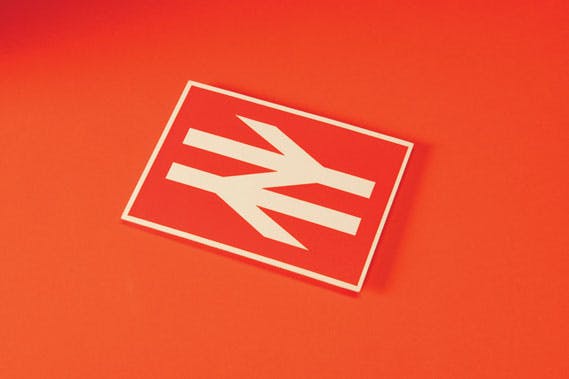
The arrows of indecision. The barbed wire. The crow’s feet. In the 50 years since he drew up one of the UK’s most recognisable symbols, designer Gerry Barney has heard them all. But he doesn’t mind. While the public was to gradually fall out of love with British Rail as an organisation, its double arrow logo carried on, quietly working away as a beautifully simple and remarkably relevant piece of design.
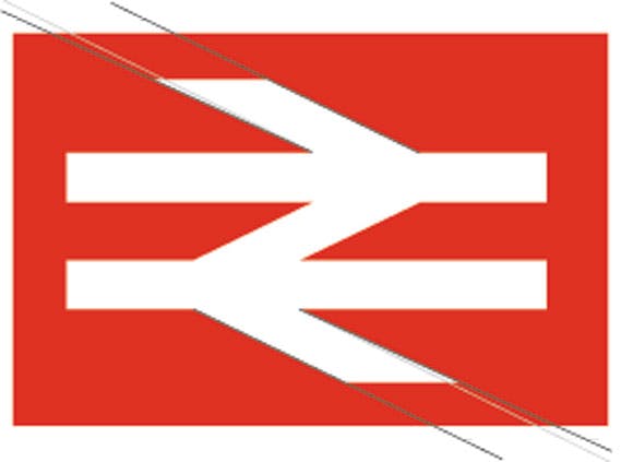
Its resilience is impressive. It survived BR’s privatisation in 1996, the effective re-nationalisation of the railways in 2002, and remains the de facto symbol for stations across the UK, on everything from signage to tickets and websites. In representing two tracks and a set of points, Barney’s brief to make something ‘timeless’ looks to have done its job.
In the early 1960s, British Railways, the nationalised rail network created by the Attlee government in 1948, was changing. It was set to become a modern, streamlined organisation, with the help of a radical secret weapon: a corporate identity. Out would go its heraldic badge with its connections to the steam age – a red lion, ‘sejant erect’, grasping a train wheel – and in would come sans-serif type and a total, unifying identity system. Canadian Railways had unveiled its bold CN device in 1960 and this dispelled any thoughts that BR’s crest could be brought up to date. Modern corporate identity had arrived and the British Railways Board were determined to follow its call.
The story of the British Rail symbol begins in 1960 when Barney, then aged 21, applied for a job as a lettering artist at the prestigious Design Research Unit. He got the job and quickly established a close working relationship with the studio’s co-founder, Milner Gray. Despite being 40 years Barney’s senior, Gray seemed to have found a kindred spirit. Barney not only became the first person in the studio permitted to work with the head designer’s drawings, but he was also the first to address him directly as ‘Milner’.
“I was a lettering artist, I wasn’t a designer,” says Barney, who went on to co-found design studio Sedley Place in 1978, where he still works. “The designers at DRU were given the brief and, to my knowledge, it didn’t satisfy Milner so he threw it open to the rest of the studio, six or so people. I just happened to think of this symbol.” Appropriately enough, Barney came up with his design while taking the tube to work. “I seriously did do it on the back of an envelope,” he says. “When I got to the office I drew it up. It’s exactly how I drew it the first time, with straighter lines. I just had to formalise it.”
DRU produced around 50 symbols, Barney recalls, taped them up on the studio walls and Gray along with the representative of the BRB’s Design Panel, director of industrial design for the railways George Williams, selected a shortlist of six. This was then cut down to two: a design by the studio’s Collis Clements (two circles and an arrow) and Barney’s symbol. “Arrows were in fashion,” he says, smiling.
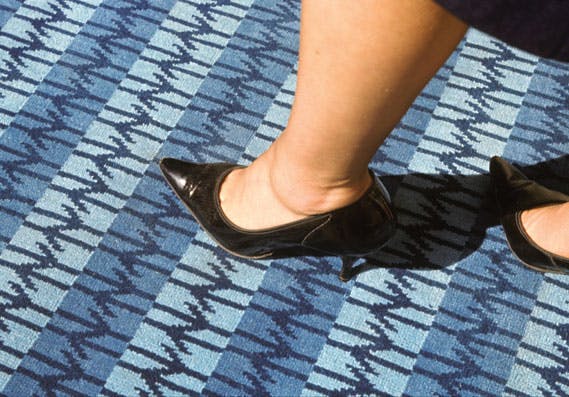
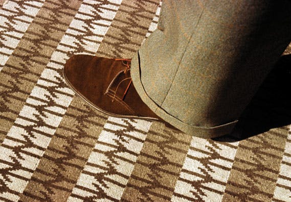
But in an interesting twist, Clements’ design was leaked to the press and was subsequently abandoned. The sheer amount of collaboration involved in producing presentation materials meant that this was often a risk. “In those days you actually had things made for presentations,” says Barney. “For this, curtain fabrics were produced, carpets were woven, posters were printed, and it was all put together in the form of an exhibition. It was enormous. So when Collis’s design got leaked it only left one; the one I did.”
On closer inspection, Barney’s symbol isn’t quite as straightforward as it first appears, much of which can be attributed to his background in hand lettering. “When you do a line of lettering with the characters the same height, the ‘o’s can look too small, so they’re always made a bit bigger,” he explains. “In the BR symbol the lines aren’t all the same thickness. Where the angled bars meet the horizontal ones they will appear thicker at the join, so they actually widen slightly going out. But that comes from lettering, where you have to pay attention to the counters; the spaces that are left, not the thing you’re drawing. They work together.”
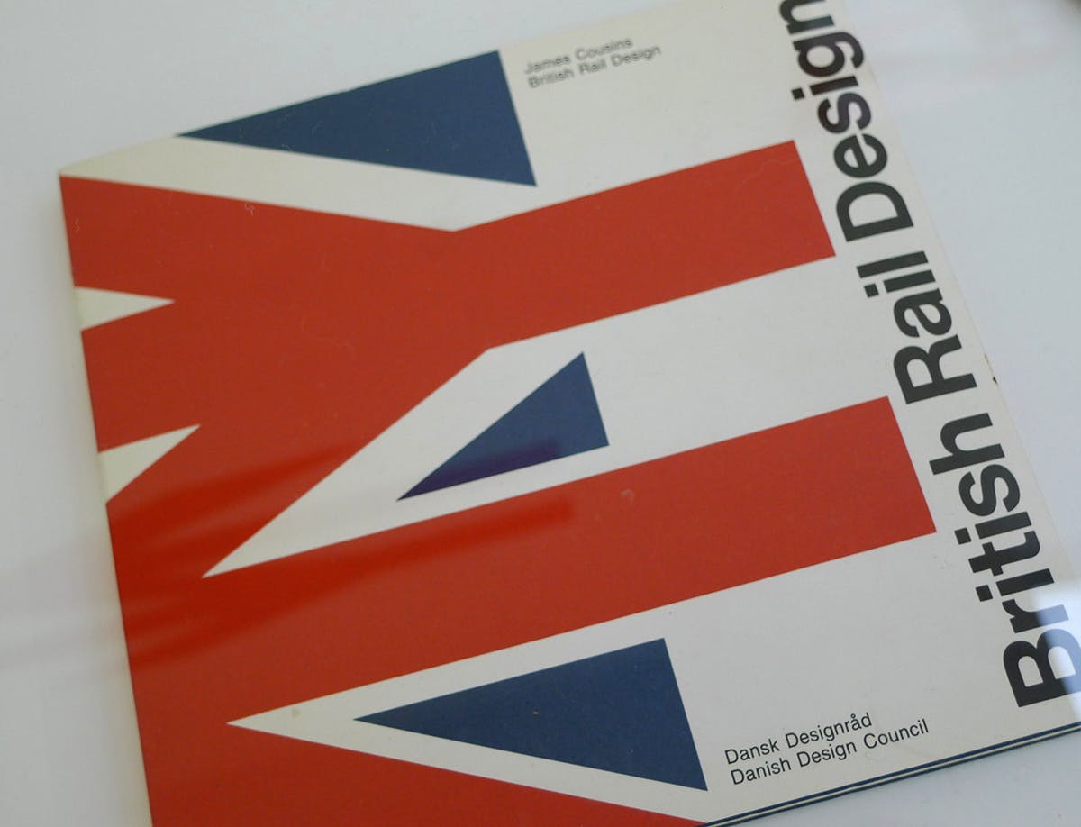
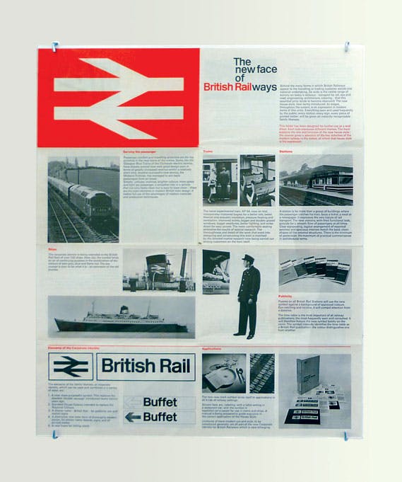
Writing of the project in the pages of Design in 1965, Robert Spark reflected on the four basic visual elements that DRU had created for British Rail: a symbol, a logotype, a name-style and house colours. “To be effective,” wrote Spark , “these elements need to be applied to every facet of the railway system: locomotives and passenger and freight rolling stock; stations, town offices and other architecture; signposting of all kinds; uniforms; road transport; ships; print, publicity, sales aids and exhibitions.” It was, even by today’s standards of cross- and multimedia applications, quite the undertaking.
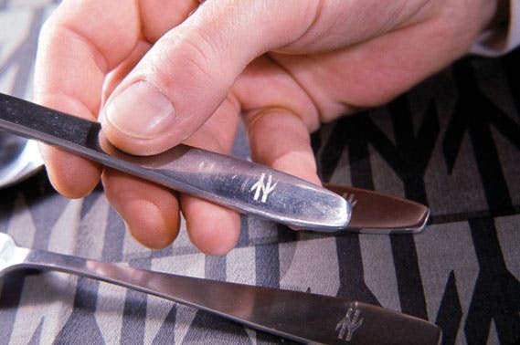
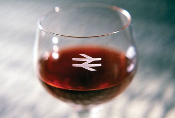
“If you can design a pictogram that works, you don’t have to speak the language,” says Barney, crystallising the way in which the double arrows device was able to work across elements as diverse as posters, uniforms, cutlery and signage. “The current logotypes for the different railway companies are so complicated,” he adds. “You just don’t have the immediacy there of a symbol like London Transport. Even when our work had launched, it didn’t take long before the words ‘British Rail’ began to disappear from the BR symbol.”
At this point, Barney puts a graphic design myth to bed. Legend had it that the shortening to ‘British Rail’ happened because the DRU simply ran out of time to draw up the letters for ‘ways’ before the final pitch took place. What actually occurred, Barney explains (and it does sound far more plausible) was that Gray had intentions to change the name from the beginning and presented it as such. “British Railways were reorganising the whole network, making it corporate, so wherever you saw the name it would appear the same,” says Barney. “It was a nationwide piece of implementation. It couldn’t fail, really, whether you liked it or not.”
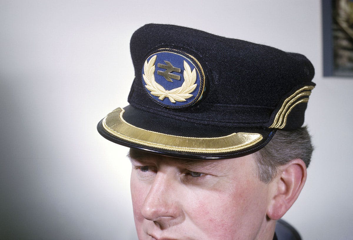
At the time, the influence of German and Swiss design (notable, too, in Jock Kinneir and Margaret Calvert’s Rail Alphabet typeface for the organisation) permeated the Design Research Unit. “DRU did a packaging concept for Ilford, for example, which looked like Geigy,” says Barney. “It was a big change, people were using Helvetica, moving away from traditional faces. CN seemed to sum it all up. It was clean, but if you weren’t careful, boring. It took the life and soul out of things. In retrospect there was too much but at the time everyone wanted to use it, it was exciting.” One idea of Barney’s, to render the BR symbol as a supergraphic device, was perhaps a bit too exciting for British Rail. “The first designs I did for putting the symbol on a train,” he recalls, “I had it covering practically the whole engine. It looked bloody great, but they wouldn’t do it.”
Following the demise of British Rail, Barney’s double arrow device is now a registered trademark in the name of the Secretary of State for Transport, from whom the Association of Train Operating Companies use the symbol under license across the UK network. Barney remains very proud of the work, if pleasantly surprised that it is still in use.
“I couldn’t post-rationalise it, I’m not good at that,” he says. “It worked because it was obvious. When you think of railways, you think of parallel lines: up this way, down that way. There was a certain amount of logic I could use to explain the way it looked, then it was a question of stylisation. I’m proud that it’s lasted so long, more than anything. I’ve never thought ‘I wish I could do it again because I’d do it better’. I actually wouldn’t know what to do.” Looking back, 50 years on, those arrows seem far from indecisive.
A wide range of marketing material connected to the British railway system can be found in Search Engine, the archive and research centre at the National Railway Museum in York. Call 01904 686235 or email search.engine@nrm.org.uk to arrange a visit. All the images on these pages, plus the main image on the previous spread, are taken from the National Railway Museum’s collection and can be purchased as prints from the Science and Society Picture Library website at scienceandsociety.co.uk. The National Railway Museum covers 300 years of railway history from locomotives and rolling stock, to posters, tickets and uniforms. Admission is free. More information on the museum at nrm.org.uk
More on our top 20 logos here.
-
Post a comment
Latest from CR


