Does Burberry’s redesign signal a new chapter for ‘British’ symbolism?
Under new chief creative officer Daniel Lee, the fashion house has revealed a refreshed design identity that centres on its British heritage. Is it more than just a rebuke of minimal fashion branding?
When Burberry revealed its new branding on February 6, there was an audible sigh of relief from both the graphic design community and the fashion world.
That’s not to say Peter Saville’s previous visual identity for the luxury house was particularly disliked; nor do people necessarily appreciate the constant flip-flopping between logos every time a new creative director comes in. But the reintroduction of a serifed wordmark, along with an intricate logo, was taken as a welcome contrast to the minimal branding that’s swept through the fashion industry in the last five to ten years – a trend that’s felt inevitable rather than what it actually is: a choice.
A return to something more ornate at Daniel Lee’s Burberry was perhaps to be expected, with the designer having previously headed up Bottega Veneta – one of the few fashion brands of its ilk to hang on to a serif while the rest of the crowd trimmed just about all of the fat away from their branding. Burberry’s new brand campaign was the first glimpse of the house’s direction under his reign, with the redesign preceding his runway debut later this month.
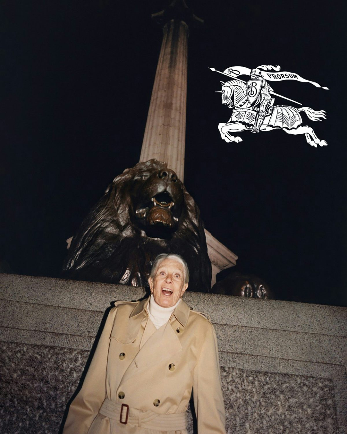
The new logo is a refresh of Burberry’s original symbol, known as the Equestrian Knight Design, which was adopted by the house after it won an open design competition circa 1901.
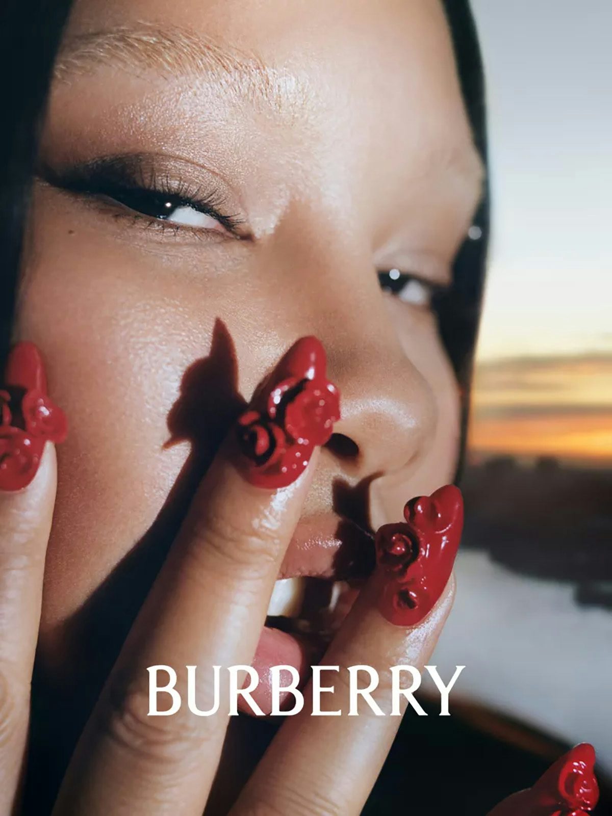
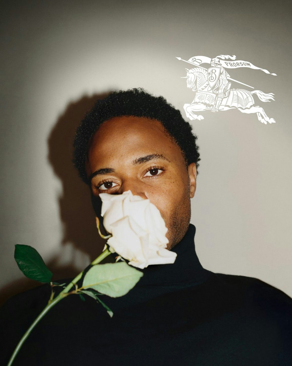
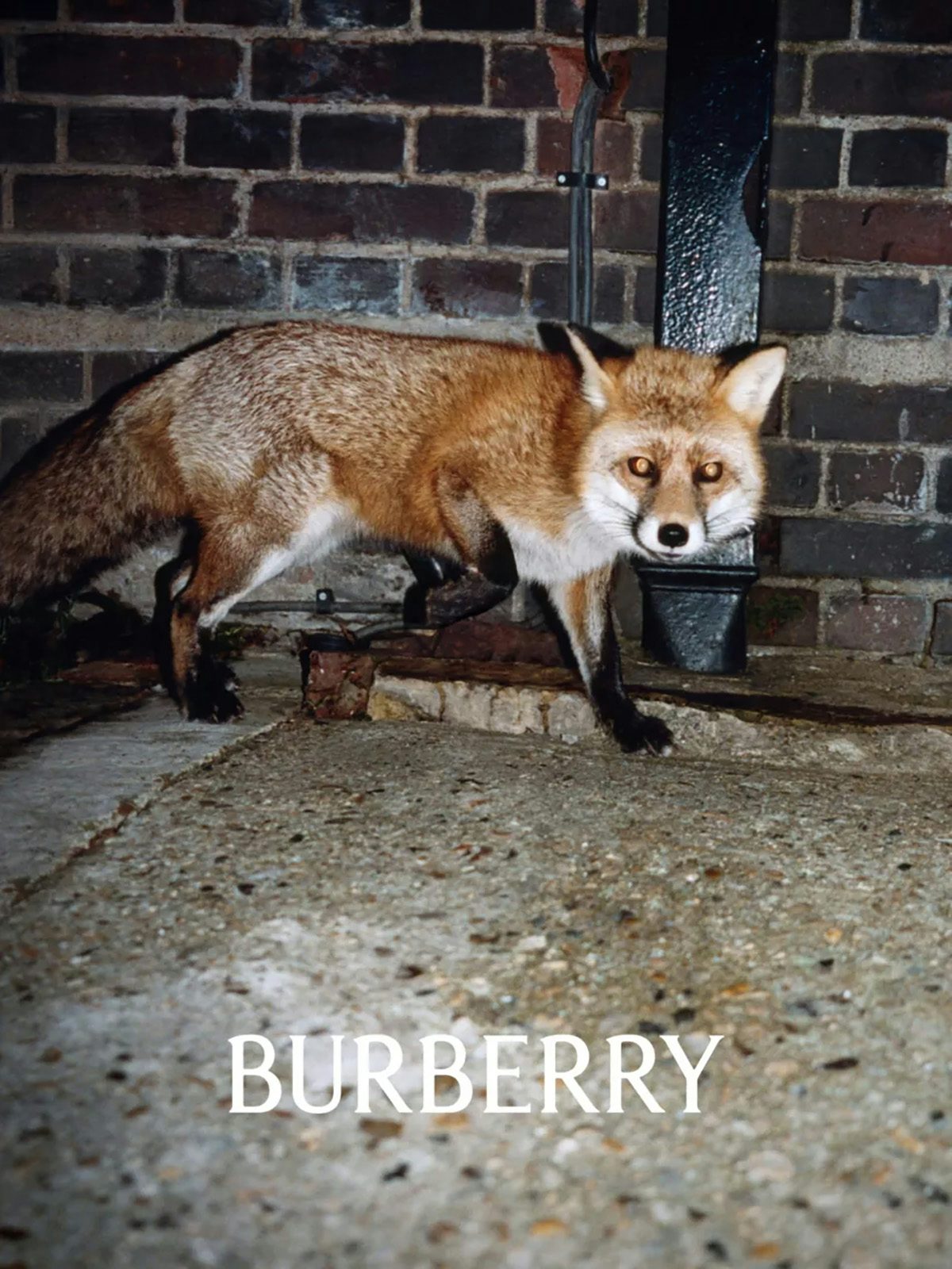
The new design identity has been integrated (rather loosely) into Lee’s first brand campaign with Burberry. Shot by Tyrone Lebon, it features the likes of actor Vanessa Redgrave, footballer Raheem Sterling, music artists John Glacier (who scored the accompanying film) and Shygirl, and Britpop progeny Lennon Gallagher. They appear alongside flash-heavy street-style photos of urban foxes and boisterous swans, which channel the cheerfully brash, irreverent lens of Martin Parr.
View this post on Instagram
It’s a fitting comparison because, like Parr, the campaign and identity examine the perceived hallmarks of Britishness (or at least Englishness). The roses repeated throughout the campaign nod to the English national flower, while the Houses of Parliament and Trafalgar Square – some of London’s most famous destinations – were among the shoot locations.
Burberry has made a legacy out of its heritage; the brand’s trench coats and signature check prints having become national symbols themselves. But it’s been a complicated few years for companies whose entire brand is all about being British, given the identity crisis the country has gone through.

The Brexit referendum divided the nation almost exactly in two. So-called ‘culture wars’ have become a daily fixture on breakfast TV and evening panel shows alike. By 2019, Slowthai was so confident that there’s Nothing Great About Britain that he made it the title of his album, while Stormzy headlined Glastonbury that same year in a Banksy-designed stab-proof vest dripping with a Union Jack – a symbol of national pride, a reminder of colonialism, or a far-right motif, depending on who you ask.
Language and imagery have become wrapped up in all of this, so it’s interesting to see how big brands leverage and redefine something as divisive as ‘Britishness’ today. Burberry’s new identity shrewdly avoids anything quite as explicit as a Union Jack. The only flag that appears in the refreshed branding features the Latin word ‘prorsum’, meaning ‘forward’ (though some pointed out that by facing left, the knight appears to be going backwards).
View this post on Instagram
In an interview with British Vogue published a couple of months ago, Lee said that “Burberry flies the flag for Britishness and for the UK and for culture. So we have to use our platforms because we have a responsibility to communicate those things. I don’t know if this is the right way to say this, but more than surprising people, I really would like them to see the new vision and feel reassured – like, ‘Oh, yeah, this makes sense: This is what Burberry should be.’”
This first move illustrates his (re)interpretation of Britishness within the house, and it might just reverberate outwards, too.
Latest from CR


