
Champions League unveils new look by DesignStudio
The refreshed identity is part of a collaborative effort with UEFA’s marketing partner TEAM Marketing AG, and sees an illuminated version of the competition’s starball logo
Just as we’re about to enter global football mania with the start of the 2018 World Cup, UEFA has revealed a timely rebrand for the Champions League.
Developed by DesignStudio in collaboration with UEFA’s marketing partner TEAM Marketing AG, the new branding uses an illuminated version of the competition’s existing ‘starball’ logo as its centrepiece.
An animated version of the logo can be used to spotlight different moments in games, ranging from the flick of a player’s ankle to a shot of a stadium.
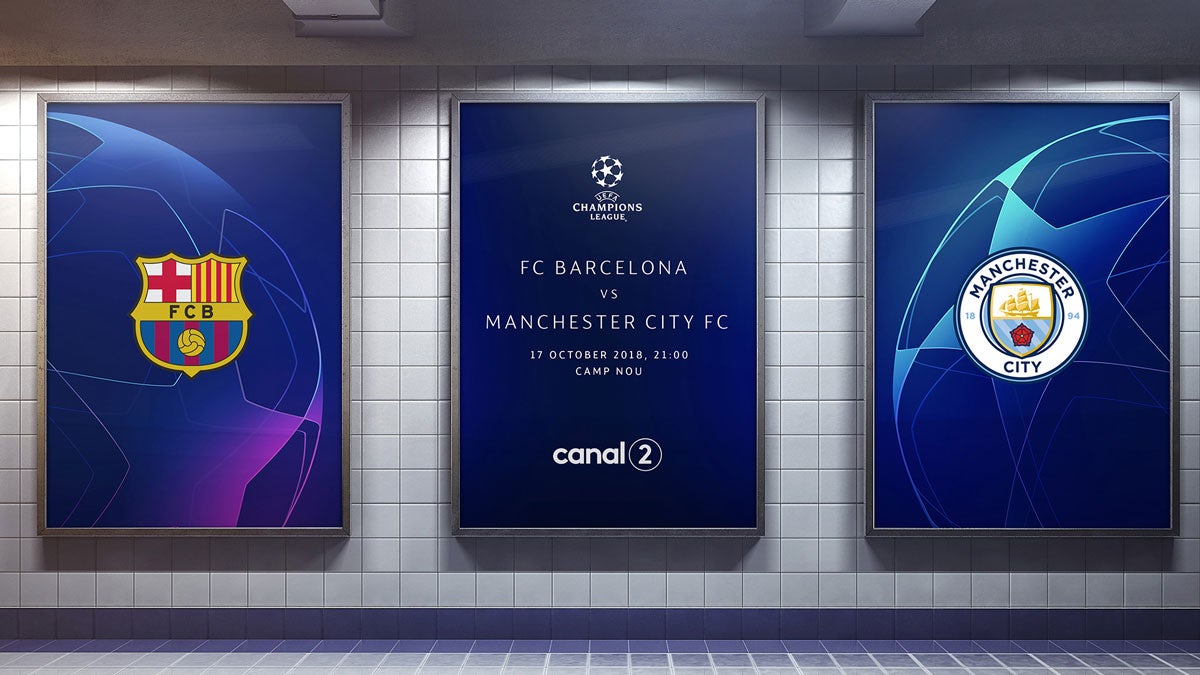
The identity – which will be used by UEFA for the next three years – aims to be more flexible than previous iterations. Magenta and cyan have been added to the existing blue colour palette as accent colours, to complement the fact that many of the matches take place in the evening.
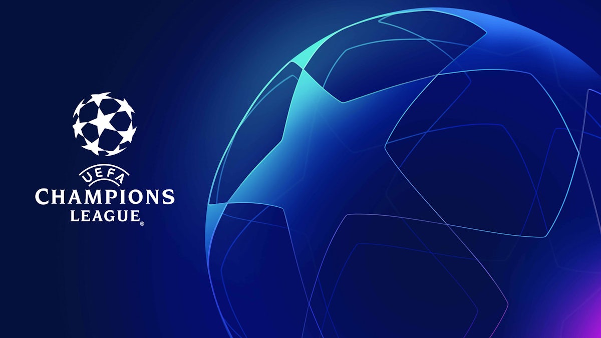
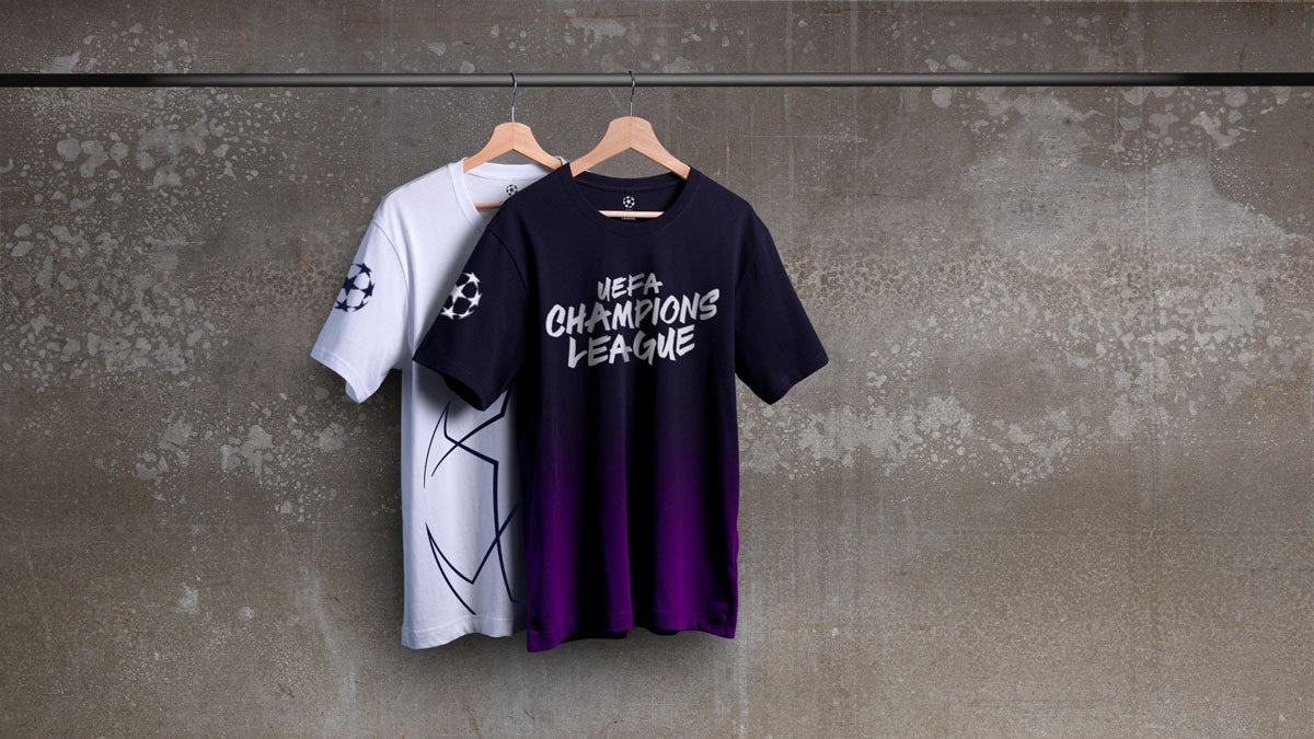
Working with type foundry Fontsmith, DesignStudio created a new lightweight font of the brand’s existing typeface.
The refined branding has been designed to be scalable across digital, mobile and social media, including on smaller surfaces such as smartphones and larger screens including HD televisions.

A new co-branding system has also been introduced to allow the Champions League’s commercial partners to tailor the identity to suit their own needs, while making sure it looks consistent.
It’s not the first time that DesignStudio has ventured into the realms of football, having rebranded the Premier League with Robin Brand Consultants in 2016.
The Champions League’s facelift comes hot on the heels of another UEFA brand refresh, when London-based studio Turquoise updated the Europa League’s energy wave identity last month.


