Channel 5 rebrands with new logo
Viacom has unveiled a new identity for Channel 5, which will be rolled out across its TV channels and on demand service on Thursday. It’s a radical departure from the channel’s previous look – but will it make people think differently about 5?
The youngest of the main terrestrial channels, 5 was launched in 1997. Like all PSBs, it has a remit to provide a broad range of programming (license requirements dictate a minimum amount of news, current affairs and original content) – but it has always struggled to differentiate itself from its rivals and has consistently held the lowest share of ratings. In its early days, it was known for soft porn, the Pepsi Chart Show and a bold approach to news broadcasting, with presenter Kirsty Young sitting on her desk rather than behind it. Today though, it’s more commonly associated with weekend re-runs of Columbo and buying up series that other channels had outgrown, from Neighbours to Celebrity Big Brother.

In its relatively brief history, the channel has undergone several makeovers: Wolff Olins and Saatchi & Saatchi devised its initial launch campaign (shown above) with bold stripes and the tagline ‘Give me 5’, a look which was also applied on-air. In 2002, the channel became known as five and in 2008, its lower case logo was replaced with an uppercase version designed by DixonBaxi.

In 2010, Express newspaper group owner Richard Desmond bought the channel for £103 million, and re-launched it as Channel 5 (bringing with it another new logo). It was then sold to Viacom in 2014 for £450 million, who promised a double digit budget growth for new programming last year and plans to launch a comprehensive rebrand. Shows introduced since include Lip Sync Battle UK (where celebrities don costumes and mime famous songs) and Body Donors, an original documentary about what happens to people’s bodies after they are donated to medical science. Channel 5 reported a 4% increase in viewing figures among 16-34 year-olds last year, and says it was the only major free-to-air channel to grow audience share.


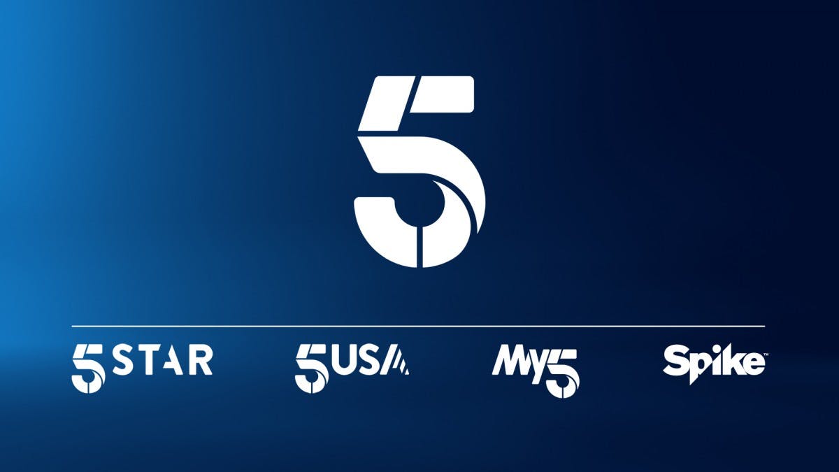
The rebrand, which launches on Channel 5 on Thursday morning, includes a new logo and on-screen treatments for each of 5’s channels – Channel 5, 5USA and 5Star – designed by New York agency Gretel (the logo for sister channel Spike, which launched in April last year, has remained the same). Online service Demand 5 has been renamed My5 and has a new logo designed by Los Angeles agency Troika, and Viacom has worked with several production companies to create new idents for Channel 5 and 5USA. The new look has taken 13 months to create, and Viacom hopes it will challenge negative perceptions of the brand and attract 16-34 year-old viewers as well as those in the ABC1 demographic.
The new 5 logo sees the number broken into segments, which, like Channel 4’s, can be animated and deconstructed or re-arranged on-screen. Different colours and textures will also be added to reflect different moods and types of content:
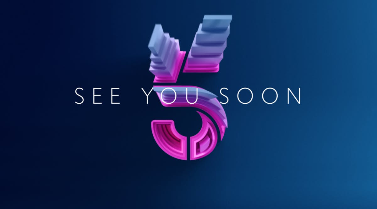
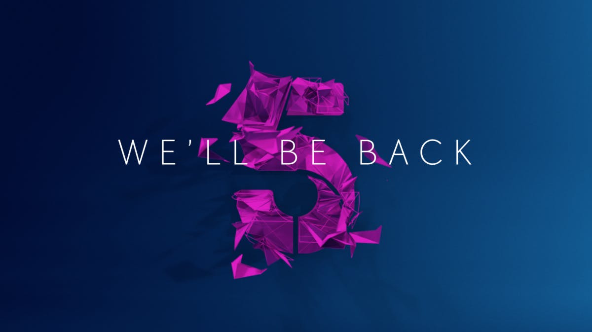
Channel 5’s colour palette is made up of eight gradations, spanning pink, purple, green, blue and orange, and on-screen messaging will speak to viewers in a warm and friendly tone, with messages such as ‘see you soon’, ‘welcome back’ and ‘settle in’ set in typeface Nobel Light.
The project was led by Channel 5’s VP of marketing, Jo Bacon and Jody Malam, creative director at MTV. Bacon says the new look is inspired by the idea of presenting ‘spirited TV with an emotional heart’, reflecting Channel 5’s new positioning.
“Channel 5 is for everyone – we’re for the masses, and appeal to all of the UK, some of the time,” says Bacon. Describing 5’s spirit as creative, unashamedly entertaining, occasionally provocative and honest, she says its programming exists “to make the everyday more colourful” – an idea that is reflected in its new idents. The aim was also to communicate a sense of empathy, of programming that speaks to and for the people, she says, as well as a cheekiness and sense of playfulness.
The idents draw on the idea of 5 making everyday life better with a series of short films which each feature a moment of surprise; from a group of five whales emerging from the sea, to five tropical birds appearing on a balcony. “We didn’t want to make them just about the logo, we wanted to create moments of entertainment in their own right,” says Bacon. Films were created by Academy, and directed by Si&Ad.
London studio Momoco, meanwhile (which has worked on titles for Luther and London Spy), has created a slick series of idents for 5USA, which were shot using drones and feature sweeping views of US cities. “We wanted to capture a sense of Americana,” says Bacon. “5USA has a loyal fan base, so we didn’t want to alienate them, but we wanted to contemporise [the channel],” she explains.
The rebrand aims to better connect 5’s channels, while also giving each one a distinct voice, explains Bacon. 5USA’s Americana-style look references its focus on US drama, while 5Star’s branding is designed to appeal to a younger audience. “We want things to look like a family, but also distinctive and individual,” she adds.
Bacon says the team did extensive research into perceptions of Channel 5 before starting the rebrand – the project began with a four-month exercise to develop a new strategy, carried out by research and comms teams. While reticent to cite any specific negative feedback from viewers, Bacon acknowledges that there have long been concerns over the quality of 5’s programming – something that was revealed in research – and says the rebrand aims to address this with high production values, cinematic idents and a more upmarket look and feel.
Bacon also says the previous branding, with a ‘5’ in a red circle, felt quite “tabloid-esque” and failed to reflect the channel’s new commitment to launching a broader range of programming, from Body Donors to Ben Fogle: New Lives in the Wild (where adventurer Fogle visits people who have left the daily grind behind to set up a new life in remote areas). Explaining the decision to work with a number of agencies, she says Viacom wanted to work with “the best talent from around the world”.


Like ITV’s rebrand, which was launched in 2013, 5’s new look does a stellar job of smartening up the channel’s image and giving the brand a flexible suite of assets that can be adapted to suit digital, print and on-air applications. The new logo feels much more dynamic, and the range of colours and textures gives 5 the freedom to distinguish between different types of shows – for example, news, sports and factual entertainment – or moods, from serious to more light-hearted.
The idents certainly feel more upmarket – the 5USA films convey a real sense of drama and excitement, while drawing on some familiar cityscapes, and the main channel idents are sure to raise a smile with their use of puppies, birds and skilled skateboarders. But while they’re nicely shot, I’m not sure what they really say about Channel 5 or its new direction – yes, they’re warm and friendly, but they don’t provoke a strong emotional response, and lack the kind of boldness we saw in Jonathan Glazer’s recent idents for Channel 4, or the depth in ManvsMachine’s films for Film4, which reward repeat viewing with dozens of hidden movie references.


While the channel’s image was in clear need of an update, 5’s biggest problem has always been its content – and in an increasingly crowded marketplace, creating a brand designed to appeal to “all of the people, some of the time” is a difficult thing to sell, and a difficult brief to design for. Appealing to mass audiences is something every PSB has to do, but 5 has always lacked the advantage of being the UK’s oldest broadcaster and a much-loved institution like the BBC, home to some of the nation’s best loved shows like ITV (from Corrie to Downton and Call the Midwife) or being ‘born risky’ like Channel 4 – and with more channels than ever competing for viewers’ attention, having a vague proposition without a strong and clearly defined USP is a real problem.
Viacom and the agencies involved have certainly brought 5’s identity up to date – but will it change people’s minds about the brand? And most importantly, will it make them more likely to watch it? 2015’s viewing figures have been positive, and the new look will likely inspire curiosity in those who haven’t tuned into 5 in a long time – but whether those viewers stick around will ultimately depend on the quality of its promised new programming.
Latest from CR


