CNET’s new identity is inspired by the golden era of journalism
Collins has reimagined the tech-focused media company’s branding for a new chapter, also enlisting the help of illustrator Robert Beatty to introduce a more surrealist approach to its marketing
Since launching in 1994, US media brand CNET (an abbreviation of Computer Network) has become a trusted source for reporting and advice on all things related to technology and digital culture.
As tech has evolved over the last two decades to influence almost every aspect our lives, the media company decided to expand its coverage and advice to what matters most in modern life – including money, home, wellness, culture and climate.

To coincide with its refreshed editorial approach, CNET enlisted the help of New York and San Francicso-based studio Collins, which was tasked with crafting a new brand strategy, brand story and visual identity for the media company.
Collins’ brief was to turn CNET from a tech review site into an editorial-first brand known for its useful information and expertise, putting it alongside the raft of other news organisations that are placing renewed emphasis on trust, including the New York Times and the Guardian.
“Faced with today’s partisan publications on one end and clickbait factories on the other, we looked to broadcast journalism giants from the 1950s through 1970s – the decades before the FCC (Federal Communications Commission) abolished the fairness doctrine requiring outlets to represent differing viewpoints. A time when the news was deeply respected and viewed as a public good,” says Collins.
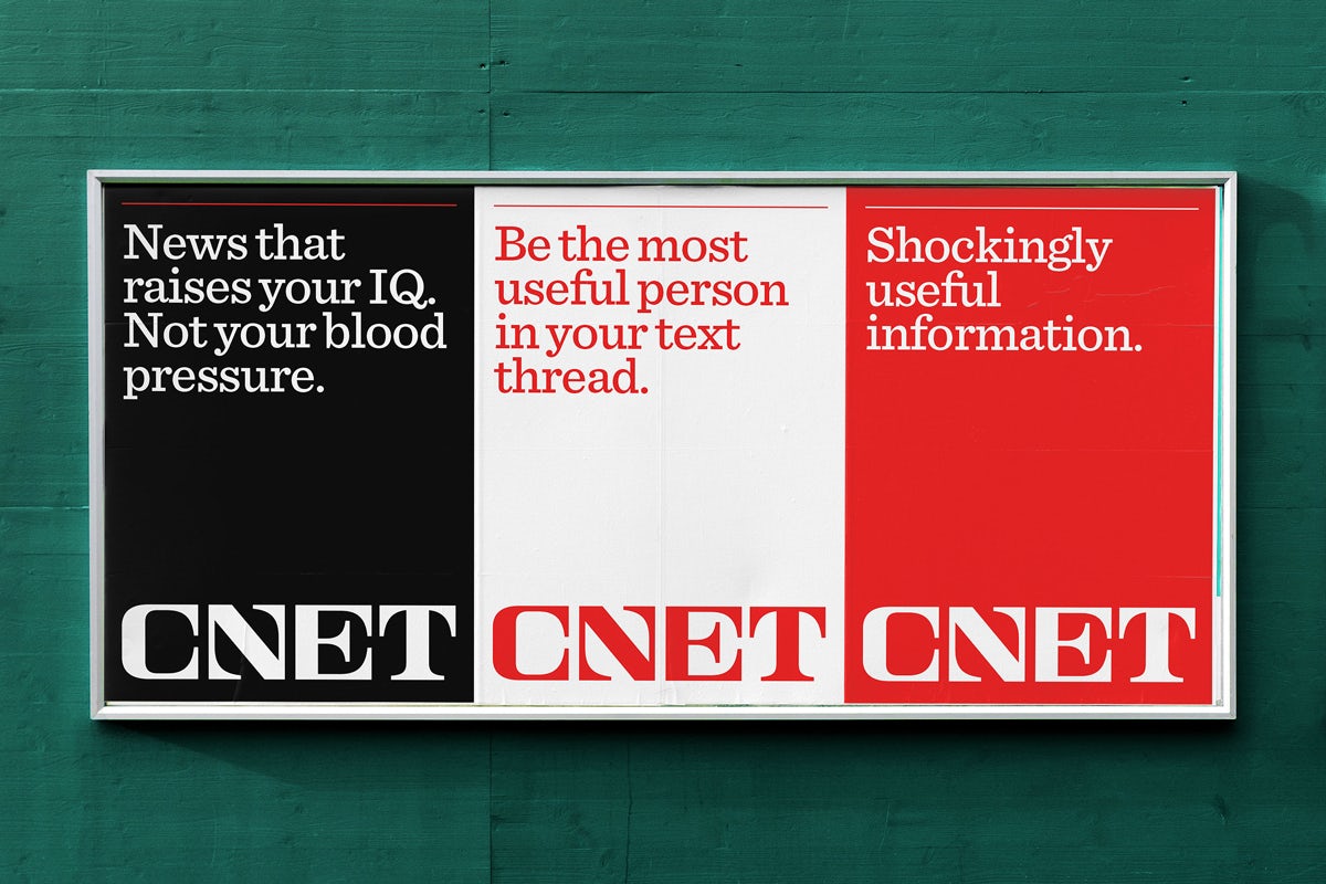
The new visual identity swaps the lower case sans serif logo that CNET had used for the past 30 years in favour of a more trim, custom serif wordmark inspired by editorial design from the so-called golden era of journalism.


“[The] new wordmark aims to be trustworthy while also pointing to a fresh way forward. It heralds a new and open editorial experience that allows their stories and advice to have a sense of importance – in any media channel – without crowding each other out,” says Collins.
In marketing CNET’s new approach, the studio leaned into bold surrealism with a series of striking artworks by Kentucky-based illustrator Robert Beatty. It has also introduced a slab serif typeface, Sentinel, and a new brand voice that seeks to make talking about the news more enjoyable.
Latest from CR


