Deliveroo reveals new logo and visual identity
Food delivery startup Deliveroo’s new branding features a minimal kangaroo logo, colourful rider jerseys and photography that captures the ‘messiness’ of food
Deliveroo was founded in 2013 and is now one of London’s fastest growing startups. The company delivers restaurant food to customers in 12 countries and recently raised £200 million to help it expand into new markets.
Today, the company revealed a new logo and visual identity created by DesignStudio – the same agency that rebranded Airbnb in 2014 and the Premier League earlier this year.
The new branding sees Deliveroo’s original logo – a kangaroo holding a bag of food against a teal backdrop – replaced with a more minimal graphic symbol. The logo features on the company’s new app and website, designed in-house using guidelines created by DesignStudio. The symbol has also inspired the design of colourful jackets and jerseys for riders.

In a blog post announcing the rebrand, Deliveroo’s design team says DesignStudio explored several options for the new logo. The agency consulted with staff and carried out a semiotics analysis of what the symbol means in other countries and cultures before deciding on a final design.
“We explored a variety of routes … some that kept the kangaroo as its primary inspiration, to completely new logos that left our kangaroo roots behind. What the process highlighted was that both internally and externally our Roo had become a beloved part of our brand,” writes the design team.
“What we landed on was an evolution from our original and more literal take on the kangaroo, turning it into a striking new mark bold and impactful, but still maintaining the character and charm of the Roo.
“Importantly, this new Roo gave us a series of angles that would help the rest of our graphic system take shape. A system that would run across everything, from our site to our rider kit.”
James Hurst, ECD at Design Studio, told CR: “Literal meanings are often positive in one culture but controversial in another, while character brands cut through the forgettability of abstract marks. As such, we have created a symbol that can be recognised as a character, the Roo, irrespective of what language you speak, while the minimalist aesthetic reduces established cultural associations. This is a mark that Deliveroo will imbue with meaning over the next few years.”
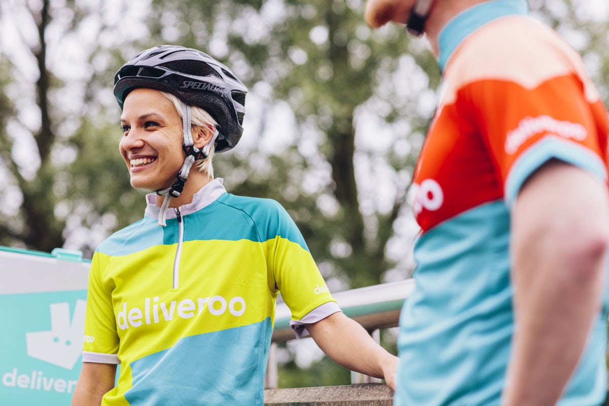

Rider kits feature designs based on the shape of the word mark and come in a range of bold colours. Deliveroo and DesignStudio consulted with road safety organisation Brake to create the new kits, which are designed to be more reflective and safer than previous black-and-teal uniforms.
“On Brake’s advice we added the hyper-reflective material on the waist, shoulders and wrists of the jackets to demonstrate the movement of our riders’ bodies at night, and amped up the colours in our kit for the day. Our riders in warmer climates asked us for jerseys that allowed them to keep cool and our riders in colder places wanted a truly waterproof jacket to keep them dry,” says Deliveroo.

The addition of safer kits will likely be a welcome change for riders – particularly as the company has been criticised for failing to offer much protection to employees in the event of accident or injury.
Deliveroo says its model differs by market, but that most riders are freelance contractors, telling CR: “All scooter and moped riders are required to obtain third party cover by law. This forms part of each of our rider’s vehicle registration requirements and is a mandatory stage of our on-boarding process. Although bicycle insurance is not a legal requirement, we encourage all riders to obtain public liability insurance for cover in the event of an accident, injury, theft or damage while riding. We also offer all riders discounted cover with a number of leading insurance companies.”
Alongside the identity system and uniforms, DesignStudio has devised a global launch campaign, which will be revealed on Friday, and rider equipment.
The company’s new website features bold colours and up-close shots of meals from burgers to sushi. The brand says its new photography style aims to capture “the messiness of food in its tangible, up-close glory” – whether a burger dripping in cheese sauce or pancakes topped with maple syrup.

Headlines on the website and app feature a customised version of Production type’s Stratos typeface, a distinctive alternative to the rounded sans type we often see in apps and tech startup branding.
“For the headlines we are using a customised version of Stratos, it echoes the angles and shape within the [kangaroo] symbol and is brimming with personality for bold punchy headlines,” says Hurst. “It’s the same type used across the rider jackets … and is also the basis for the word mark.”
Deliveroo says it will be delving deeper into various aspects of the new identity on its blog over the next few weeks, looking at various elements of the brand toolkit and how it will applied in various formats.

It’s a strong piece of work from DesignStudio: the website features some mouth-watering photography while rider kits are more eye-catching than previous designs, as well as being safer. The logo has been likened to a hand flipping a ‘V’ sign but it certainly stands out as an app icon on smartphones.
As Deliveroo looks to expand into new markets and compete with rival service Uber Eats, having a great identity will be crucial to its success. But the new branding is unlikely to resolve one of the biggest issues currently facing Deliveroo’s image: the perception that it does not pay workers fairly.
Hundreds of workers recently protested after the company introduced a pilot scheme offering £3.75 per delivery instead of the £7 hourly wage and £1 delivery fee it previously provided. Deliveroo was ordered to pay workers minimum wage unless it reaches an agreement in court to treat them as self employed and conceded to make the pilot scheme optional, promising at least least £7.50 per hour plus petrol for those taking part.
The company’s investment in creating safer kits for riders should be welcomed but as it enters new markets, it is likely to face yet more questions about wages and insurance – questions that will persist beyond the launch of its new branding.
Latest from CR


