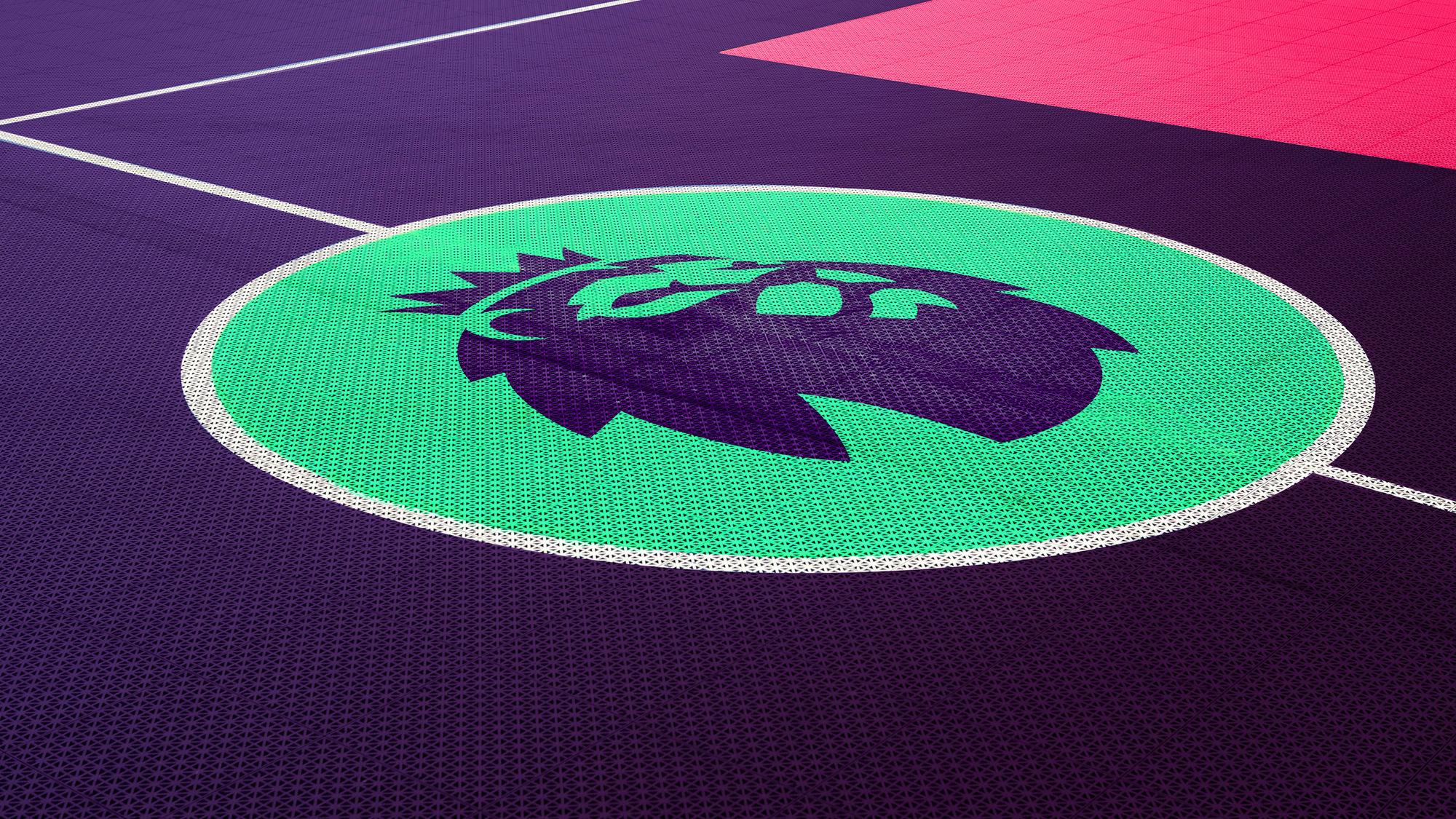
DesignStudio rebrands Premier League
The Premier League has launched a new visual identity for the 2016/17 season, with an updated lion icon designed to communicate a new side to the world’s most popular football league
The new branding, on which DesignStudio collaborated with Robin Brand Consultants, will be used from the 2016/17 season onwards and follows the League’s decision to drop title sponsorship. The League has been promoted as the Barclays Premier League since 2007/8, and was previously known as the Barclaycard Premiership and the Carling Premiership, but will carry no main sponsor from next season.
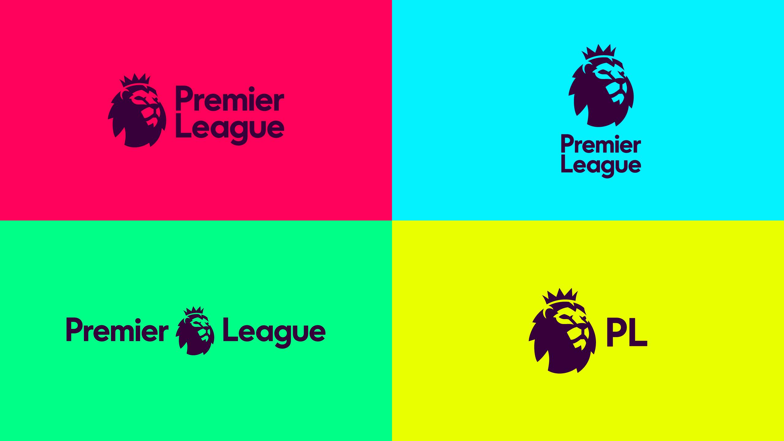
The new identity features rounded sans type, a redrawn lion icon and a colour palette which will be updated every three years.
“Lots of people around the world understood that lion to represent the Premier League … so it wasn’t about destroying everything that was there to build something new, it was about building on that equity and heritage,” says CEO and co-founder of DesignStudio Paul Stafford.
And, as DesignStudio ECD Stuart Watson told us, there were practical problems with the old design that the new look seeks to address – “The old logo couldn’t invert, it didn’t work small, so all those things are gone now,” he explains. “We did about 600 iterations through many different stages to get where we are today. We wanted it to feel instantly recognisable to the existing marque, but be its own thing in its own way.”
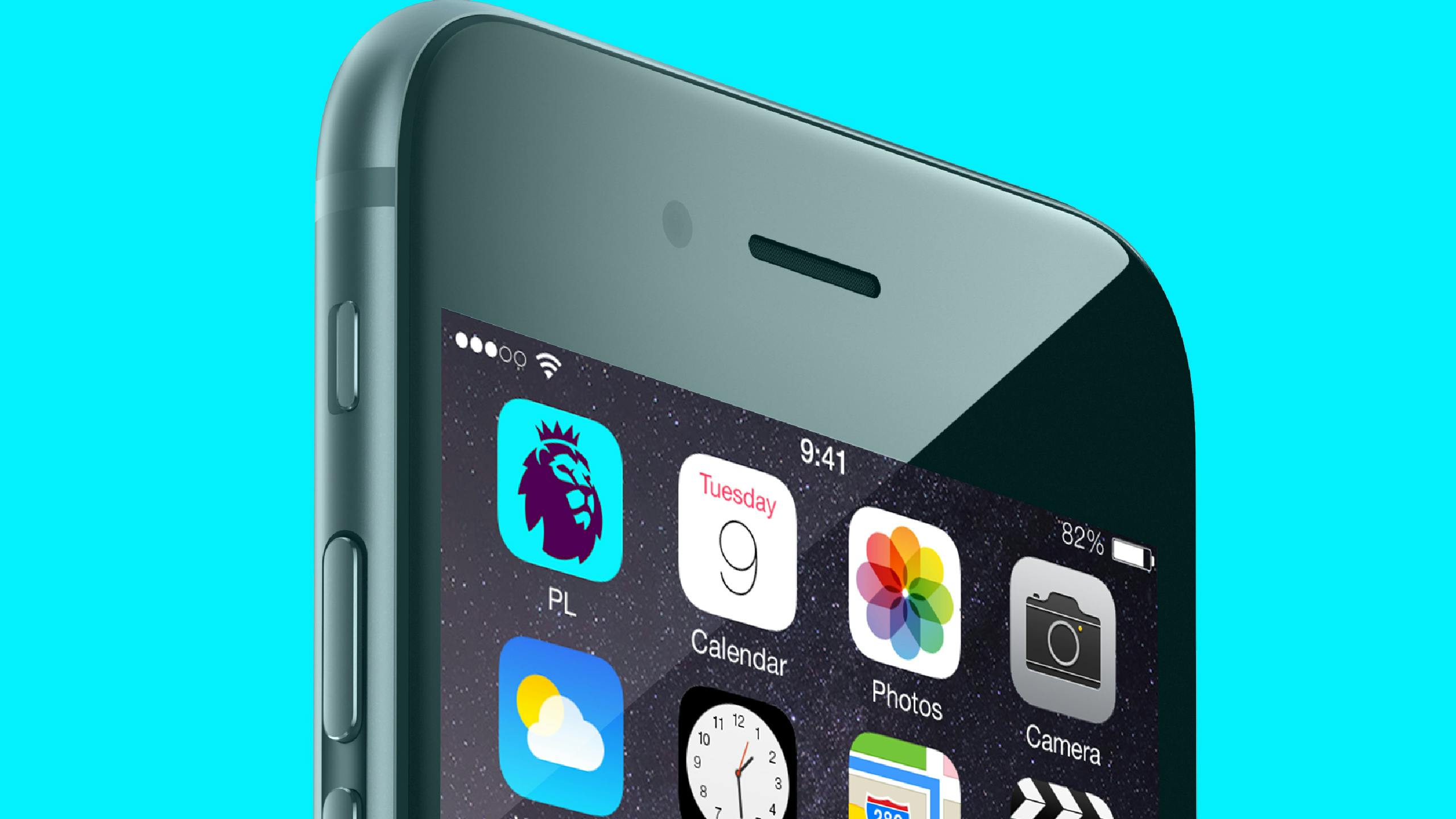
Interestingly, Watson says that “the real driver behind [the new look is] this kind of digital, broadcast-first approach – make it work as an app icon, and worry about everything else after.”
The serif wordmark, meanwhile, has been replaced with a friendlier-looking rounded sans based on FontFont’s FF Mark. DesignStudio is also working on a bespoke font, Premier Sans, for the brand. “[The identity] is a huge tonal shift from buttoned up, shirt and tie, formal, reserved … to warm, human, approachable and informal,” says Watson. “We needed a really human font, so we picked FF Mark as a placeholder, then redrew that and created a bespoke word mark so that Premier and League stacked nicely,” he adds.
The colour palette will be updated every three years and for now, includes bold shades of yellow, green, blue and a pinkish-red. “We want [the Premier League] to be known as very vibrant and bold and colourful, and we really wanted to get away from red, white and blue,” explains Watson. “The other interesting thing is that they’re not club colours – we’ve been really careful to make the colours our own.”
Colours were also designed to allow for formal applications as well as more light-hearted communications: an aubergine word mark on a white background, for example, is designed to look more serious than brighter shades which can be used to talk about community projects or address children. “[You have to think about everything] from talking to a 6-year-old child, to a 60-year-old politician, from lobbying in parliament to talking in primary schools…. We had to prove the system could stretch and flex, not just in broadcast in digital, but also in the messaging spectrum,” says Watson.

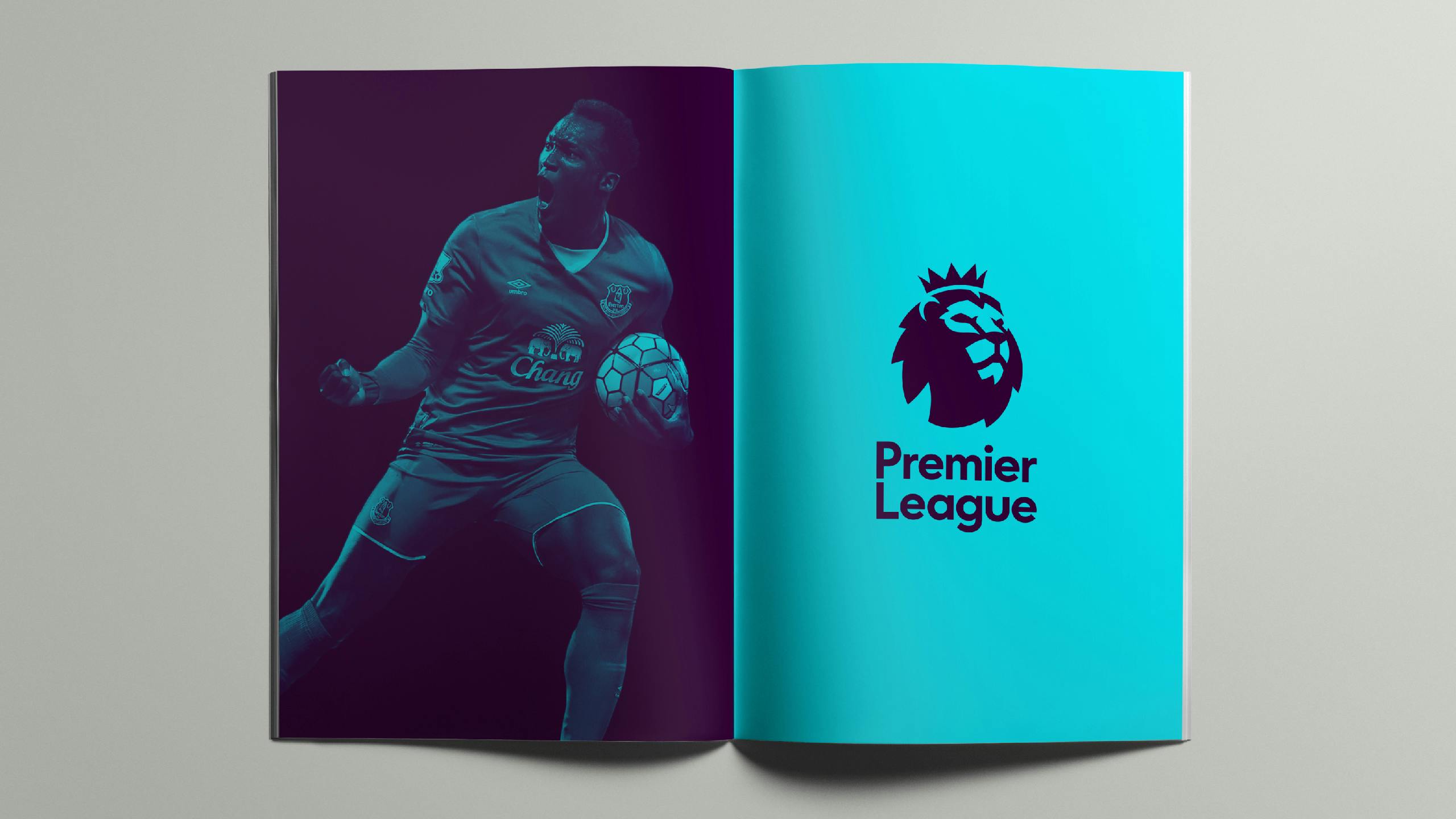
With imagery, DesignStudio has adopted a similar approach to Collins’ work for Spotify last year, using vibrant colour washes over photos of players supplied by clubs and image libraries. Original photography, however, will have a much more authentic feel, says Watson, “focusing on people and their expressions.”
To promote the rebrand, Premier League has released a new film which aims to highlight the inclusive nature of football, showing footage of community projects as well as premier league matches – but with Liverpool fans recently walking out in protest over rising ticket prices, and many feeling that they are priced out of games at their home clubs, the tag line ‘for every fan’ feels a little hollow.


Nevertheless, this is a distinct, and intriguing change of tone for the Premier League. Ever since its formation in 1992, the League has been controversial among football fans. For some, it marks the point at which the game lost its soul, a ‘brand’ forever associated with spiralling wages, ever larger TV deals and rocketing ticket prices. But there is no denying its success. The Premier League is the most-watched in the world, and generates the world’s highest revenues for a football league. Stadiums are (by and large) full and many of the world’s best players play in England’s top division.
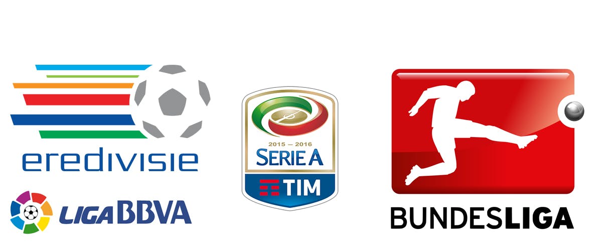
The Premier League is now a genuinely international business and, as such, competes with its rival leagues in Europe and beyond. In design terms, the new look compares more than favourably with its competitors who remain mired in the obvious (balls and/or men kicking balls) and the bizarre (Serie A’s swooshy, stadium-y centre circle with ugly sponsor logo attached).
As a side note, it’s perhaps unsurprising that one of the few football leagues to do anything noteworthy in design terms is the American MLS. In 2014, it replaced its previous clunkingly obvious logo (a boot kicking a ball no less) with a graphic shield device that cleverly adapted to carry the colours of all its competing teams.
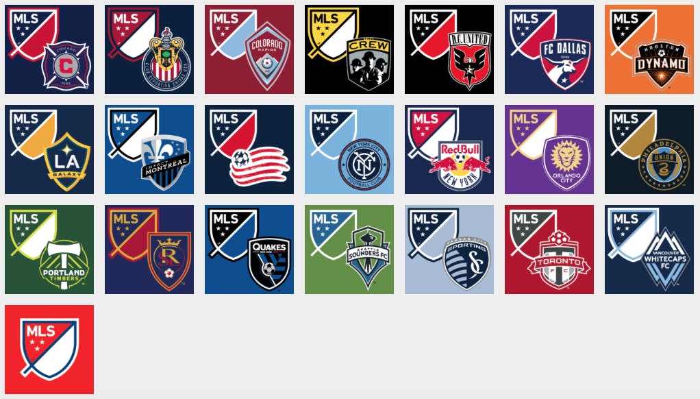
But the franchise-baed MLS has a very different relationship with its teams to that of the Premier League and English clubs. Thanks to promotion and relegation, the constituent members of the league change year on year while the clubs themselves have been around far longer than the league they play in and have their own highly developed identities and iconography.

The Premier League’s previous identity felt like it still had one foot (or paw) in the tradition of heraldic sporting imagery. The new look represents a clean break from such iconography and in comparison to its European competitors, is clean, modern and distinctive.
The most obvious change is the lack of a football or any other obvious football-related visual cues. Without them, would anyone unfamiliar with the Premier League know what it does? Probably not, but there’s a certain confidence in kicking the ball into touch and you have to wonder how often the logo would be seen outside of a footballing context or by anyone unfamiliar with what the league does. And the FA, the world’s oldest football association, has managed without a ball on its badge for well over a hundred years.
What is more intriguing from a brand perspective is that change in tone. “Warm, human, approachable and informal” are not qualities that most people would have associated with the Premier League. DesignStudio told us that the new system will be used to capture ‘the human stories’ around the Premier League – for example, by showcasing grassroots projects and the impact of the League’s work in local communities. And ECD Watson added that the new look could in future open the door to new sponsors, “getting away from that football thing of booze, banks and betting, and into working with much more social and forward-thinking businesses.”
A caring, sharing, friendly Premier League? That would be as big a shock as Leicester City winning the thing.
Latest from CR


