20. FedEx (1994)
Lindon Leader/Landor Associates
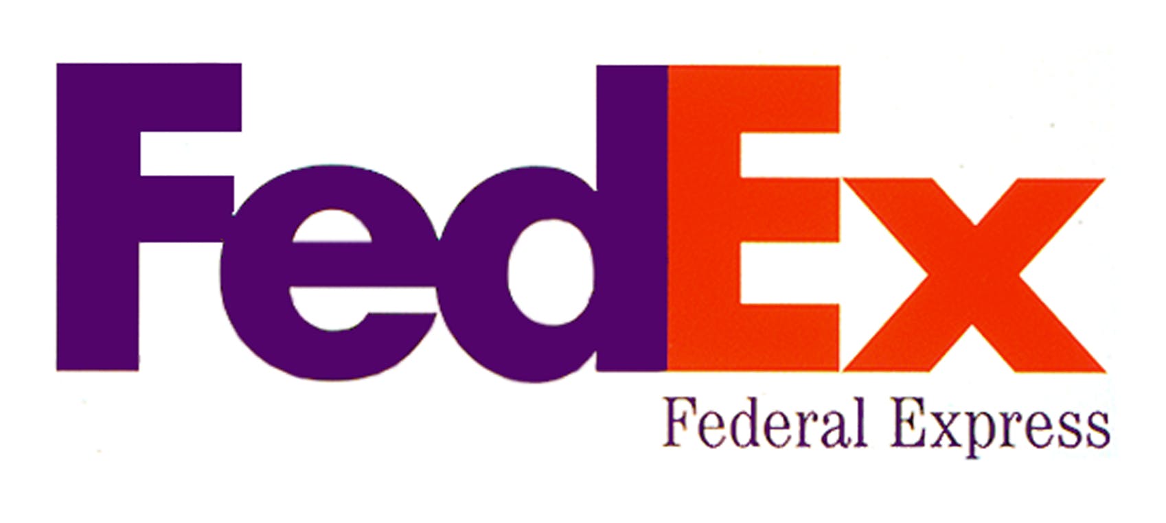
Designed by Landor Associates in 1994, the FedEx logo might appear simple, boring even, to the casual observer. But once you have spotted the forward-facing arrow created by the negative space between the ‘E’ and the ‘x’, it is impossible not to think “that’s clever”.

The logo’s designer, Lindon Leader, had to create unique letterforms to make the logo and apparently a blend of Univers 67 (Bold Condensed) and Futura Bold provided the starting point.
“Neither [typeface] was particularly suited to forcing an arrow into its assigned parking place without torturing the beautifully crafted letterforms of the respective faces,” Leader told TheSneeze.com blog in 2004. “I took the best characteristics of both and combined them into unique and proprietary letterforms that included both ligatures and a higher x-height.”
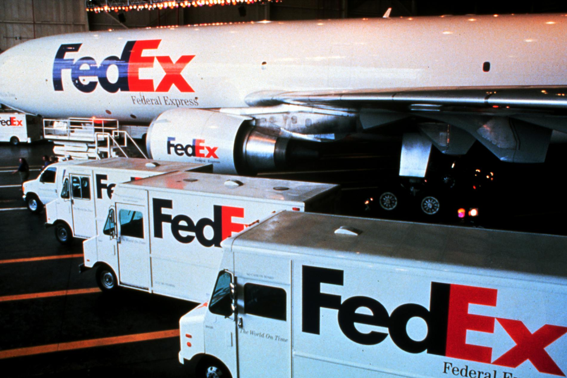

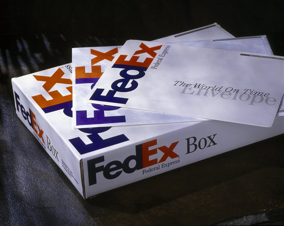
Images courtesy Landor Associates
-
Post a comment
Latest from CR


