A fresh look at Rugby
Rugby is a new magazine about, yes, rugby, from the team at content agency Eric. Creative Director Simon Campbell talks us through the magazine’s design and how it’s trying to approach the sport differently
 What is the magazine’s intended audience and how does it seek to be different to most sports titles?
There seems to be a huge gap in sports magazines in general, they’re either very commercial and full of small bite-sized content that, arguably, you may be able to find better on the web. Or they’re over-stylized and completely style over substance so while they often look beautiful they lack the editorial to back it up. There are a few exceptions but we really wanted a platform to tell stories in the truest form – big intros, long reads in a quality journal format.
How/where were you trying to position it? And why rugby?
We want to it to be for the rugby fans who love the sport beyond the Six Nations and Rugby World Cup and wanted to spend a Sunday afternoon reading editorial with unique insight and depth – and perhaps be willing to pay a little bit more for a premium title. It’s about the game at all levels and uncovering the great stories within the game, we wanted to tell them in a way that would engage the non-rugby fans too. The key part of the editorial process was having several non-rugby fans read the articles to see if they enjoyed them.
Why rugby? From a digital perspective, we work with a lot of brands that either have a direct connection to the sport or like to be assosicated via sponsorship, so it made sense. Plus we love the game and feel it’s massively under represented in the print world.
Are there other titles that you used as a reference point – not necessarily in terms of the look, but more the values and spirit of the title?
The football fanzine magazine When Saturday Comes is a long-term favourite, the design is non-fussy and the print stock couldn’t be more authentic, but they have some great grassroots pics and it’s all about the stories and they get some good writers along for the journey too.
From a design point of few, when I was describing Rugby to people I would say it was Kinfolk but for sport. By that I meant the ethos of stylish, thought-out design and great typography. Other magazines such as Port, Fantastic Man and Wax were also points of reference. As well as their design it was also the way they treated their subject matter. They all come from a point of expertise and display their content with authority and style. I wanted to do the same with Rugby.
How does that translate in terms of the writing and the way you approach the subject?
We make everything about the people, clubs and countries we’re writing about. This isn’t about us in any way, it’s not about our opinion, it’s about telling their stories in the most entertaining, colourful and authentic way. The beauty of long-form editorial is you can really set a scene and get proper insight into people and places. We also had the luxury of being able to say when we thought a story was either too long or too short, we gave every story the space it warranted – some proved far more interesting so got more pages, others were cut back.
And how does that translate into the design? Can you talk us through the type choices?
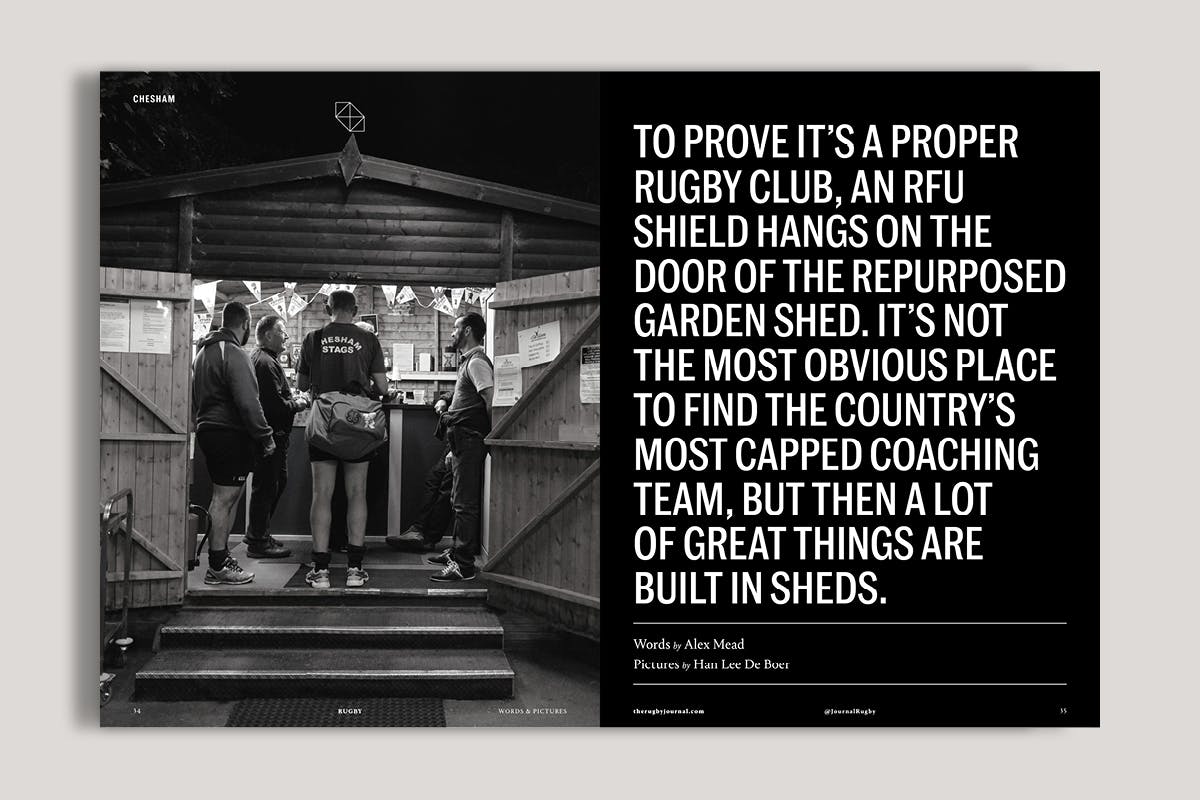
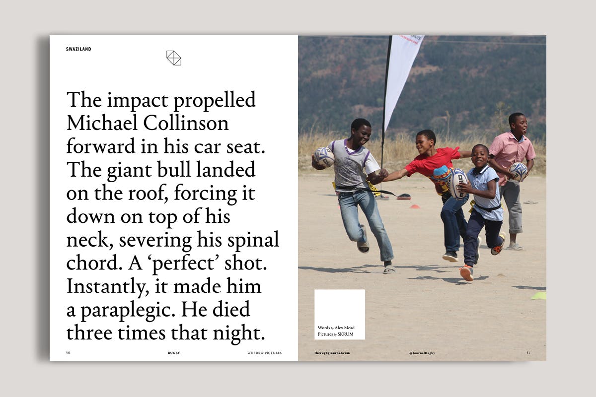
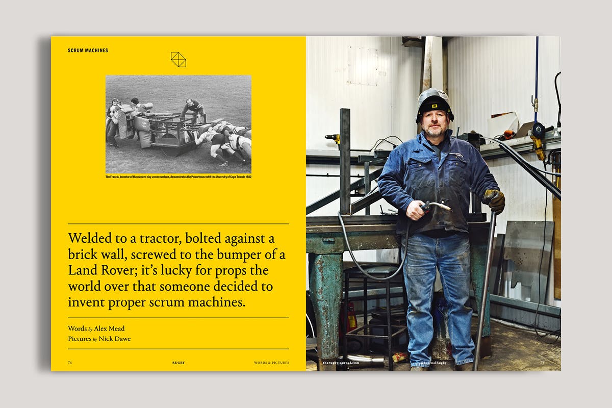
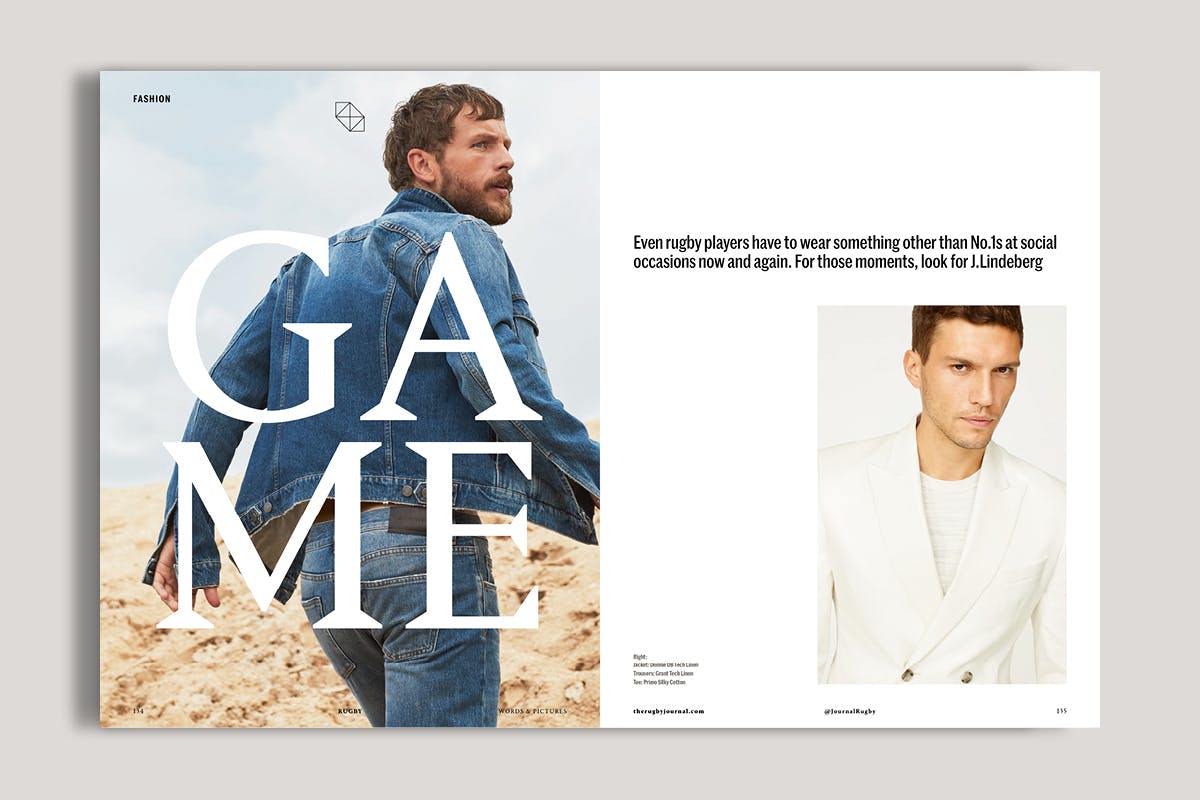
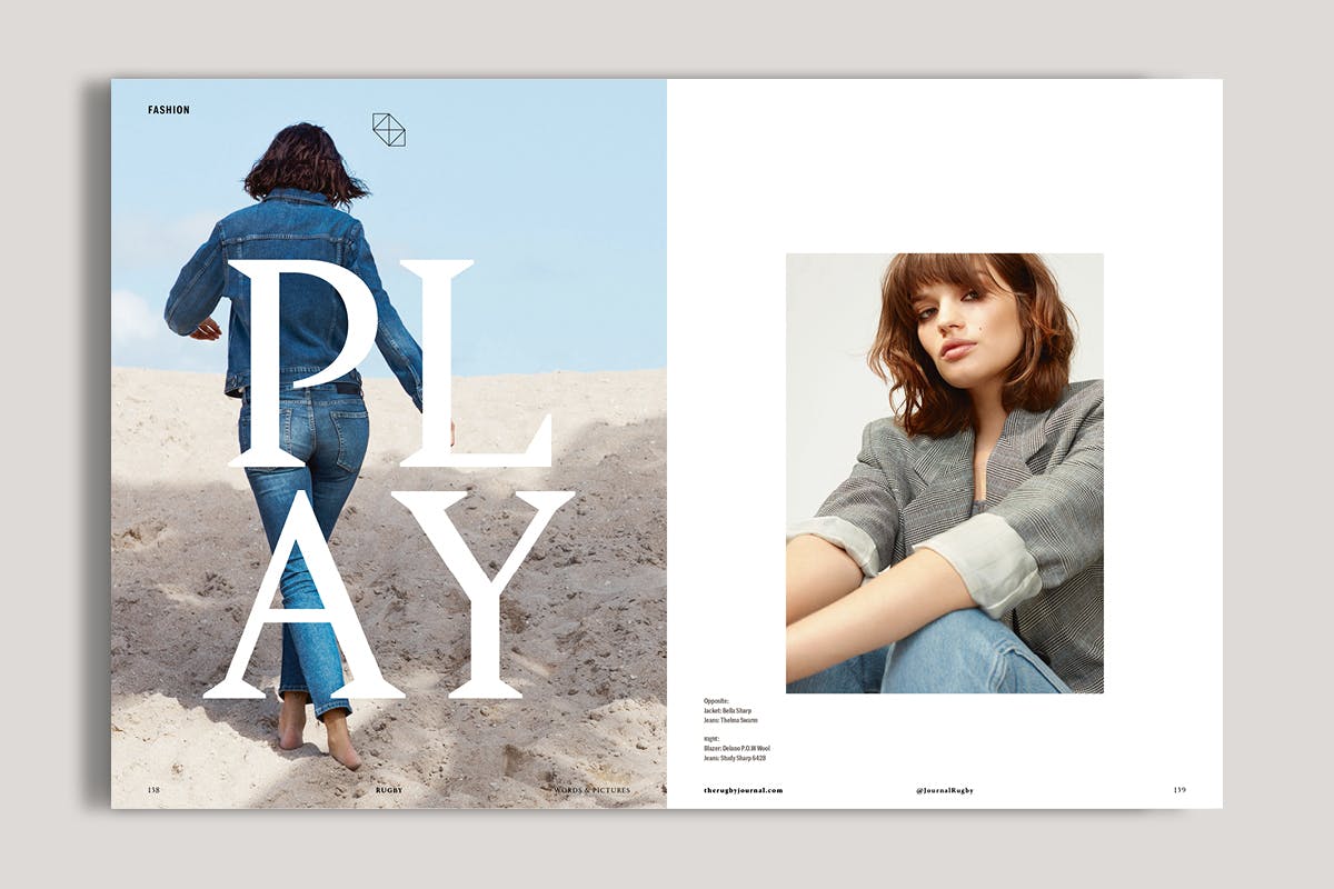
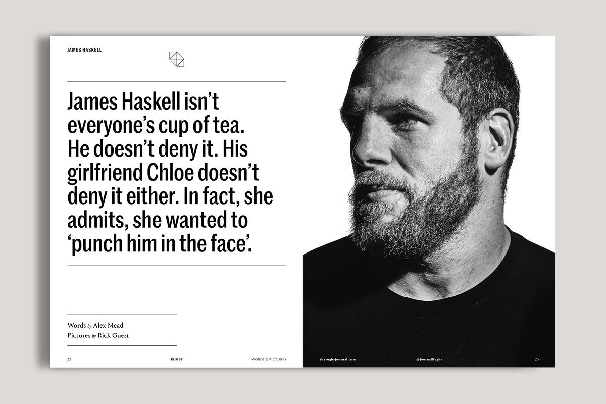
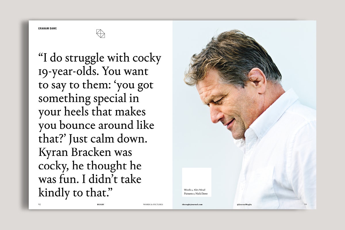
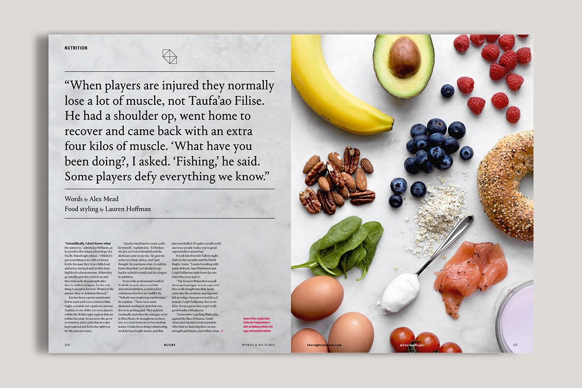
Typography is very important to any magazine, as important as the masthead or logo, and is often overlooked in today’s design landscape. I’ve used two fonts from Commercial Type, Marr Sans and Portrait. I wanted both the serif and sans serif to compliment each other as we flip between the two throughout the magazine. We’ve used big, bold statements to start each feature instead of traditional headings and sells. Words and pictures get equal measure in Rugby, so we wanted the words to stand out as much as the image. The average point size for our opening statements is 60pt so it was very important to have fonts that look great when displayed big. Marr Sans in its medium weight looks fantastic on the page.
What about photography – how are you trying to differentiate the magazine in terms of the images used?
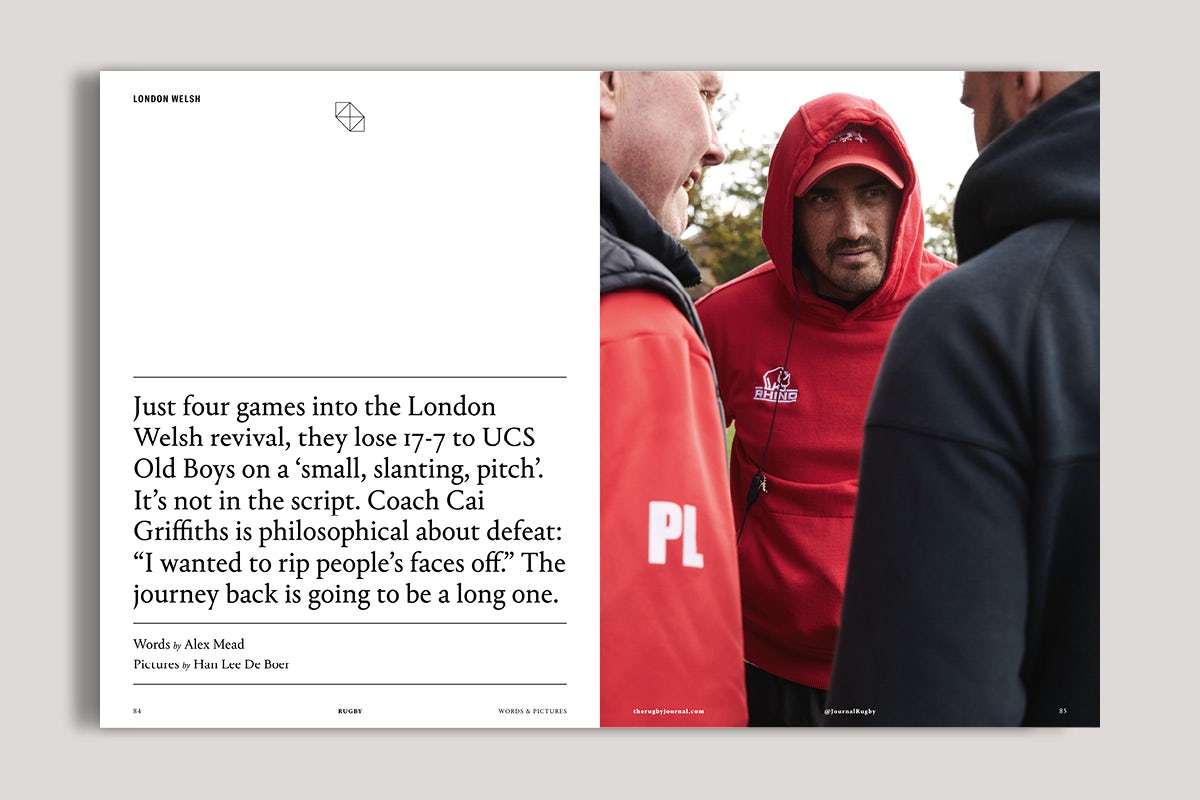
Our whole approach to this project has been to do something different. That’s true of the photography as well. We haven’t gone to traditional sports photographers. My background over recent years has been in fashion and portrait photography, art directing numerous shoots with some very talented photographers. I wanted to bring that style to Rugby. I think that’s what gives Rugby part of its unique look, the images have a slightly different focus to them. You can see that in all of our features. Most of our photographers have confessed to knowing very little about rugby. Our briefs are very open, I’m more interested in seeing the photographers point of view as opposed to us giving them a very tight, rugby-focused brief. That makes it interesting for everyone.
How did you put the team of contributors and designers together – are they all staff at the agency?
We wrote 90% of it in-house, partly because we wanted to showcase our own writing skills, partly because we had such a distinct style we were aiming for it was easier than spending ages editing other people’s work. Budget was the third factor. Design and art direction was all in-house, likewise sub-editing etc too. Some images were inhouse but the majority were external due to wanting to get the variety and styles the stories required.
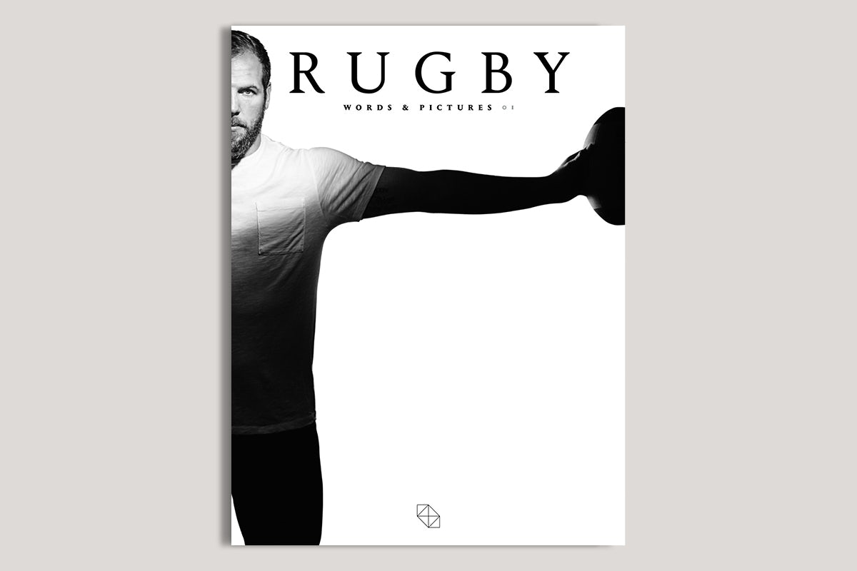
The contributors are mostly people we have known and worked with for years. Or people that we’ve wanted to work with but have never quite had the right vehicle or budget. Rugby has let us transcend those barriers. I’ve admired Rick Guest’s work for years and it was a pleasure to work with him on Rugby. He shot James Haskell for our cover. We worked on a concept together and the results are a stunning set of images. We met in a pub car park near Haskell’s house and two hours later had the shoot in the bag. Sometimes it just works.
How does Rugby relate to or help with the rest of what you do at Eric – was it conceived as a piece of self-promotion? Do you want it to express certain values about what Eric does so that it will help position the business?
Although we’re a comparatively new agency, we’ve done a lot of content work in digital platforms and while some of this had a print aspect (for instance our Crabtree & Evelyn campaign included recipe cards), we really wanted to produce something that would showcase our creativity in a way potential clients could literally feel – too many emails to prospects get ignored amid the spam when you’re starting, but something beautiful, premium and weighty that arrives in the post always gets a second look. Even non-rugby fans will appreciate the quality of Rugby.
For the future, how do you hope Rugby will progress? What plans do you have around frequency and the model for the magazine going forward?
We’ve been overwhelmed by the response, we literally couldn’t have made up the positive comments that we’ve had on social – ‘Monocle for rugby’ is a favourite. Presuming the advertisers follow up their interest, we’re looking at quarterly model, but perhaps building a bit of an online presence too through our social channels on Instagram (@therugbyjournal), Twitter (@journalrugby) and Facebook (@journalrugby) and also our hub therugbyjournal.com with some additional content.
