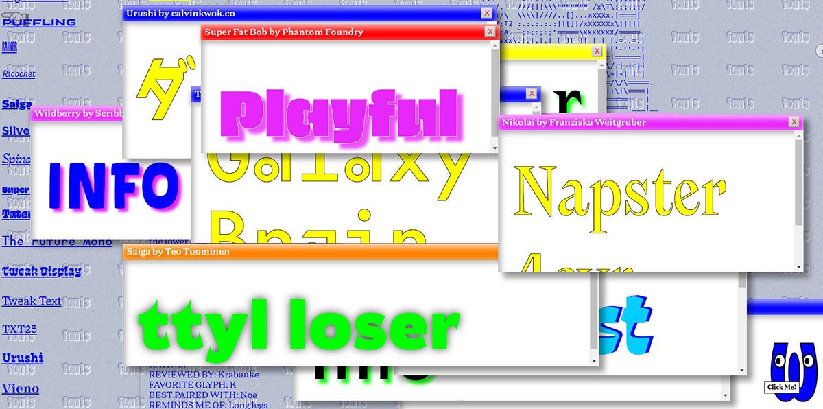
Is this the future of type specimens?
Future Fonts is celebrating a year of releases with a jazzy take on the usually staid type specimen – imbued with a healthy dose of design nostalgia

The foundry describes the specimen as “an exploration of type culture”, and an attempt to explore overlooked parts of type design history. It’s divided into three main modules, which make cheerful use of colour, imagery, and scrolling letters.
The whole thing is enjoyably bizarre, particularly the Hyperfood module, which feels like a journey into a surreal digital supermarket. Floating ‘sale’ and ‘buy now’ messages appear over cut-out photos of food, surrounded by spiky clipart-style halos. Hyperweb is also notable for its deft use of a 90s-era web aesthetic – the same tactic that sent Marvel’s Captain Marvel site viral.


The site, which was designed by Portland studio Fisk, is undoubtedly bonkers, but it’s interesting to see such an unconventional take on the type specimen.
It ties into Future Fonts’ mission, which is to offer experimental and in-progress typefaces that haven’t yet hit the wider type market. Buyers enjoy lower prices – although these go up over time as designers create new versions – and also support and encourage creators to finish typefaces. In its first year, the foundry has added 70 fonts to its catalogue, contributed from 40 foundries across 22 countries.


