
McDonald’s reimagines its logo for our new Covid-19 reality
The fast food chain is leading by example by separating the two halves of its famous Golden Arches to comply with the current social distancing guidance, in a new social campaign created by Brazilian agency DPZ&T
McDonald’s isn’t afraid to use the power of minimalism to its advantage in its advertising. A recent campaign saw the fast food giant coopt its Golden Arches as a way of directing hungry motorists to its nearest outlet, while in another stunt it used nothing but a bit of clever typography to recreate some of its best known dishes.
As the world tries to get to grips with life during the coronavirus pandemic, McDonald’s Brazil has put its Golden Arches to good use again in a new campaign aimed at encouraging social distancing.
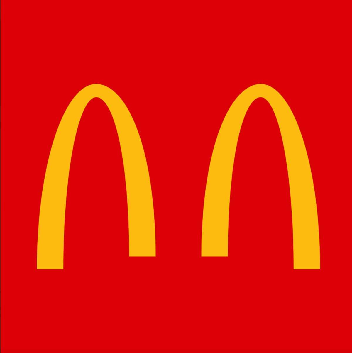
Created by Brazilian agency DPZ&T and running across McDonald’s’ social channels, the stunt sees it split its instantly recognisable logo in two. It comes as the fast food giant is promoting its delivery and drive-in services in Brazil, while it has decided to completely shut all of its branches in the UK.
McDonald’s isn’t the only big brand responding to the new reality of coronavirus in its branding. Coca-Cola launched a campaign in the normally notoriously busy Times Square also encouraging social distancing, Time Out has temporarily changed its name to Time In, and Latin America’s largest ecommerce platform, Mercado Libre, even swapped out its longtime logo of two people shaking hands for the newly certified elbow bump greeting.
Latest from CR


