
Meet the Canadian brands redesigning cannabis use
Umbrella brand HIKU brings together a set of Canadian companies using design to reset people’s perceptions of cannabis use. CR finds out why it’s leaving behind hackneyed leaf logos to create a more sophisticated visual language
As the second country in the world to legalise marijuana, Canada is home to a burgeoning group of brands keen to convert cannabis into a household product – albeit one with more excitement than, say, packets of cereal or boxes of tea. HIKU, which encompasses a group of Canadian cannabis companies, is one brand putting creativity at the forefront of its efforts, using design to combat the stigma that still surrounds the drug.
Included in its portfolio is retail brand Tokyo Smoke, which has shops across Toronto selling coffee, sweets, and smoking accessories. Its stores – described as “reinventions of the classic coffee shop” – have won multiple awards for their interior design. They range from converted warehouses with bare bricks and poured concrete floors, to minimal, monochromatic spaces, which are all intended to use design as an icebreaker. For those feeling nervous about going into a Tokyo Smoke shop, the idea is that its interiors offer a welcoming, and familiar environment before anything else.


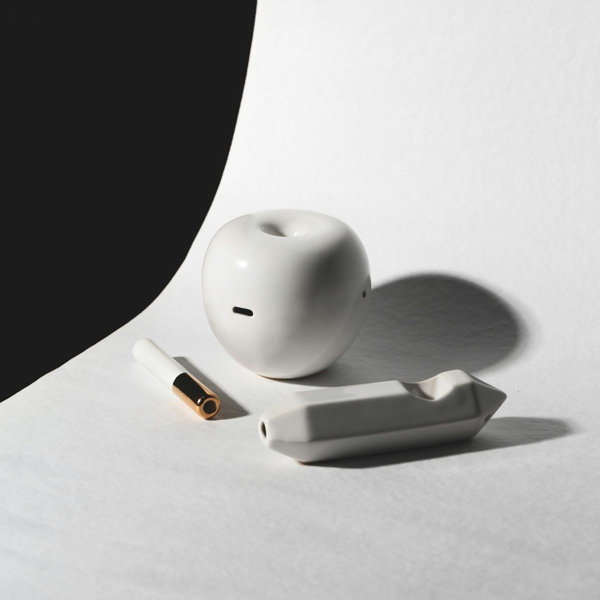
HIKU’s brands are also reinventing the accessories that go with smoking, designing products that don’t need to be hidden away. Van Der Pop sells accessories aimed at women smokers, while Maitri offers a collection of minimal wood-and-ceramic pipes and trays that wouldn’t feel out of place on a coffee table.
“I don’t think it was wanting to get away from a visual stereotype, so much as it was wanting to establish our own,” says Josh Lyon, Partner & VP Marketing & Partnerships at HIKU. “As a design-first brand we felt it was important to build our own look and feel. To break down stereotypes and encourage engagement with our brand, you have to speak the same language as your community – which is heavily design driven. The best way for us to introduce, or reintroduce, cannabis to them was to do so in a manner that immediately felt familiar and in line with their aesthetic.”


For HIKU, design is a way to create products and stories that people want to talk about – facilitating conversation that, previously, might not have taken place. It’s these kinds of open discussions, happening alongside education, that it believes will combat the stigma around cannabis use. But starting this dialogue means going beyond predictable visual motifs.
“In the cannabis space, naturally, many will incorporate the leaf,” says Lyon. “When you think about audience, you have a lot of people who are strongly familiar with the plant and would be completely drawn to versions of that. For many new to cannabis, or returning after time way, potentially they need different visual cues to draw them in.”
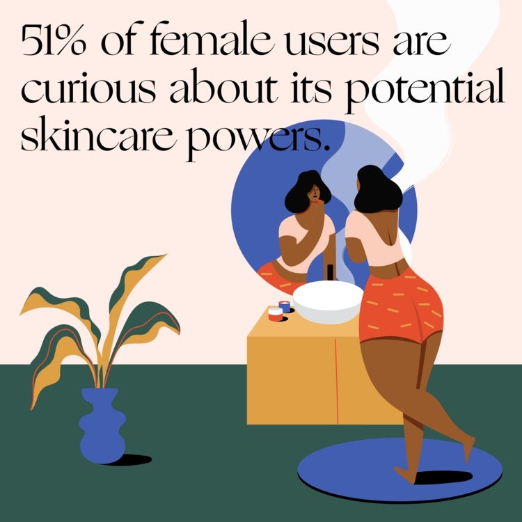
Lyon emphasises that their work has to go beyond the purely aesthetic, with many of its brands using one-to-one storytelling to engage people. It’s something Van der Pop does through its Women and Weed speakers series, as well as its website – which tackles concerns around the perception of women smokers, and offers advice one everything from cannabis-related skincare to how to use a grinder.

However despite changing laws, HIKU faces a challenging task. “Canada is about to become the first G20 country to legalise recreational cannabis,” Lyon told CR. “That also means there is no blueprint for how the legal industry should be built. As a brand we’re continually trying to keep up with the evolving regulations, from where and how companies are allowed to sell, to how we’re allowed to market. The current reality of the industry is that the restrictive regulation ensure that clear, informative and engaging communication is difficult at best.
It’s clearly a landscape that’s changing rapidly, particularly with the prospect of more countries introducing legalisation for both medicinal and recreational use. As more brands spring up to take advantage of this, it’s obvious that clever design and branding will be essential to standing out. “When we see that legal cannabis is the norm, versus the exception, we’ll be in a place where it can be looked at alongside other major household brands,” says Lyon. “You don’t generally see household brands for product segments that aren’t widely legal.”
Latest from CR


