MTV logo changes, stays same
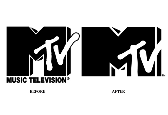
After 29 years, MTV unveils a logo ‘refresh’ – like many of its viewers, the network has become a little wider and a little fatter
 After 29 years, MTV unveils a logo ‘refresh’ – like many of its viewers, the network has become a little wider and a little fatter
There’s nothing terribly revolutionary about MTV’s new logo – described aptly by the network as a ‘refresh’ rather than a redesign. But what it does do differently is join the ever-growing ranks of the ‘logo-as-receptacle-for-imagery’ crowd.
The wider, more rectilinear space within MTV’s new mark (which was created in-house) is tailor-made for housing images from its output, as shown here.
![]() It’s a trend that appears to be gaining more and more traction with identity designers and their clients. Wolff Olins has led the way, with identity projects for the London Olympics
It’s a trend that appears to be gaining more and more traction with identity designers and their clients. Wolff Olins has led the way, with identity projects for the London Olympics

New York’s tourism and marketing body, NYC & Company

And, more recently, AOL (sorry, Aol.) although, in this case, the mark sits on top of the imagery

But we have also seen it used by Pentagram for the Museum of Art and Design in New York

And, given a graphic, rather than photographic, application by Landor for the City of Melbourne

In a way, however, MTV can claim to have started the whole ‘flexible identity’ thing. When the original logo was created by Manhattan Design in 1981, no corporate colour guidelines were given. Instead (as one of the designers Frank Olinsky explains, here) both the colour and the materials in which the logo was rendered would be changed with each application, making it as supposedly eclectic as the music played on the channel.
As a result, the MTV logo appeared in a myriad of forms – everything from fur to frozen ice, dripping paint to dripping blood.
The difference these days, reflecting the new realities of the channel, is that the space in the new logo will be used more to push its programming and its endless procession of reality TV micro-celebrities than as a canvas for artists, and animators as it once was. Perhaps as further recognition of its changed positioning, it has also dropped the words ‘music television’.
Latest from CR


