Multistorey’s maximal new look for London store Koibird
London- and Stockholm-based agency Multistorey has created the branding for Koibird, billed as a store that sells “an exotic, beautiful and ornamental travel wardrobe” for women

Opening last year in London’s Marylebone Lane, the shop “goes through a metamorphosis twice a year”, says Multistorey cofounder Harry Woodrow, when each season takes a new theme or destination. This means that the entire store’s exterior, interior, branding and packaging are completely reworked.
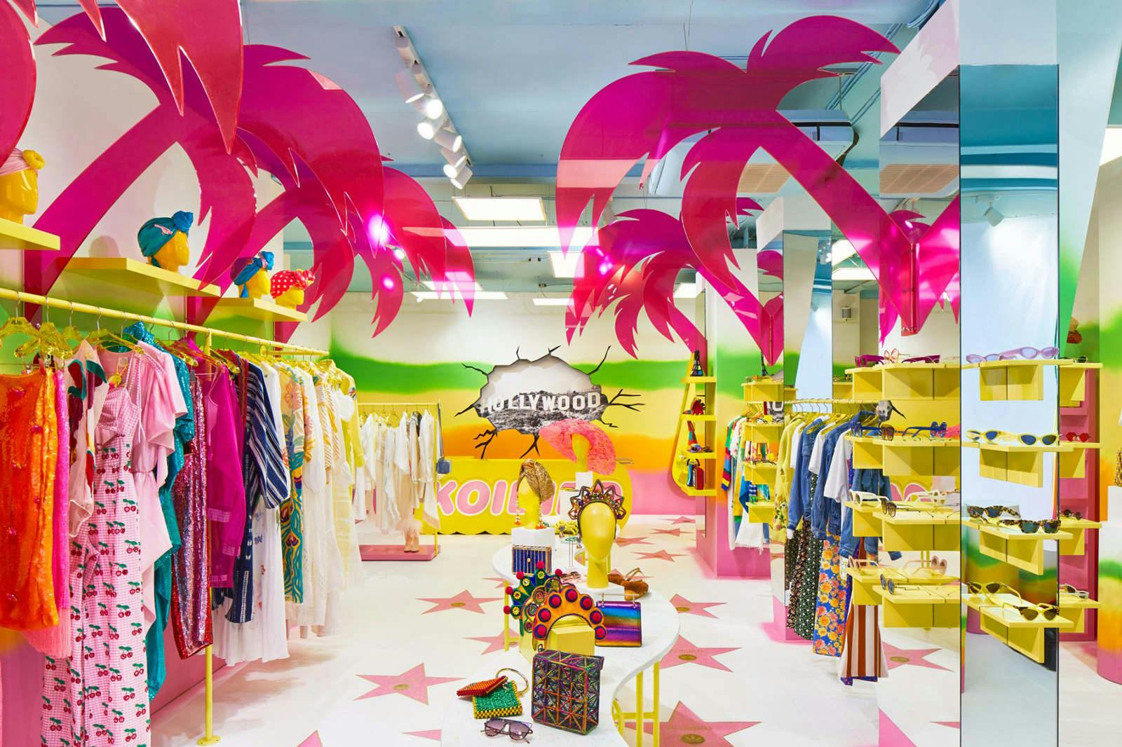
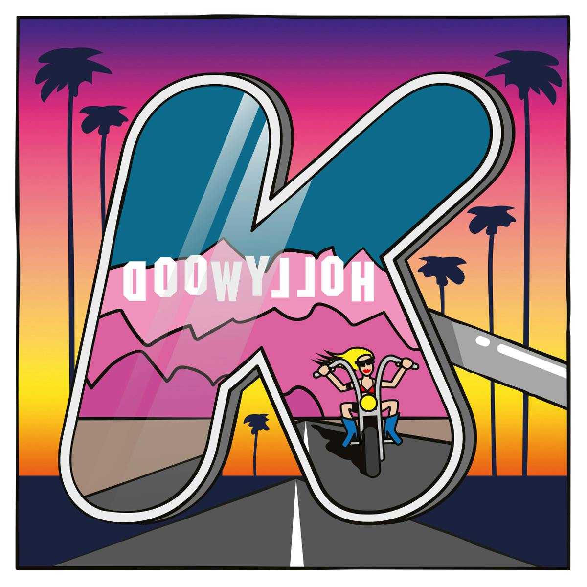
Multistorey’s approach for the Spring/Summer 2019 season, which is themed around the destination California, was to use bold, bright colours and an illustration-heavy aesthetic.

“I’ve had loads of fun creating this season’s very unsubtle illustration-based visual identity,” says Woodrow. “The only graphic constant between seasons is the bold, rounded logotype, but we could reinterpret it as we saw fit.” The logo is used alongside the secondary typeface VAG Rounded.
The agency got involved in the project having been introduced by spatial designer Anna Burns, who created the first three physical incarnations of Koibird. Multistorey had previously worked with her on the identity designs for her interiors label, and designed a book for her brand.
Multistorey tells us the brief for the project was “very loose”, and that “from the start we wanted to take a very image-based path, using the letterforms as frames for, and elements of, illustrations.”
He adds: “We were shown Anna’s early ideas for the store’s interior design and through conversations with the store’s founder, Belma Gaudio, we got a lot of understanding into her tastes, motivations and aims.
“The most important thing was to capture a particular spirit of fearless adventure, fun and glamour. We’d seen and loved the previous Koibird iterations so had an idea of the level of riotousness that was possible.”
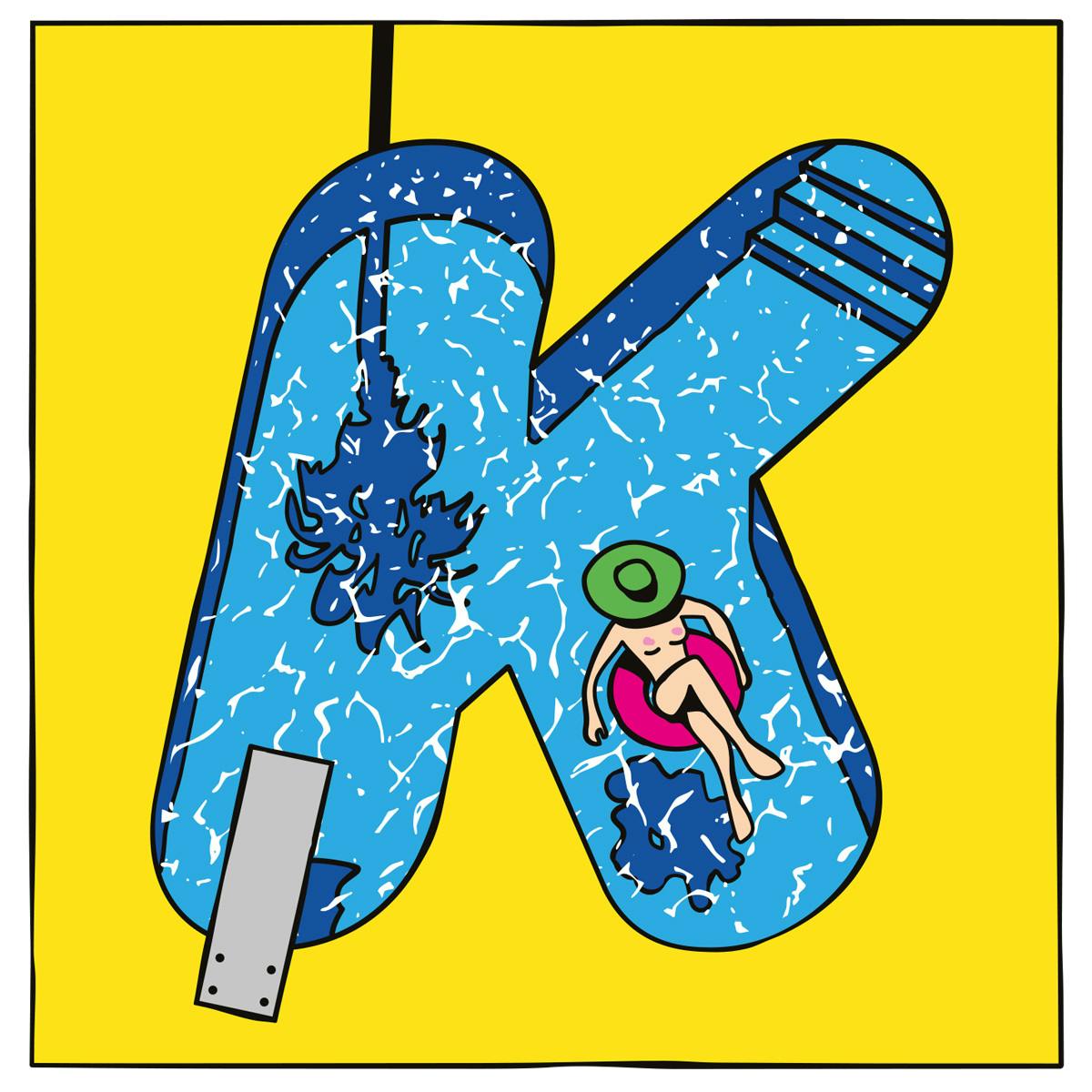
The new identity system for Koibird uses the letterforms as frames for, and elements within, illustrations of Californian scenes drawing on classic elements like beaches, palm trees, the Hollywood sign and the stars of Hollywood’s ‘Walk of Fame’, which appear across the flooring in the shop.
“So many images instantly come to mind when you hear the word California, and the interesting thing is that they don’t have to be particularly realistic or accurate: thanks to Hollywood, California exists in the global consciousness as so much more of an idea than an actual place,” Woodrow points out.
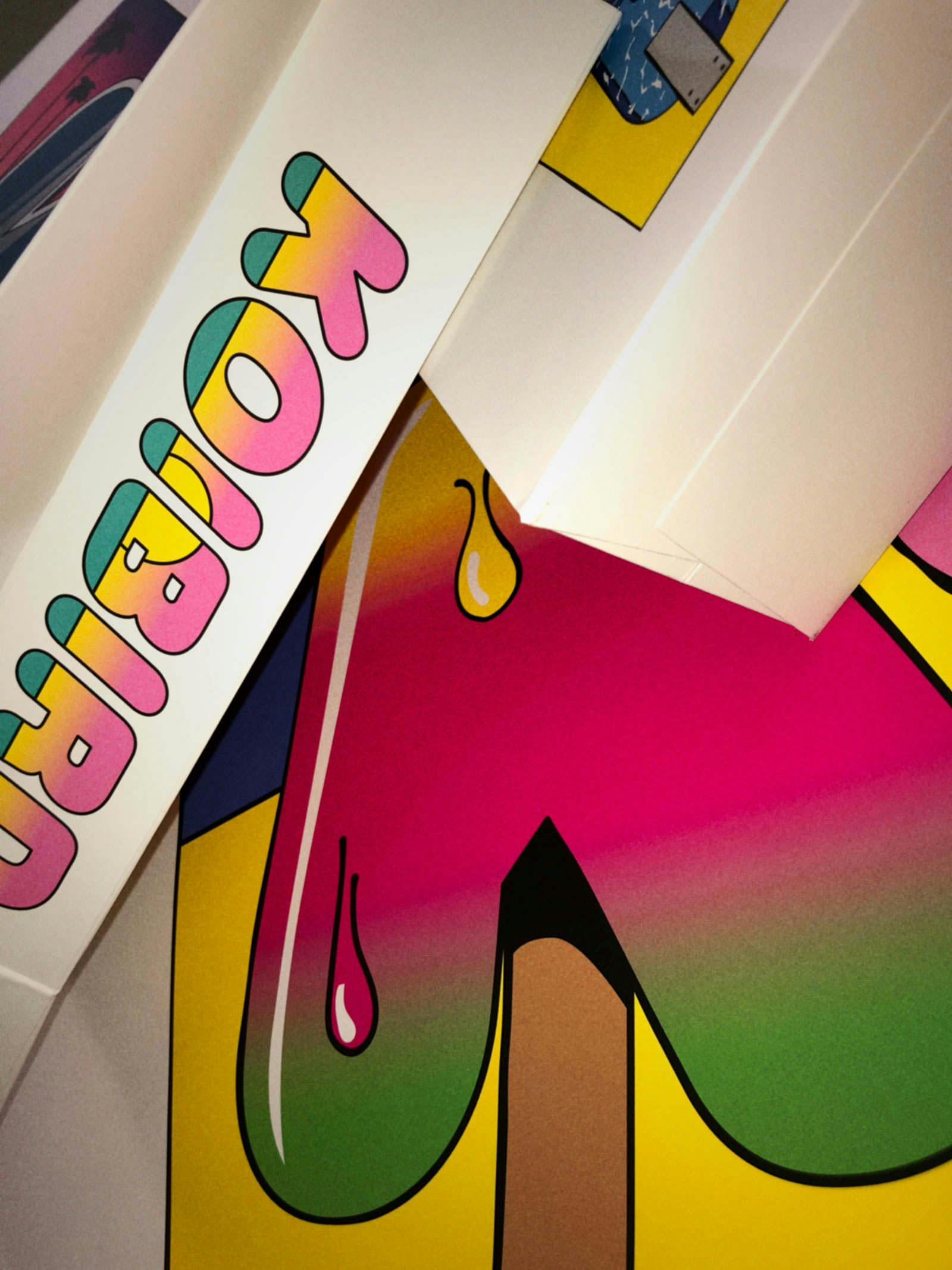

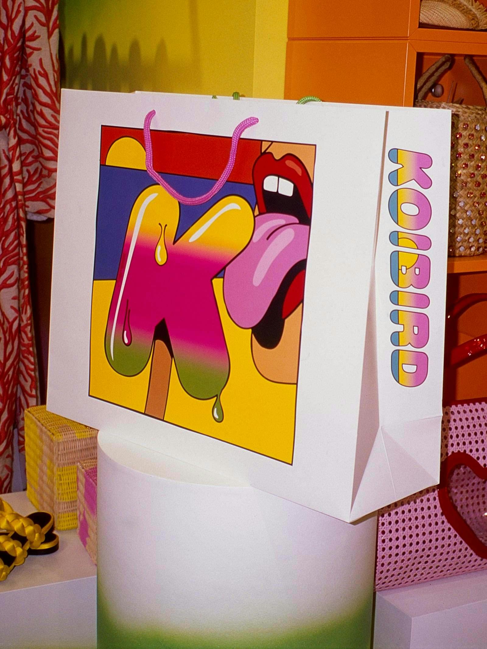
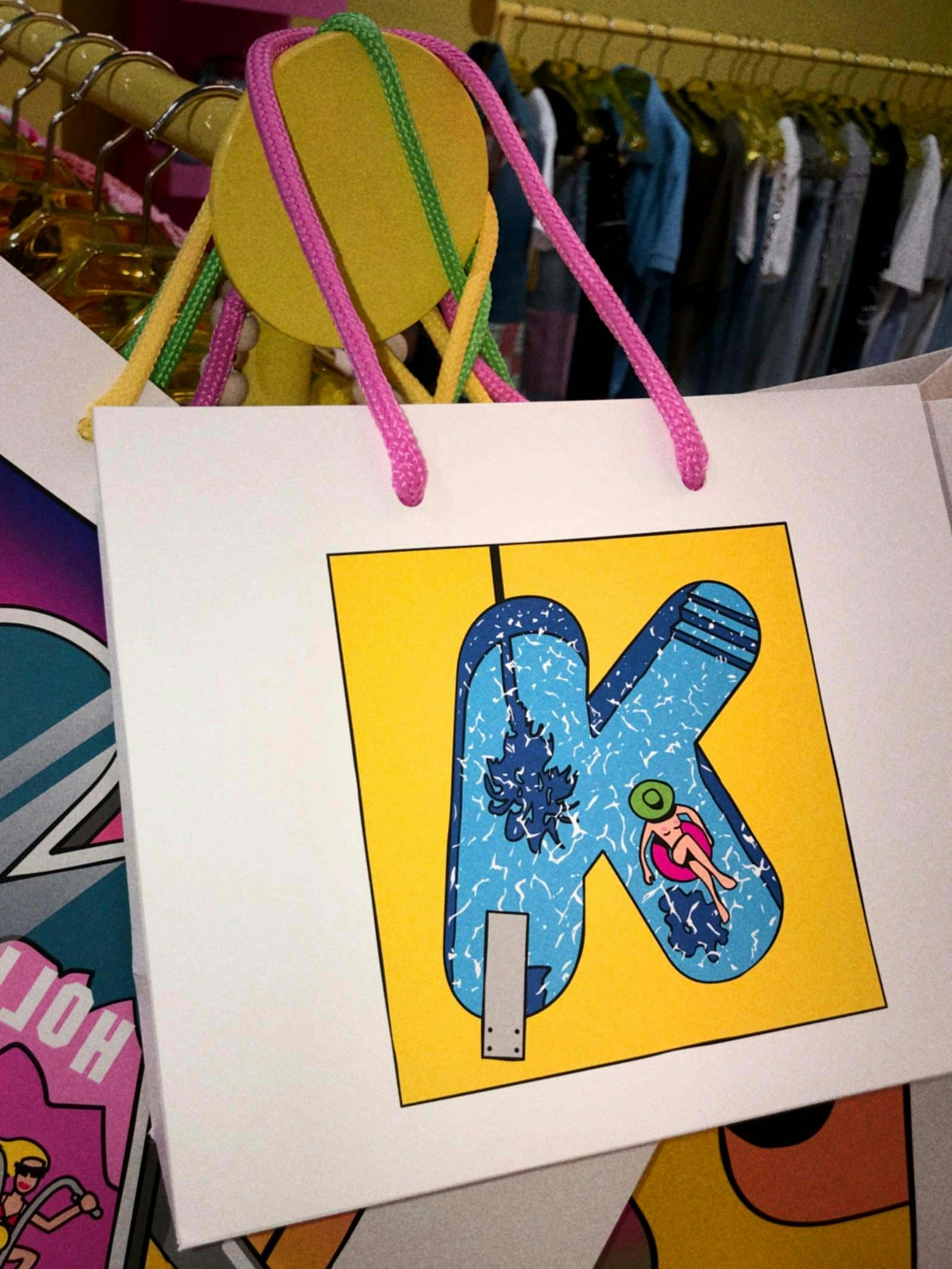
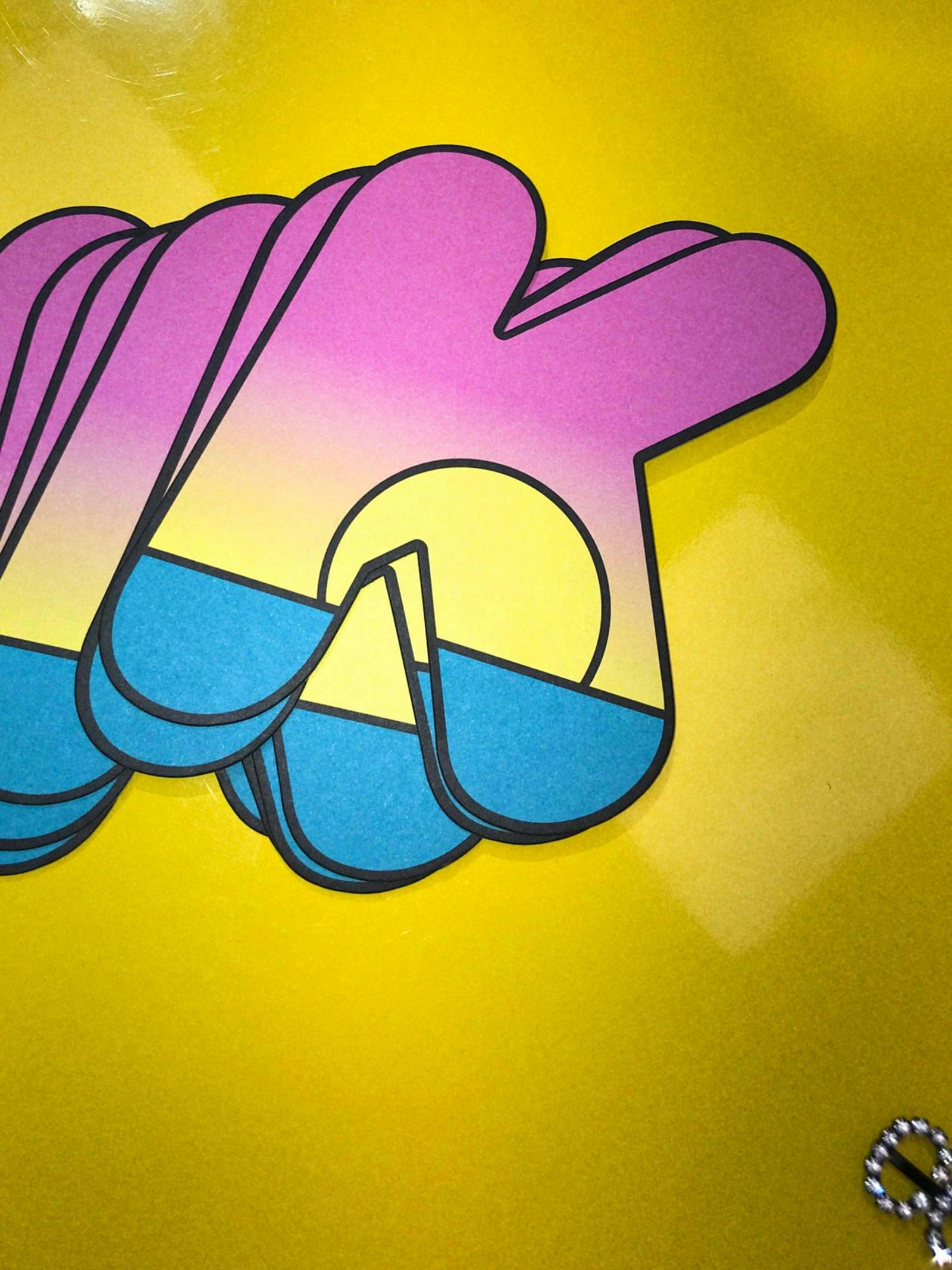
The new designs are used across all elements of store collateral including three sizes of bag, each featuring a different drawing.
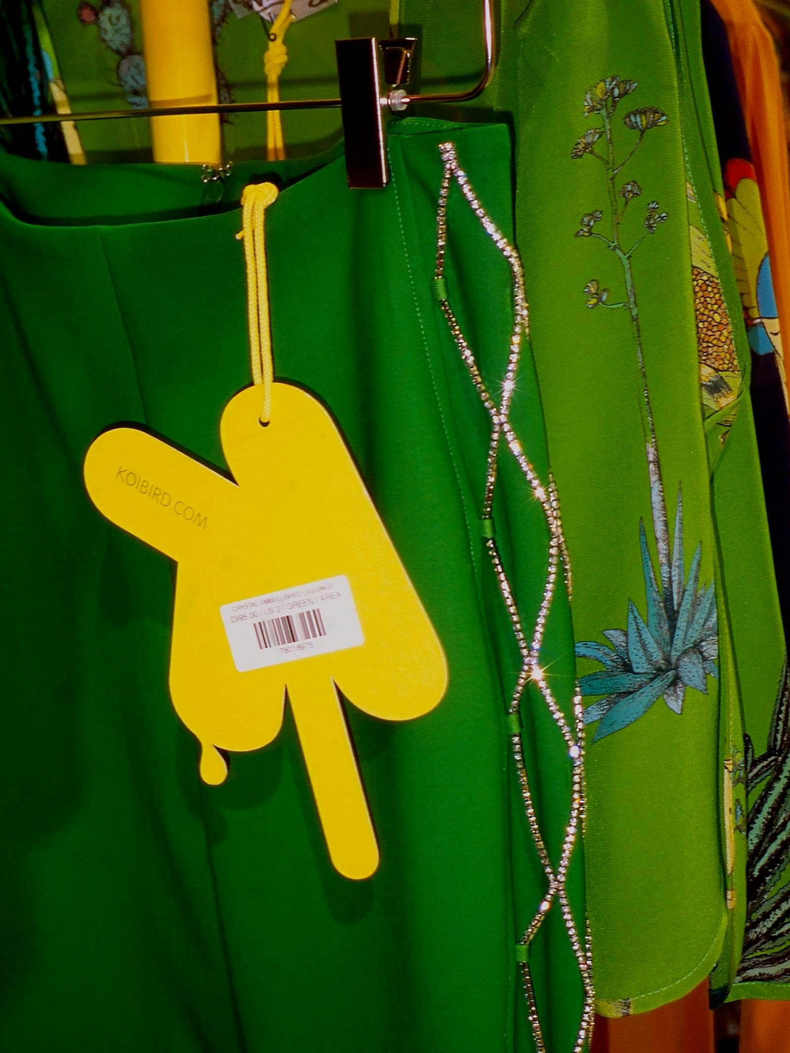
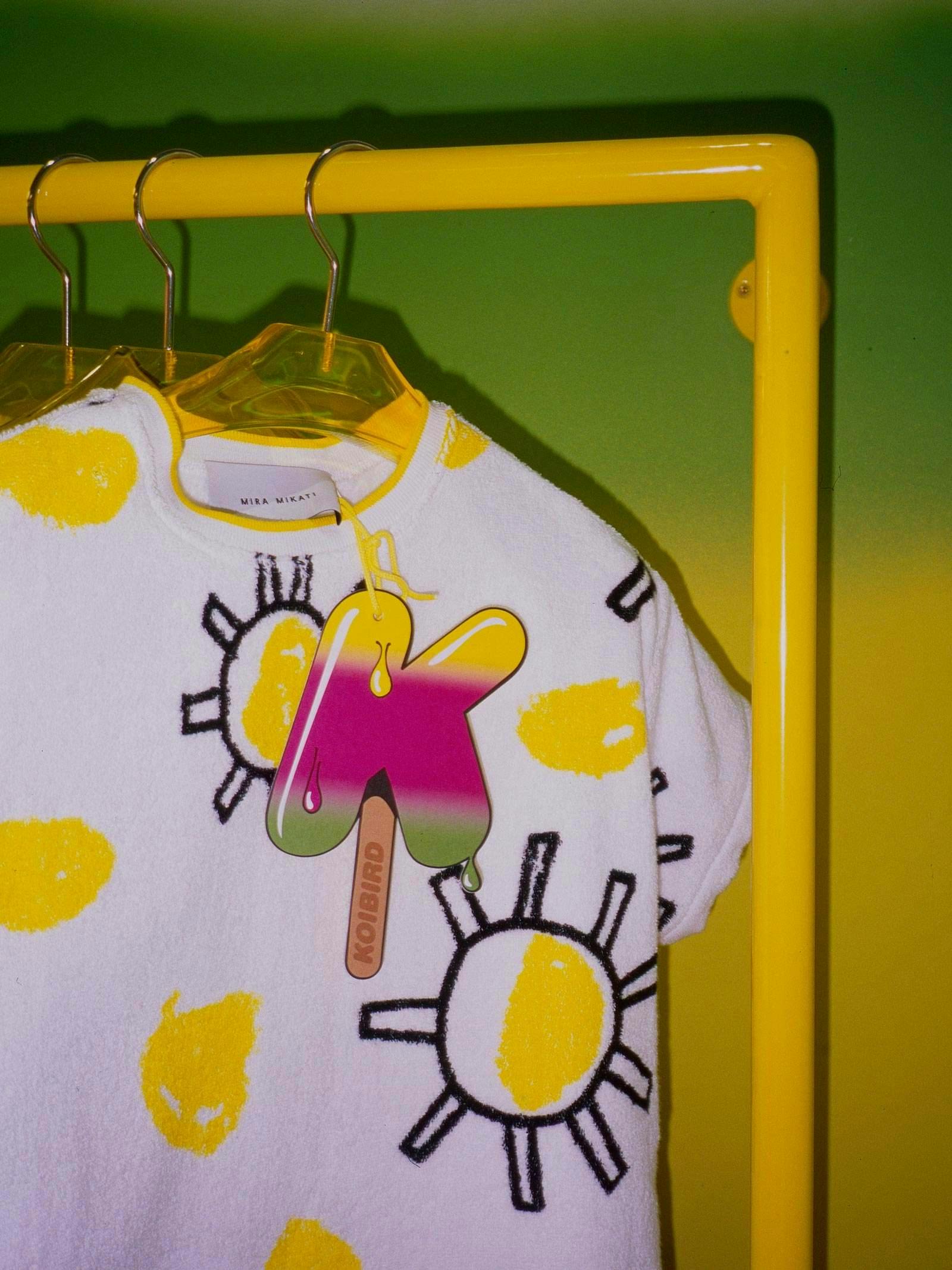
The drawings for the bags are also used across other collateral. Heavyweight, oversized swing-tags are in the shape of ice lollies, for instance; and the full Koibird logotype became a panoramic sunset over the Pacific Ocean.
Latest from CR


