A ‘P’ becomes a frame in Pallant House Gallery’s new branding
Studio Sutherl&’s identity for the Chichester arts venue sees the letter divided in two to create a framing device

Pallant House Gallery is home to modern British art. Its current programme includes an exhibition of urban landscapes, a retrospective of Surrealist painter Julian Trevelyan and a display of monochrome etchings by printmaker Norman Ackroyd.
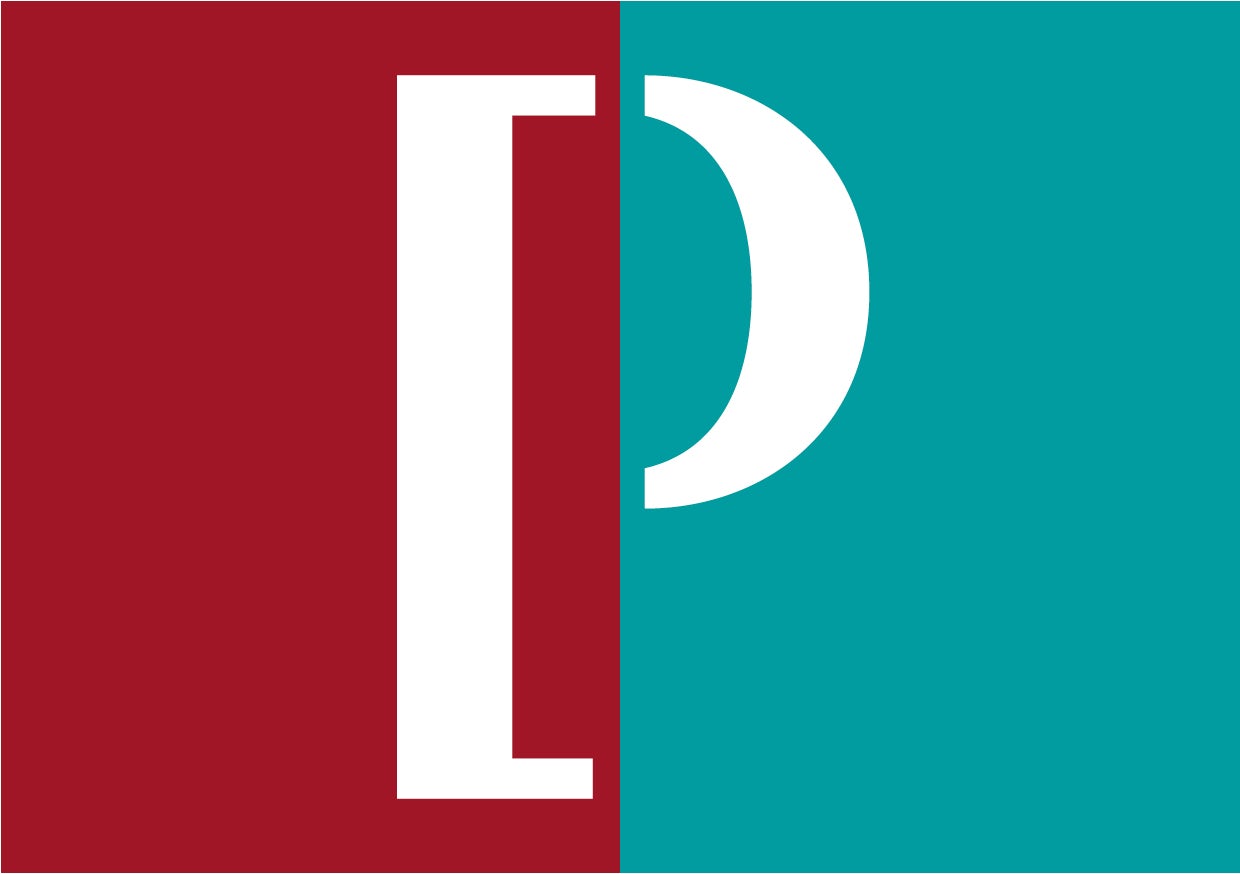
Studio Sutherl& recently worked with the gallery to create a new identity based around the letter ‘P’. The system sees the letter split into two brackets – one square, one curved – which are used to frame text and images.

The ‘P’ is used across the gallery’s communications, appearing on exhibition guides, posters and merchandise. Studio Sutherl& founder Jim Sutherland says the design is inspired by Pallant’s contrasting architecture (the gallery is made up of an 18th century townhouse and a modern extension), and the idea of Pallant House as “a collection of collections”.
“Many of the artworks in the gallery are donated as entire collections by patrons with a particular interest in modern art,” he explains.


“To reference the idea of a ‘collection of collections’ and to reflect the duality of the buildings, we combined a square and round bracket to create a ‘P’. In application, the brackets become a framing device, literally containing the works of art within the gallery, and to showcase workshops within the spaces.
“[In editorial use, the logo is echoed by using a straight bracket to open a sentence, and a round one to close it). This editorial idea used on artist dates on picture captions, job titles and posters – wherever we can to subtly reinforce the identity,” Sutherland continues.


Colours are based on key artworks in the collection: “Portland Grey is picked from The Estuary by Michael Andrews, Alizarin Red comes from China Dogs in a St Ives Window by Christopher Wood, Cobalt Turquoise comes from Thorn Head by Graham Sutherland and Cadmium Yellow from Patrick Caulfield’s Portrait of Juan Gris,” explains Sutherland.
Sutherland says the studio worked closely with the gallery’s in-house team to implement the design. The identity was launched to coincide with the start of the gallery’s latest exhibition season and Studio Sutherl& is currently working on a new signage system for Pallant House.
Latest from CR


