
Pentagram’s playful new identity for Fisher-Price
Created by Emily Oberman, the refreshed identity sits alongside a new brand strategy led by Wieden+Kennedy featuring the simple tagline: Let’s be kids
Founded in 1930 in New York, Fisher-Price’s toys have helped to define the childhoods of millions of kids over the last nine decades, bringing us classic toys including the Chatter Telephone and Little People play sets.
More recently, there has been much debate about the changing role of early childhood development and issues such as gendered toys. In light of this, the historic toymaker has unveiled a new identity that aims to help it be less prescriptive about the way we play.
Developed by Pentagram partner Emily Oberman, the refreshed identity coincides with a new brand strategy led by Wieden+Kennedy, which includes the mission statement “put the fun back into functional” and the “play back into playtime”. This is accompanied by a simple but effective new tagline: Let’s be kids.
The new identity centres on a simplified version of the brand’s historic red ‘awning’ mark, in which its four scalloped edges have been reduced to three. The logotype has been redrawn in all lowercase, with letterforms that are slightly more refined but still quirky. The hyphen between the names is now a semicircle, echoing the scalloped edge of the awning, as well as resembling a smile.
A more stripped back version of the awning, known as the flag tag, will be used everywhere from promotional photography, packaging or store displays to instantly flag a product as being Fisher-Price.
Working with type designer Jeremy Mickel, Oberman introduced a custom, semi sans serif typeface called Let’s Be Glyphs, which is partly inspired by the historic typeface Cheltenham, widely used in the toy maker’s early advertising and packaging.

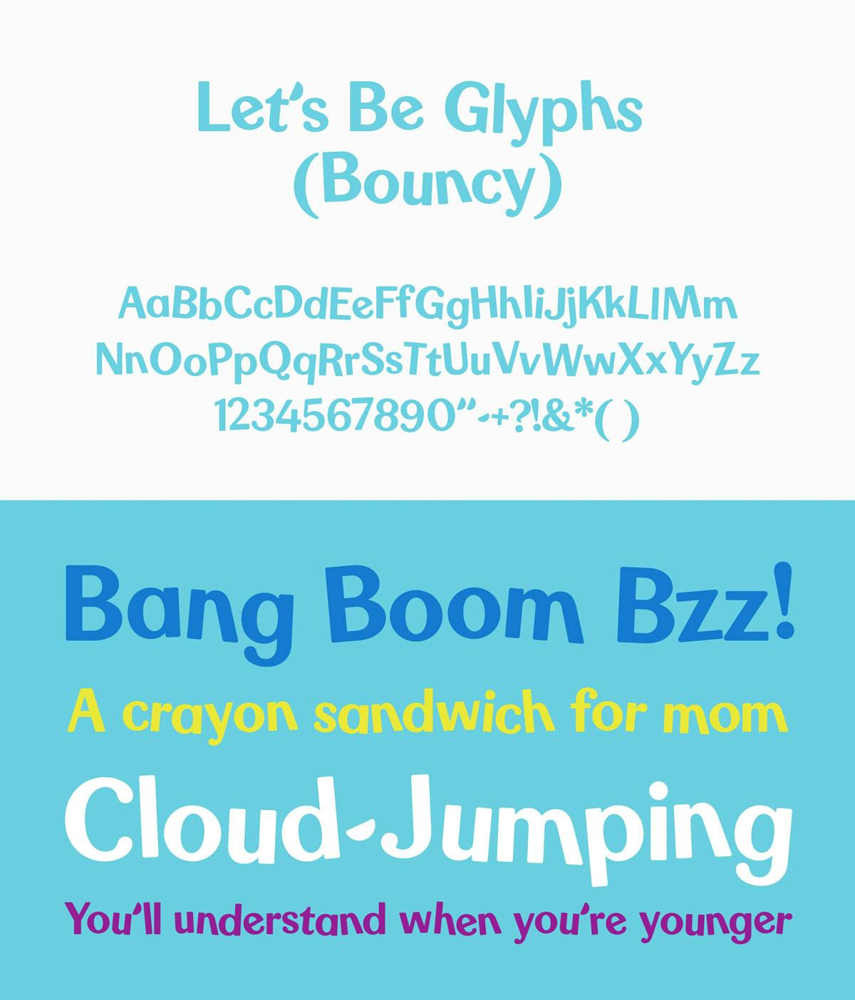
An alternative typeface has also been developed called Let’s Be Glyphs Bouncy, which features rotated characters and an uneven baseline, while sans serif font Maax will be used as a secondary typeface.
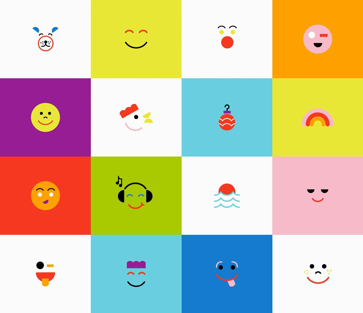
Oberman returned to Fisher-Price’s archive to create one of the refreshed identity’s other key features, Play-moji. The series of emoji-like illustrations is inspired by the faces seen on its classic Little People play sets, and cleverly transitions from cute illustrations for babies to more ‘grown up’ patterns for older kids.
Latest from CR


