Robot Food spices up Co-op’s own-brand beer
The branding agency has replaced “apologetic” drinks packaging with a set of typographically diverse blue, black and white labels.

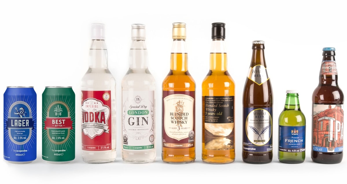
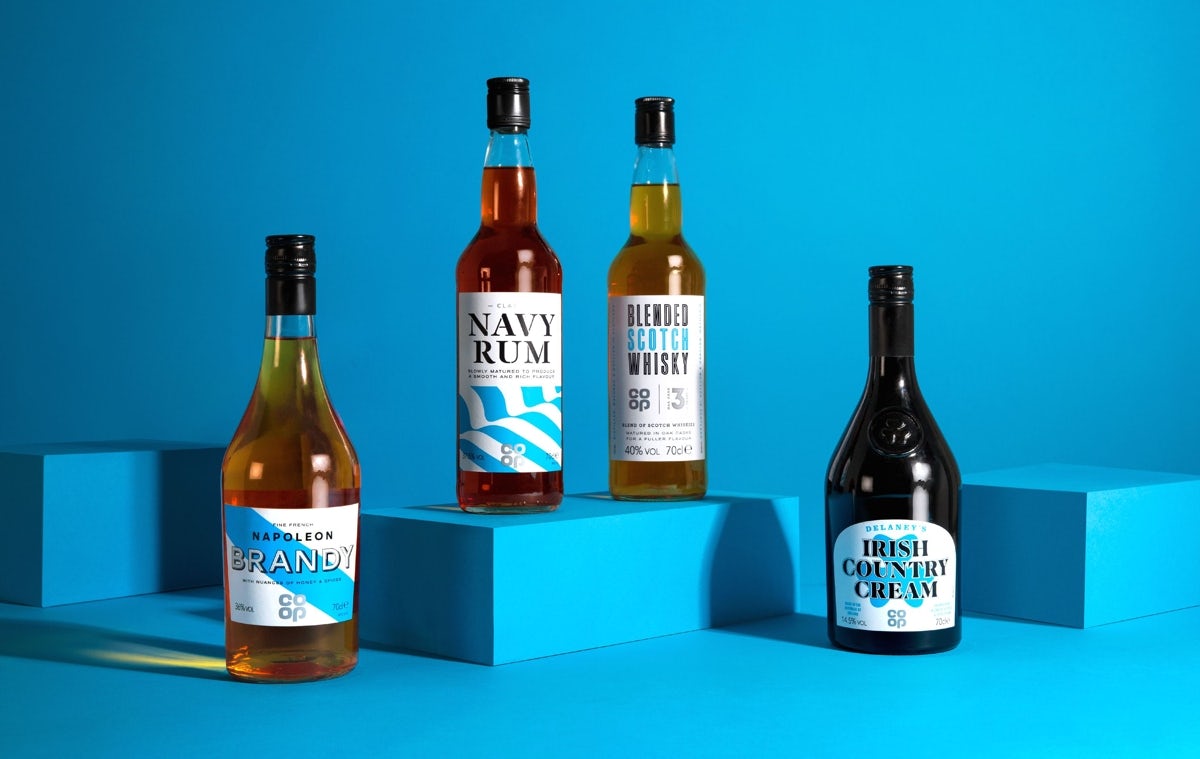
Co-op’s previous own-brand range of spirits and beers had featured generic imagery and motifs – including crossed stalks for wheat beer and the Tricolore for French imported lager – and lacked obvious and consistent branding. Robot Food has completely overhauled the packaging, creating a set of designs that work together as a group as well as standalone products.
Instead of concealing their own-brand status, Robot Food has created a palette that echoes the blue and white Co-op brand colours, stamping the logo on a prominent place on each bottle and can.


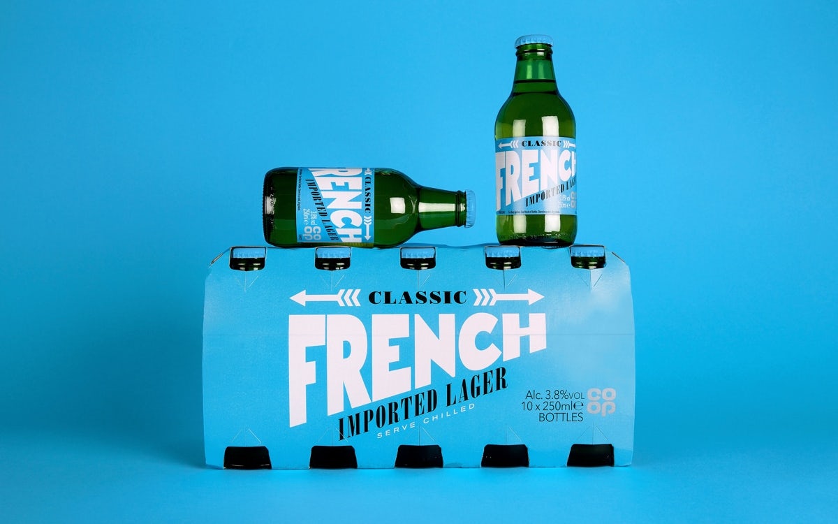
While the colours are consistent across the range, the agency has selected a range of typefaces – everything from restrained serifs, to drop shadow and outline fonts.
Cans of lager, beer and cider are distinguished by giant L, B or C letterforms, reminiscent of wood type, while striped and chequerboard patterns cover the Bavarian beer and imperial vodka bottle labels. It all adds up to a distinctive, appealing new look for Co-op.

Latest from CR


