Sea Design’s “human, soft and friendly” Callcredit rebrand
London-based agency Sea Design has recently rebranded analytics and software company Callcredit, creating designs that aim to position the brand as “a contemporary and vibrant business within a crowded sector.”
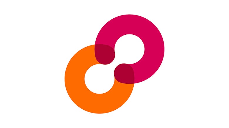
Sea worked with the UK Callcredit team and consultants Crimea River on the project, which looked to reposition the brand as well as creating a new visual identity to be used across print and digital touch points. The new branding uses a ‘CC’ logo device that represents the capture and transfer of valuable and secure data and information.
The agency initially met with Callcredit just over a year ago, and began work on the project in September 2016. “The whole project was about trying to visualise something you can’t see,” says Sea founder and creative director Bryan Edmondson. “We wanted to avoid sharp angles and make it look as human, soft and friendly as possible.”

This meant developing a series of rounded icons in dark pink and orange that hint at different parts of Callcredit’s business, such as a shopping cart icon, pluses, minuses and a house device. Sea chose to use the Avenir rounded font: “it’s not too business or tech or unfriendly,” says Edmondson. “We were trying to soften the whole language.”


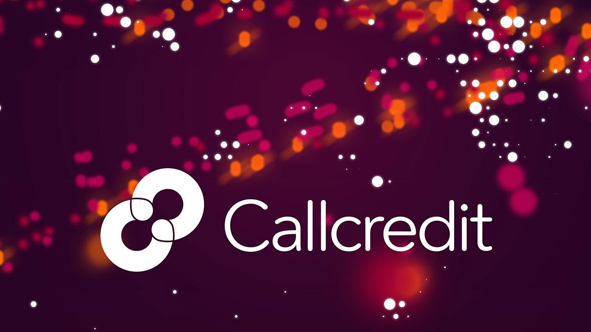
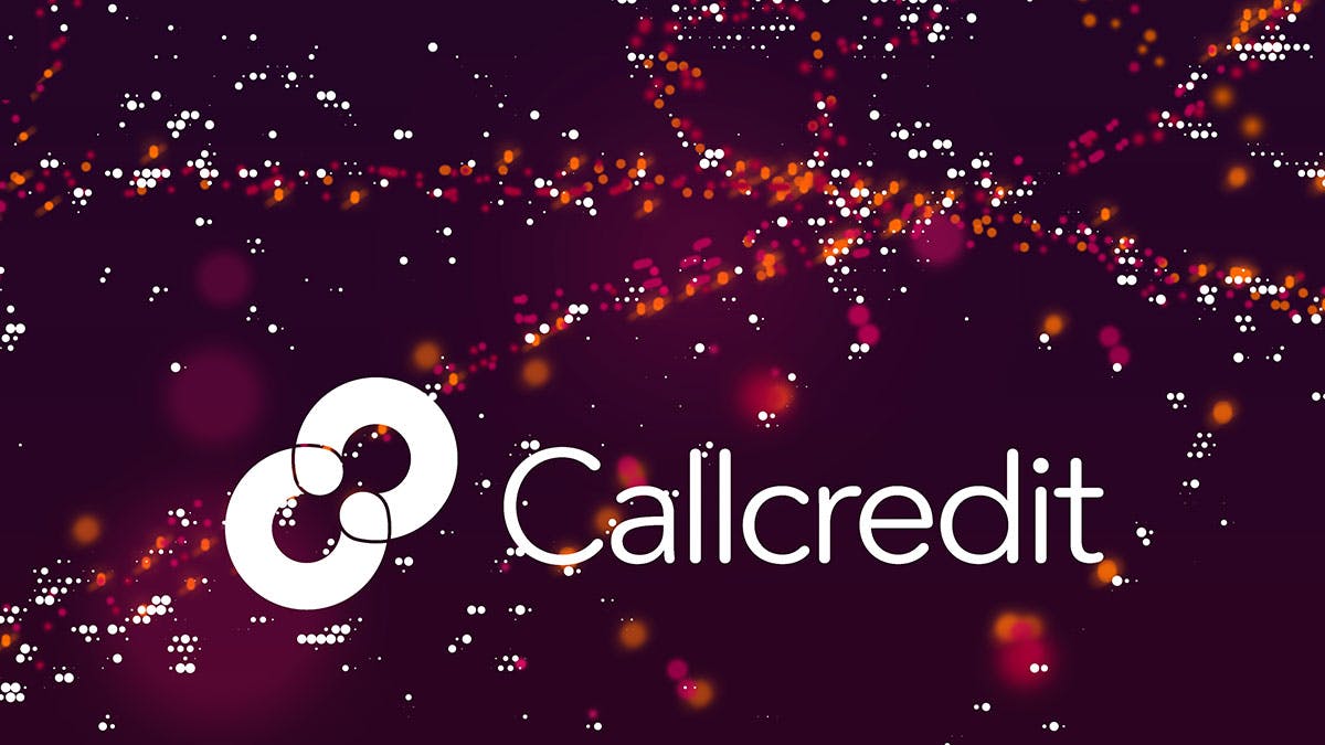

The previous identity’s claret red was “warmed up” and paired with the orange tone to give it a “bright, positive, modern feel,” says Edmondson. “They’re really smart and clever with what they do, so it’s been a really interesting project to work on. We didn’t want them to be perceived as too cold or technical.”
The new branding is to be shown across the Callcredit website, printed literature and interior signage, which is first being implemented in its UK offices before rolling out to its offices in Spain, US, Japan, China, Dubai and Lithuania.

Latest from CR


