Taschen’s new book charts the history of graphic design
Taschen’s new book brings together some of the finest posters, adverts, brand identities and magazine covers from the early 20th century, charting the development of commercial art and the historical events that shaped designs from the era
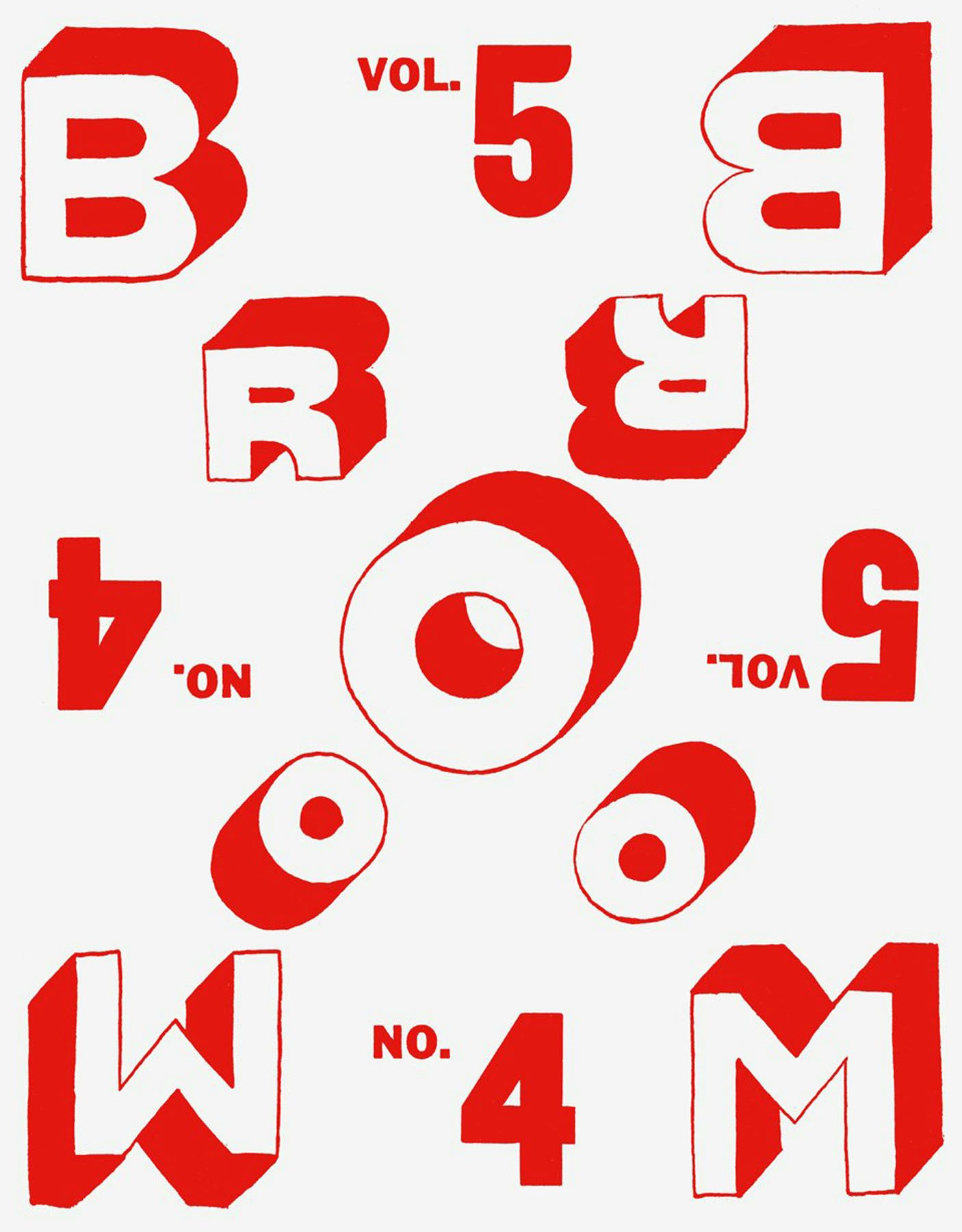
The History of Graphic Design: Volume I 1890-1959 compiles 2,500 designs from some of the era’s best known commercial artists – including London Underground roundel creator Edward Johnston, film poster designer Saul Bass, war poster artist Abram Games and master typographer Jan Tschischold.
The book charts the history of commercial art and the emergence of key design styles and techniques. There are early examples of infographics used by British newspaper The Sphere to explain the sinking of the Titanic, vibrant photomontages created for the Swiss Tourist board in the 1930s and some of the first colour posters created for brands. (A monocle-wearing pig features in an ad for livestock feed from 1895 and the Michelin man rides a bike while smoking a cigar in designs from 1912.)

The book is arranged chronologically and designs are grouped by decade. By arranging work in this way, author Jens Müller and editor Julius Wiedemann hope to put designs in context and show how commercial art is shaped by the political, economic and cultural conditions in which it is created.
It also shows how key design styles – from Futurism to New Typography – were born out of these cultural conditions as well as artistic movements which came before them.
A section on 1890 to 1900 highlights early examples of corporate identities while another on the 1930s looks at the rise of propaganda in countries under far right and communist rule. We also see an explosion artistic posters in Poland after the country came under communist rule, freeing it up from market constraints, and a similar explosion of creativity in Germany in the 1950s as the country began to recover economically from World War Two.

“The illustrated sections of the book can be interpreted from at least two different angles,” writes Müller in an introduction. “The images themselves can be considered from a purely stylistic and design-historic point of view…. However, each piece of work can also be seen as a historical document, a kind of relic of momentous events in human history.” Viewed in this way, the designs featured in The History of Graphic Design… act as a visual record of war, recession, depression and post-war boom, of the rise of communism and nationalism and of technological advancements from colour printing to photography.
Alongside iconic designs from the US, Europe and Russia the book includes some surprising and lesser-known examples from Hungary, Brazil, Japan and Austria. It’s a useful reference source for designers and a fascinating look at the development of contemporary graphic design and advertising. Taschen is already preparing a second volume which will begin at 1960 – for now, here’s a look at some of the projects and people featured in Volume 1.
Henry van de Velde’s identity for Tropon

Painter, designer and architect Henry van de Velde – one of the leading figures in Art Nouveau – created numerous posters and book designs throughout his career. He also created the brand identity for protein supplement Proton in the late 1890s. The company commissioned van de Velde to produce its packaging and advertising in 1898 and his designs are regarded as one of the first examples of corporate identity work. The book features packaging and logo designs as well as black-and-white adverts by the Belgian artist.
Karel Teige

Karel Teige was a hugely influential Czech graphic artist, writer and art critic. He was also a leading member of the Devětsil movement in the 1920s. He created around 100 magazine and book covers, recognisable for their vibrant colours, striking compositions, expressive type and geometric forms. (More on Teige’s contribution to design here.)
Takashi Kono

Takashi Kono’s beautiful posters combined a Bauhaus aesthetic with distinctly Japanese elements. The History of Graphic Design… showcases some of Kono’s work from the 1930s – designs that feel surprisingly modern despite the fact they are around 80 years old.
The Beggarstaff Brothers
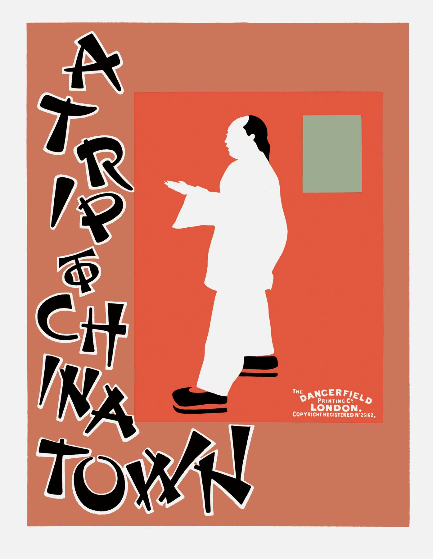
The Beggarstaff Brothers’ work stands out for its simplicity. At a time when most posters and magazine covers featured intricate, Art Nouveau-style illustrations, J & W Beggarstaff (the pseudonym used by British artists James Pryde and William Nicholson) favoured sleek silhouettes. In an essay by Pryde quoted in the book, Pryde explains: “We decided that the silhouette treatment was best, and it had this advantage, that it had not been done before. Moreover, it was a very economical way of producing a poster for reproduction, for the tones were all flat.”
Kenneth De Haak’s advertising for the New York Times

The troubling rise of fake news has seen several papers launch campaigns promoting the importance of well-informed reporting (see this ad from February, this for the Telegraph and this for The Times and Sunday Times). So this ad, designed by Kenneth D. Haak for the New York Times in 1951, feels oddly topical.
Haak created a series of ads featuring the same simple and snappy message, ‘get all the news and get it right’. Art directed by George Krikorian and Louis Silverstein the campaign was launched in response to rising printing costs and aimed to increase the paper’s readership across the US. And over 60 years later, it still demands attention.
Container Corporation of America’s Great Ideas of Western Man campaign

The History of Graphic Design… features campaigns for some of the US and Europe’s best known brands. But one that particularly stands out is a set of posters created for the Container Corporation of America.
Founded in 1926, the Container Corporation of America manufactured corrugated boxes and owned shipping mills, factories and processing plants across the US. From 1950 to 1957 its founder Walter Paepcke and his wife Elizabeth commissioned some of the country’s finest graphic designers to create posters for the brand. Design greats including Otl Aicher, Paul Rand, Saul Bass, Alvin Lustig and Esther Louise Peck were asked to create a poster featuring a quote from a famous figure. The result is an innovative set of ads (art directed by Egbert Jacobson) with thought-provoking reflections on truth, democracy, justice and education.
It’s a great example of advertising that goes beyond promoting a product and is designed to make people stop and think.

The History of Graphic Design: Vol 1 1890 – 1959 is published by Taschen and costs £49.99. See taschen.com for details or to order a copy.
Latest from CR


