The new logo for London venue Kings Place is shaped by sound waves
Studio Sutherl& has designed the branding for arts venue Kings Place, basing the logotype on sound data from performances
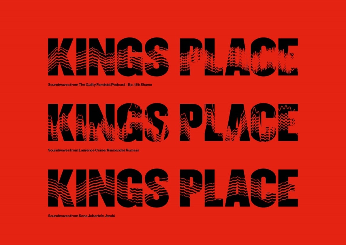
Based in London’s Kings Cross, the space bills itself as the ‘cultural pulse’ of the area, hosting comedy, festivals, music performances and talks. To create its new identity, Studio Sutherl& delved into the “energy and variety” of its events. Working together with software engineer and digital artist Joe Pochciol, the studio built SoundWaveMachine – software that can analyse audio files and then generate new logos based on them.
“We can vary the amplitude, gain and modulation,” explains studio founder Jim Sutherland. “We can also use the waves themselves graphically, for building manifestations and in print.”


The software works on any machine, meaning the client can also generate sound-based logos and headlines themselves. Part of the aim of this approach was to bring together Kings Place’s sub brands, and the sound waves give each of these a common visual identity that still allows for some individuality.
Now, the branding for each event follows the same typeface – Champion Middleweight – but adopts its own unique pattern, based on music or sound from the performance.
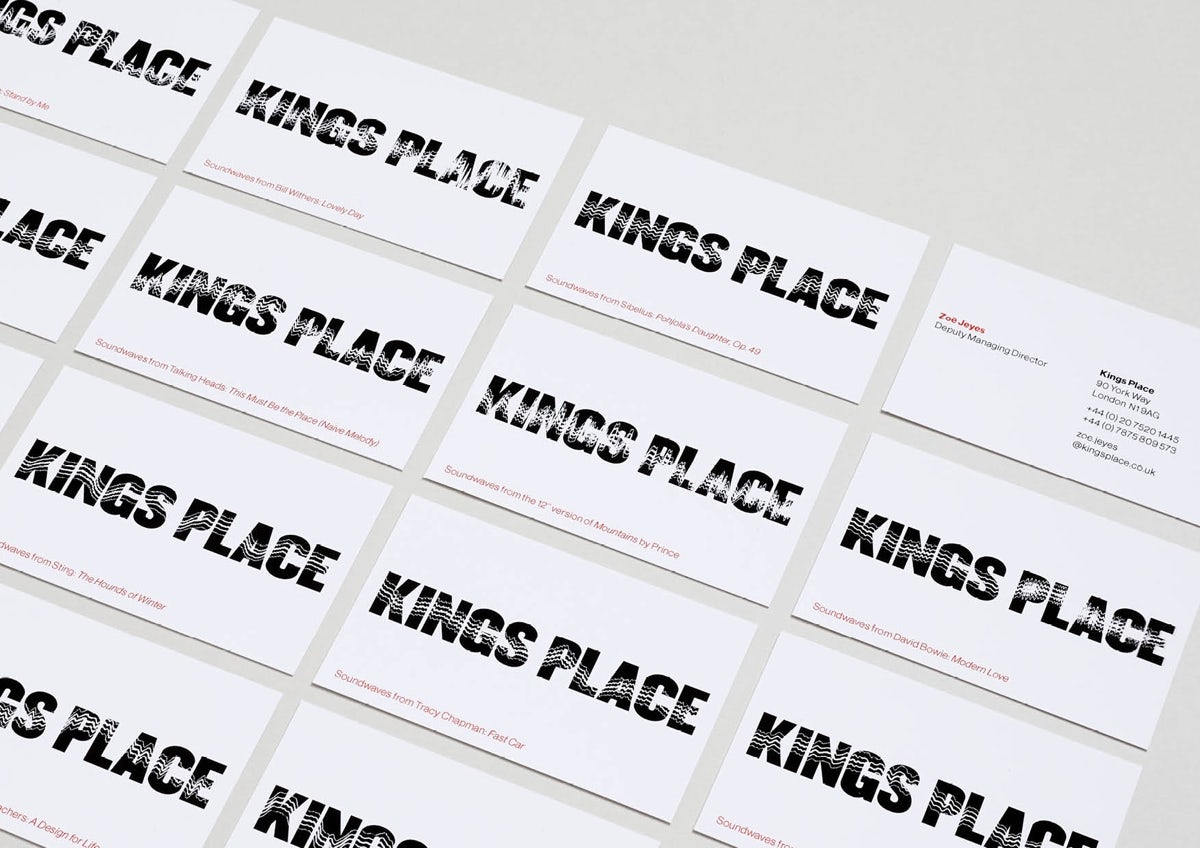
Studio Sutherl& also created individual logotypes for each member of staff, based on their favourite tracks, which are featured on business cards and email signatures.
Latest from CR


