Pentagram designs new logo and identity system for Mastercard
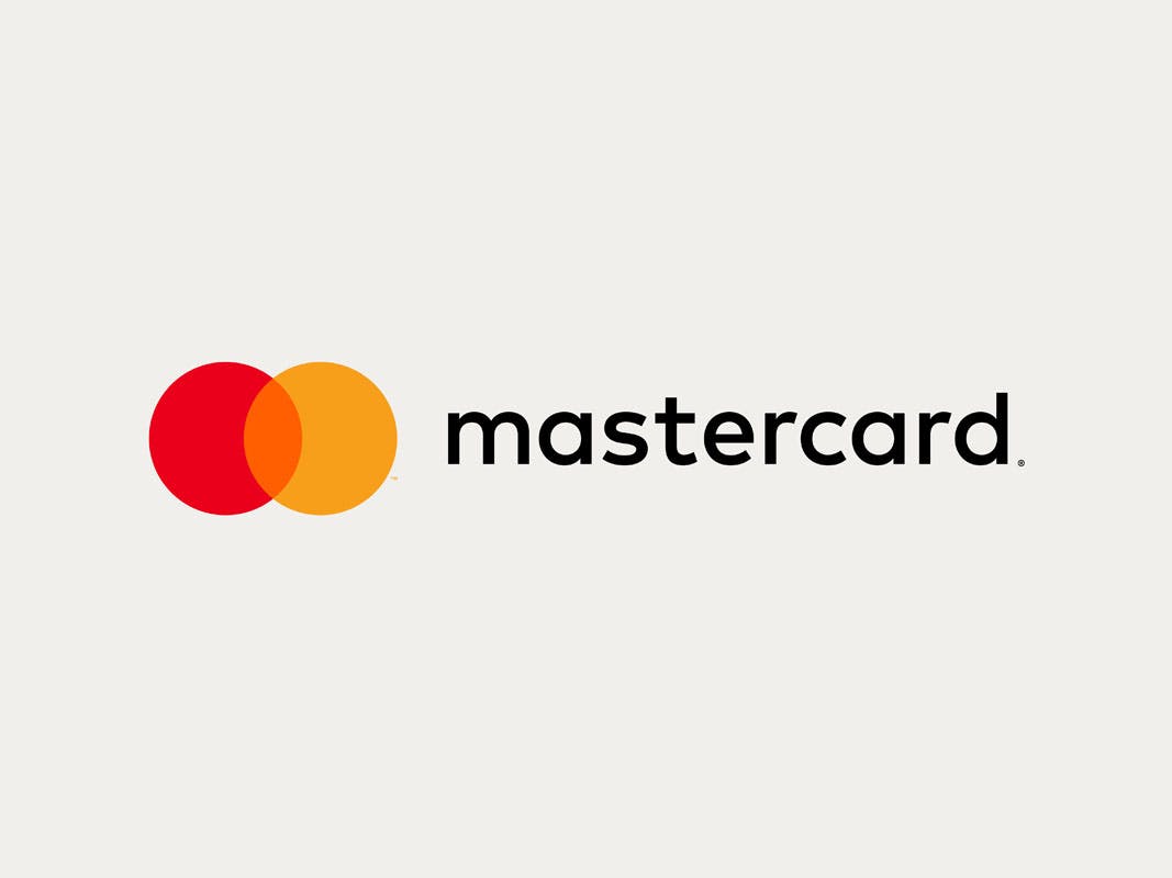
Mastercard’s logo – one of the world’s most recognisable – has been given a makeover for the digital age. Designed by Pentagram, the simplified mark retains the brand’s distinctive red and yellow circles, but gone are the teeth, the capital C and a “dated” italic font…
Mastercard’s logo has changed little since 1968. The brand’s name was changed from Master Charge to MasterCard in 1979, and its upright font was replaced with italics in 1990, but the core elements – overlapping circles in red and yellow – have remained largely the same. At nearly 50 years old, it is one of the most recognisable brand marks in the world, appearing on millions of cash machines and over 2.5 billion credit cards.
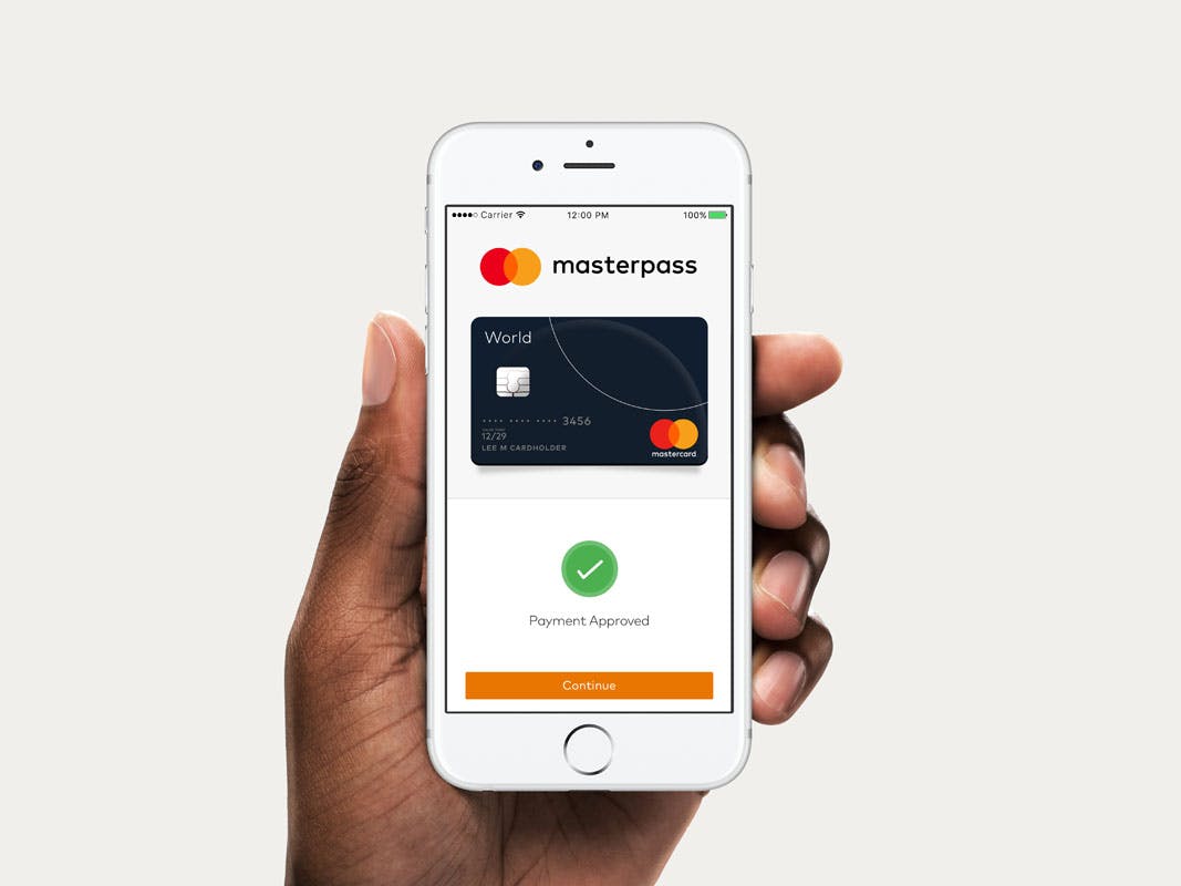
But while the Mastercard symbol has tremendous brand equity, it was starting to look a little dated. The capital ‘C’ in its name placed the emphasis on card payments, yet the company’s focus is increasingly on digital payments (it has just launched a new digital payment system, Masterpass). Mastercard says there is often confusion over what the brand does – it is not a card issuer, but rather, provides the technology used to make payments.

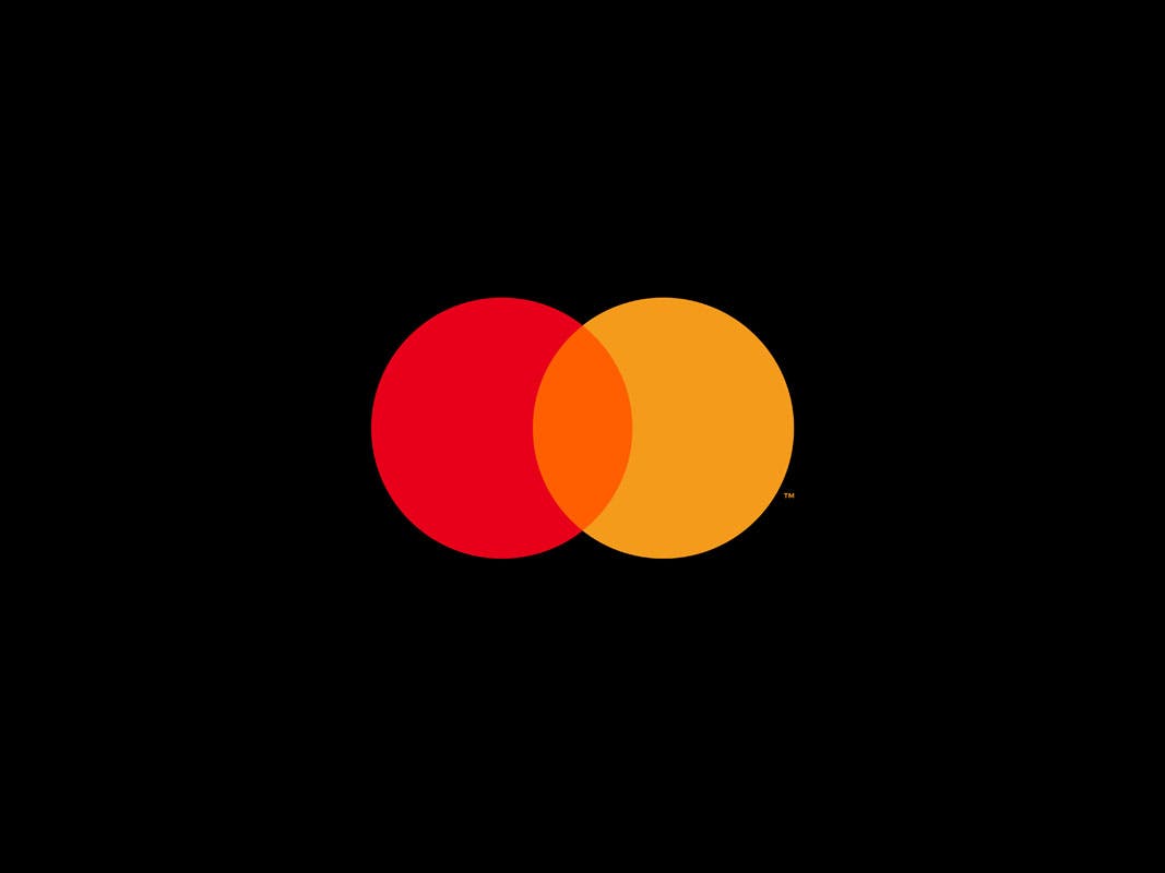
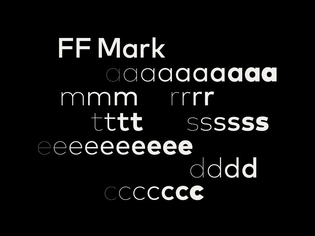
In an attempt to tackle this and bring the brand up to date, Mastercard has introduced a new logo designed by Pentagram. The simplified mark retains the red and yellow circles but features a new lowercase sans logotype in FF Mark. Gone are the heavy italics and unnecessary teeth and in its place is a logo which reduces Mastercard’s most recognisable assets to their simplest form.
“We haven’t touched our brand mark for about 20 years now and the company has changed really dramatically in that time,” says Chuck Breuel, VP Brand Marketing at MasterCard. “We’ve expanded all of our products and services and that’s really accelerated over the past few years, so we took a look at the logo and said, ‘I think we can do some things to have it more closely reflect where the company is’. To make it simpler, more impactful in a way, but still instantly recognisable,” he says.

Making even subtle changes to a logo as ubiquitous as Mastercard’s is a complex operation – it can be seen not just on cards but on cash machines, websites, restaurant and shop windows, retail websites and billboards. “There’s great recognition and heritage in those interlocking circles … so there was a lot of care taken and concern about wanting to retain our visibility and familiarity,” adds Breuel.
Given this level of recognition, Pentagram partner Michael Bierut says the decision to retain the circles was instantaneous. He also says the ubiquity of the mark gave the design team freedom to experiment with a “radically simple” design that could only work for a brand as well-known as Mastercard.
“They’ve invested for more than 50 years in some of the most basic visual attributes you can have – the circle repeated twice and overlapping, two of the three primary colours. To actually stake your claim and say you want to own something that simple is something you just can’t do if you’re a startup trying to make a name for yourself with a brand new product that no-one’s ever heard of,” he says. “If you see Mastercard’s history as a foundation for the work, then it starts to feel liberating, not inhibiting … we really just tried to distil what the essence of the brand was and see how concise we could be with communications.”
In 2006, MasterCard created a separate corporate logo with three circles, which was met with criticism for looking unnecessarily complicated. The new mark replaces this logo and will now appear across all of Mastercard’s communications. Text can appear alongside or underneath the circles and FF Mark – chosen for its circular design and simplicity – will be the sole typeface used by the brand going forward. (It already appears on Mastercard’s new Masterpass digital wallet, also revealed today).
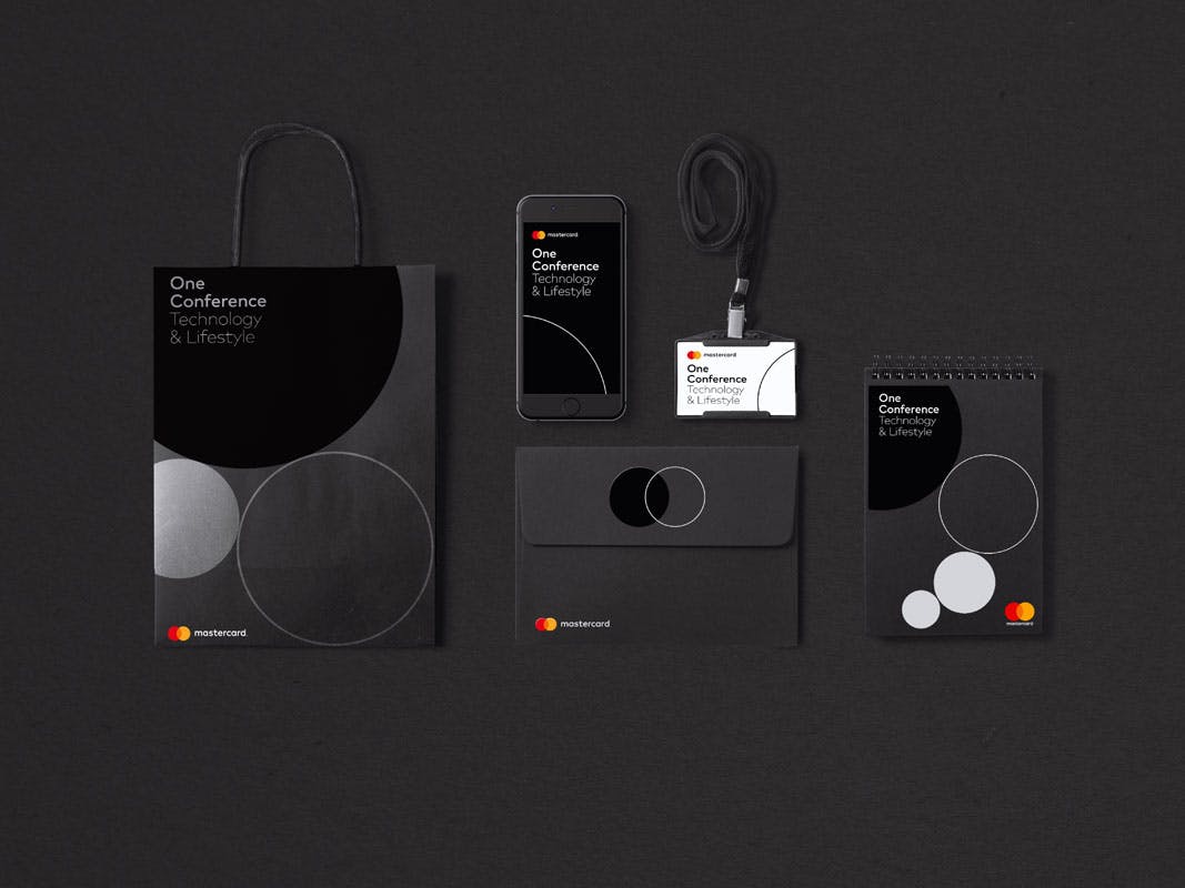
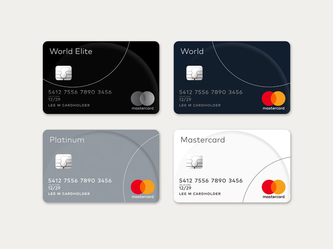
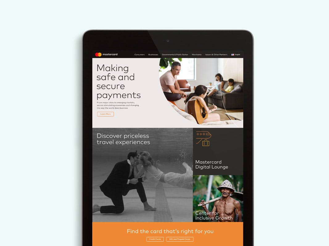
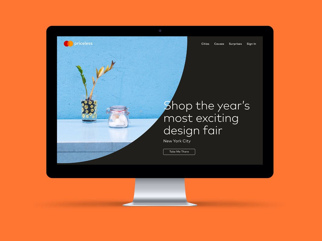
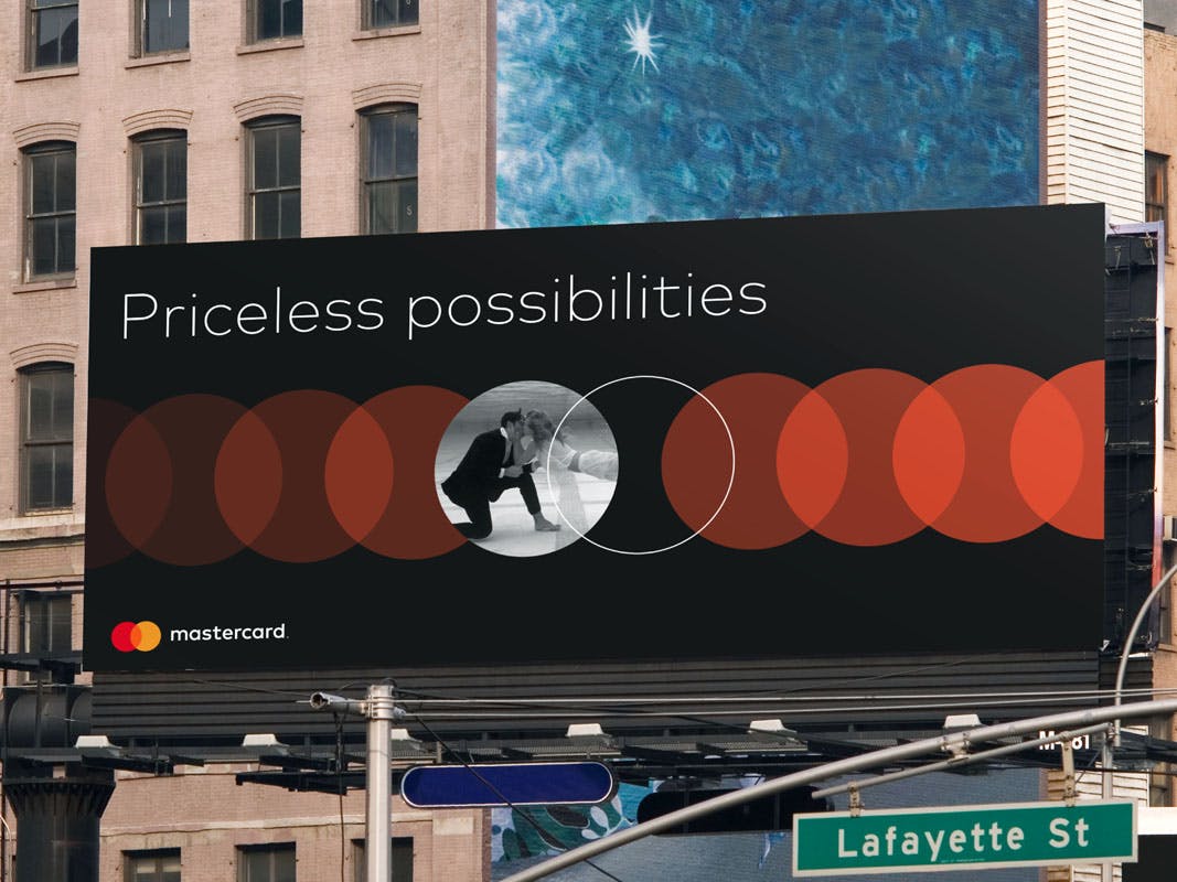
In addition to refining the logo, Pentagram has created a comprehensive visual identity for everything from sports sponsorships to corporate communications and national print campaigns. The identity uses circles throughout – outlines will appear on cards while mock-ups for billboards feature a system of repeating circles. Breuel says a suite of circular icons has also been created for advertising and interfaces. “We were trying to drive everything relentlessly to the foundation of the mark,” says Bierut.
Colours in the circles have been made slightly brighter and appear alongside a palette of black, white, green and neutral shades. The overlapping section between circles now features a bright orange shade and is designed to feel lighter and more transparent than the previous combed design.

“We were really eager to have colours that would stand out just as easily on a black background as on a white one – if you make the yellow too bright and light it fades away on white and if you make everything too dark it’s too muted on black, so it required looking at a remarkably wide range of variables to get it exactly right,” says Bierut. “It’s something we don’t expect the general public to enjoy as much but I like what happens when the circles overlap – you get some really interesting effects, as it looks a bit lighter where it touches red and a bit darker when touching yellow.”
Breuel says the new identity system is the most comprehensive the brand has ever had. “I’d like to say the system is really complicated but really, you’ve got two colours, two circles, one word and everything comes out of that,” adds Bierut. “I think it’s excitingly clear and simple in a world that too often presents itself as hopelessly complicated.”

The identity rollout will be a gradual process and Bierut says Pentagram will be working closely with Mastercard’s global design teams and agencies, advising them on how to use circles and icons and allowing them to create everything from animations to ads and signage.
“It’s not possible for any one agency to roll this whole thing out, so what we’re going to be doing is formalising the design scheme in the form of some quite simple standards that I think will invite people to use the assets in a way that’s imaginative and inventive, but still designed to have everyone – regardless of where they’re working and what they’re working on – come up with things that look characteristically of the Mastercard brand,” he explains.
“There will be lots of groups and agencies working on the rollout so planning for that is in progress, and one of the great things about working with an understood set of visual cues [like the circles] is that while the new logo looks sensational, it doesn’t make the old logo look wrong or unfamiliar.”
Latest from CR


