Typefaces for London
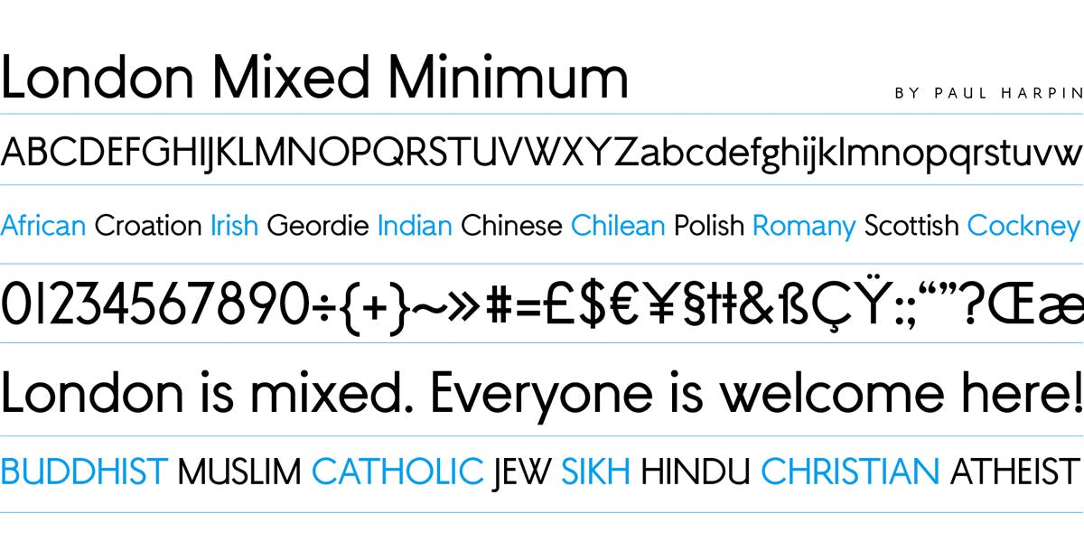
New type foundry launches with twelve fonts inspired by the capital, its buildings, language and traditions
The London Type Foundry has been set up by art director and designer Paul Harpin, type designer Paul Hickson (of P&P Hickson) and Joe Graham of consultancy Typespec. Though friends for years, the three worked together on Harpin’s BuyFontsSaveLives initiative (covered by CR here) which was launched in 2014.
Its success prompted the idea to create a more formal partnership which has resulted in the launch of the new foundry “releasing quality fonts infused with creativity, innovation, heritage, tolerance, fun and cultural diversity — all inspired by the city of London”.
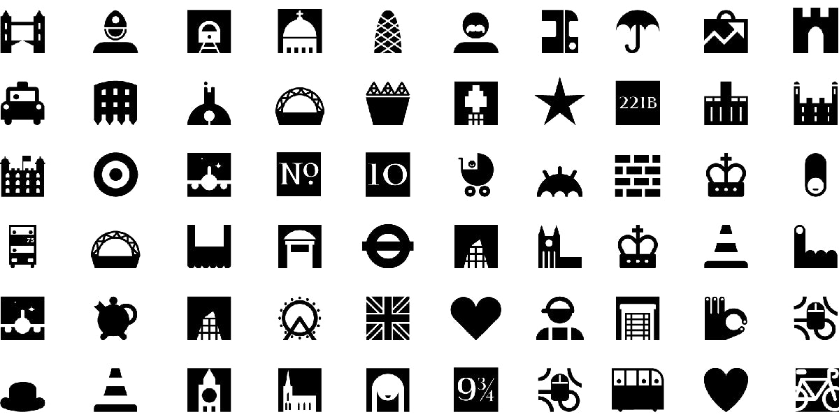
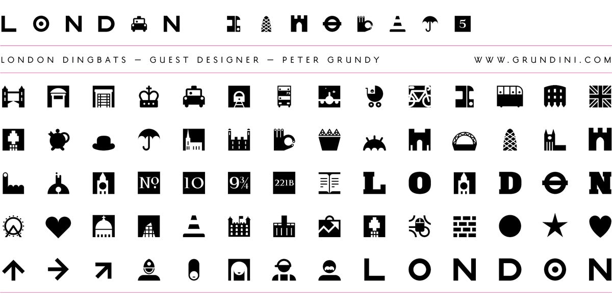
Its first collection features fonts designed by the founders and a London Dingbat set by designer Peter Grundy. The set combines famous London landmarks, iconic designs and symbols with a set of London door numbers (added by Harpin).
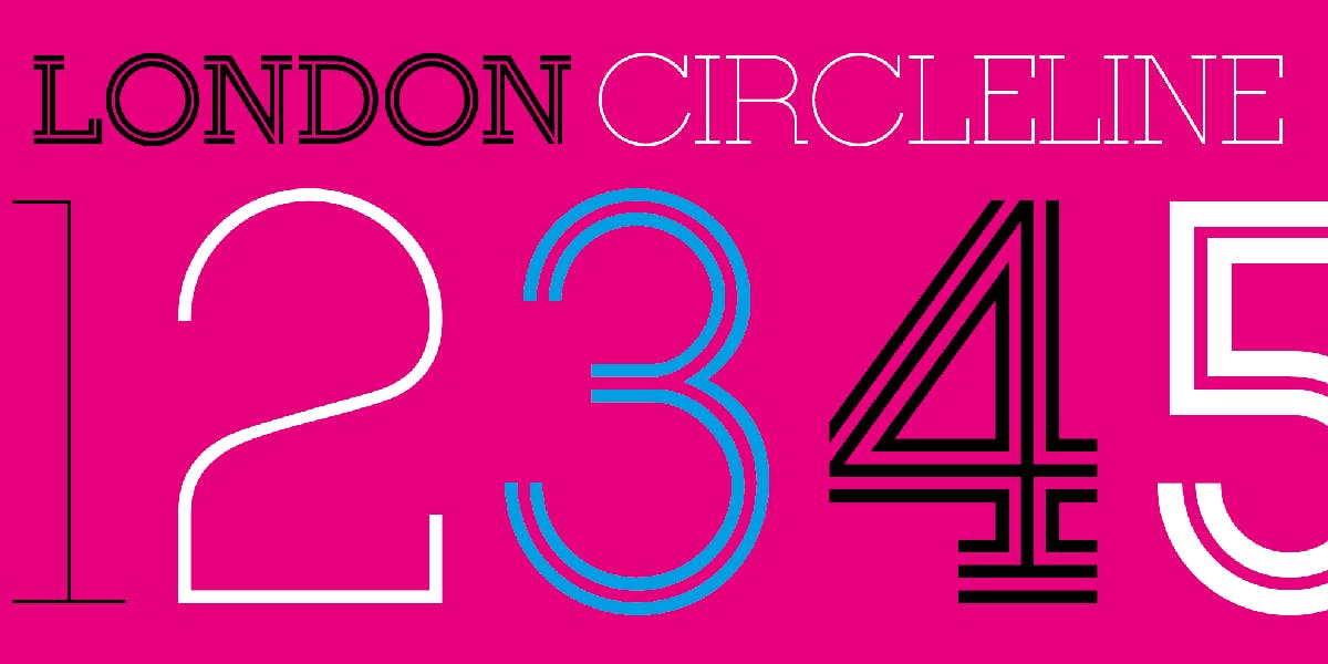
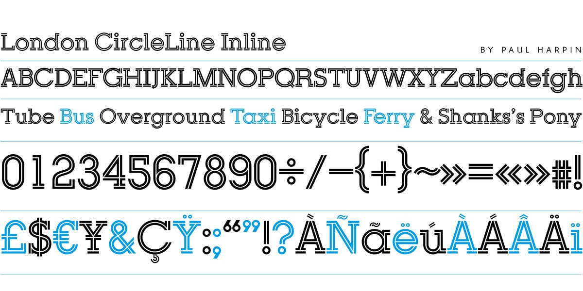
Other fonts include London CircleLine, which Harpin says was inspired by the Post Office Double Line typeface designed by John Miles (who Harpin used to work for), the London Underground Roundel and Lance Wyman’s designs for the Mexico Olympics in 1968.
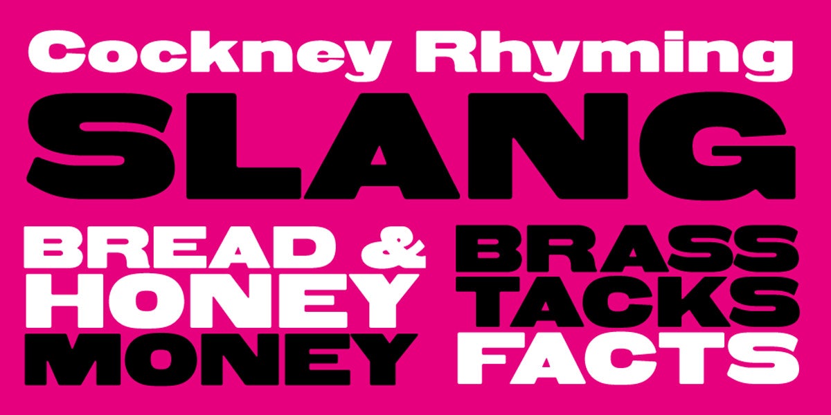
Paul Hickson’s London Whitechapel Sans “is an industrial strength, extended, heavyweight font” referencing the “engineering, cloth-making and sugar refining” heritage of the East End. Apparently, it is also “terrific for Cockney rhyming slang”.
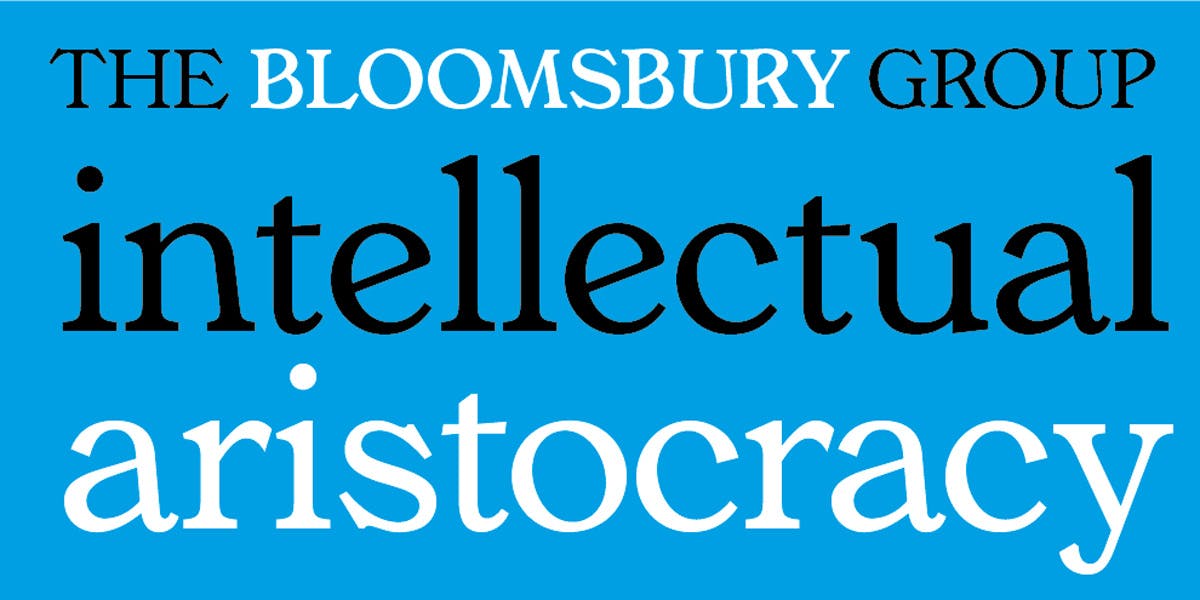
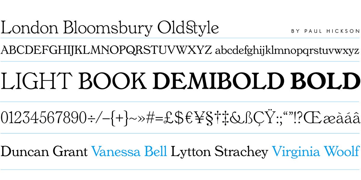
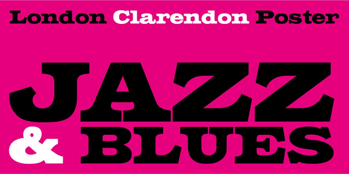
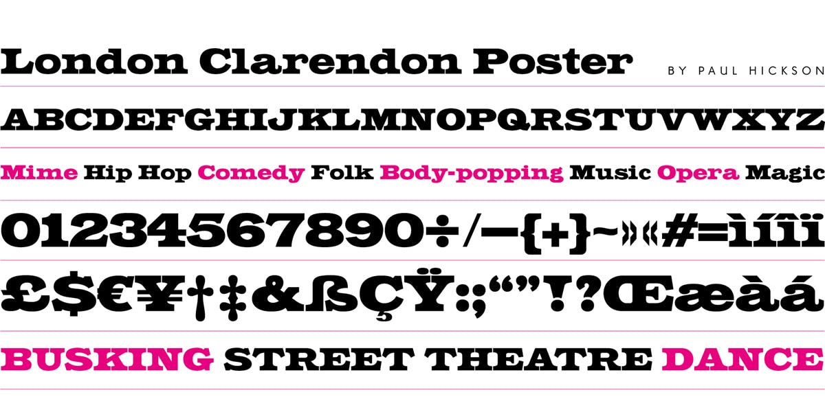
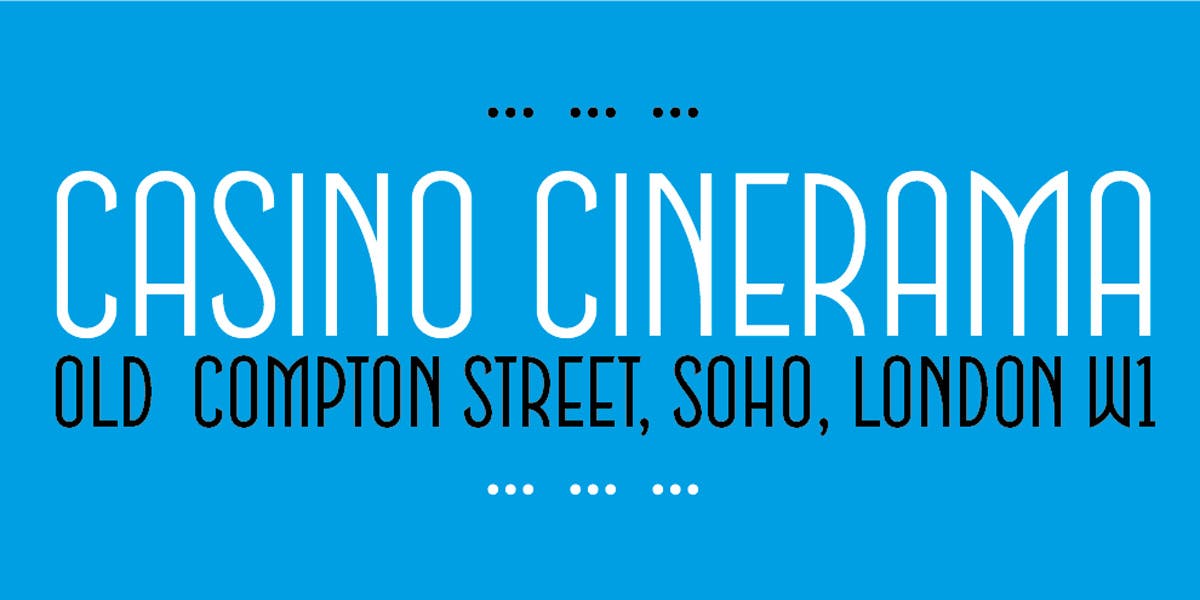
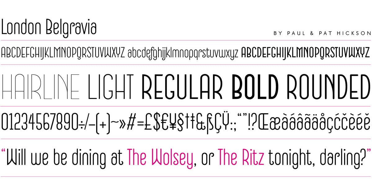
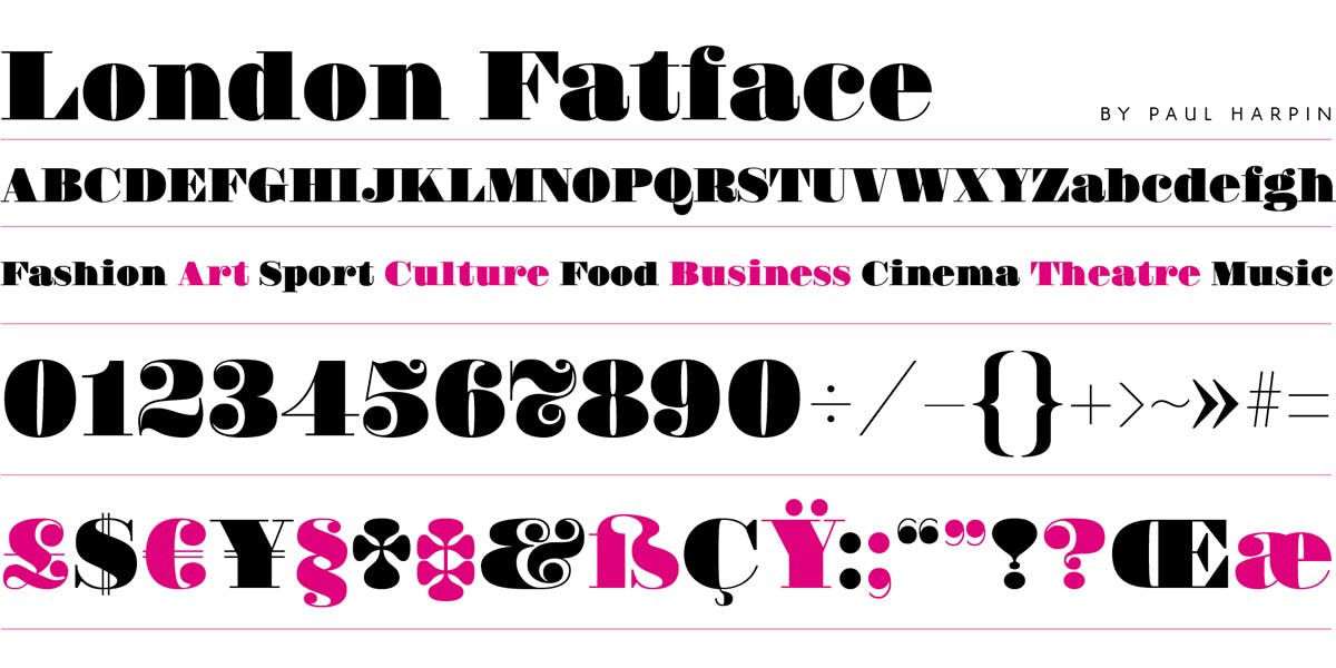
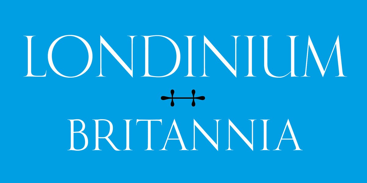
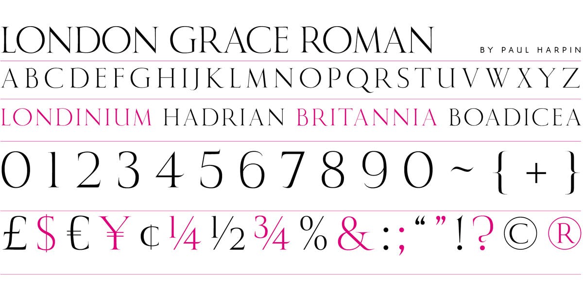
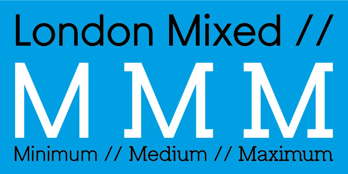
Below is the rest of the foundry’s range:
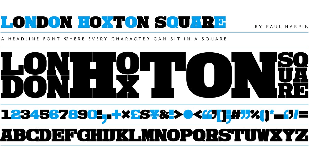
More at londontype.co.uk

