WORK: David Hockney catalogues designed by A Practice for Everyday Life
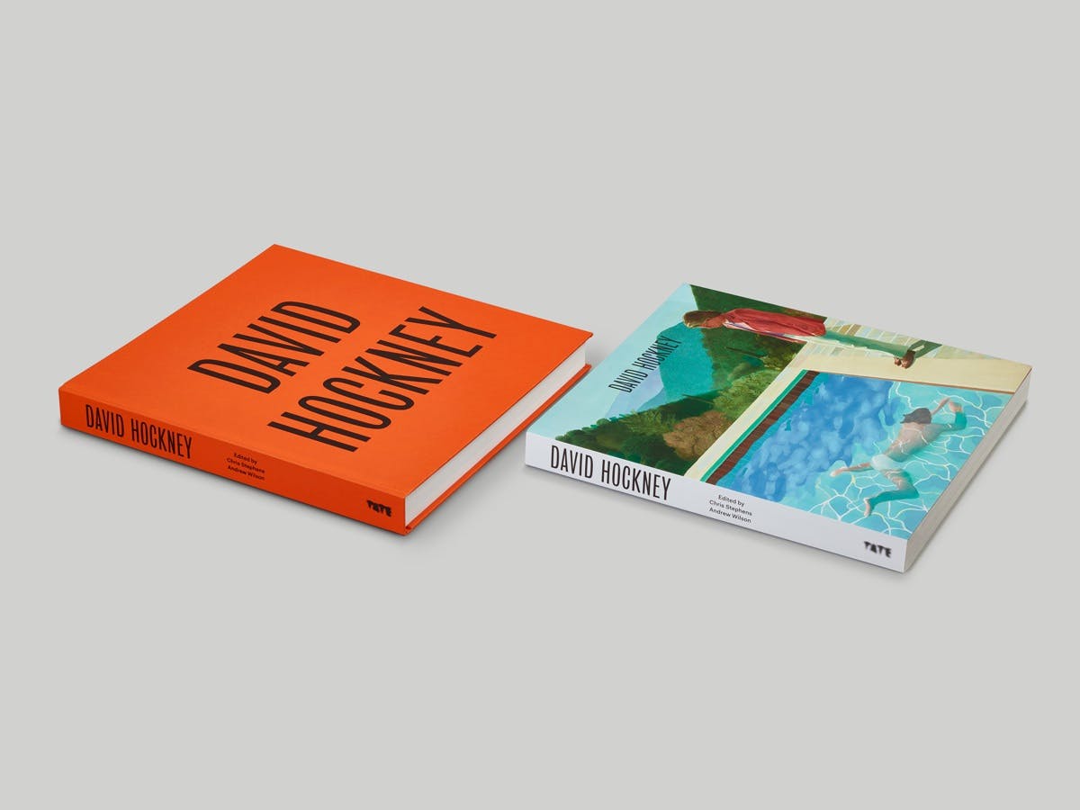
A Practice for Everyday Life has designed the catalogue for the new David Hockney exhibition at Tate Britain. Tate Publishing approached the studio to create two editions, a hardback and a softcover, to accompany the retrospective show of Hockney’s work to date.
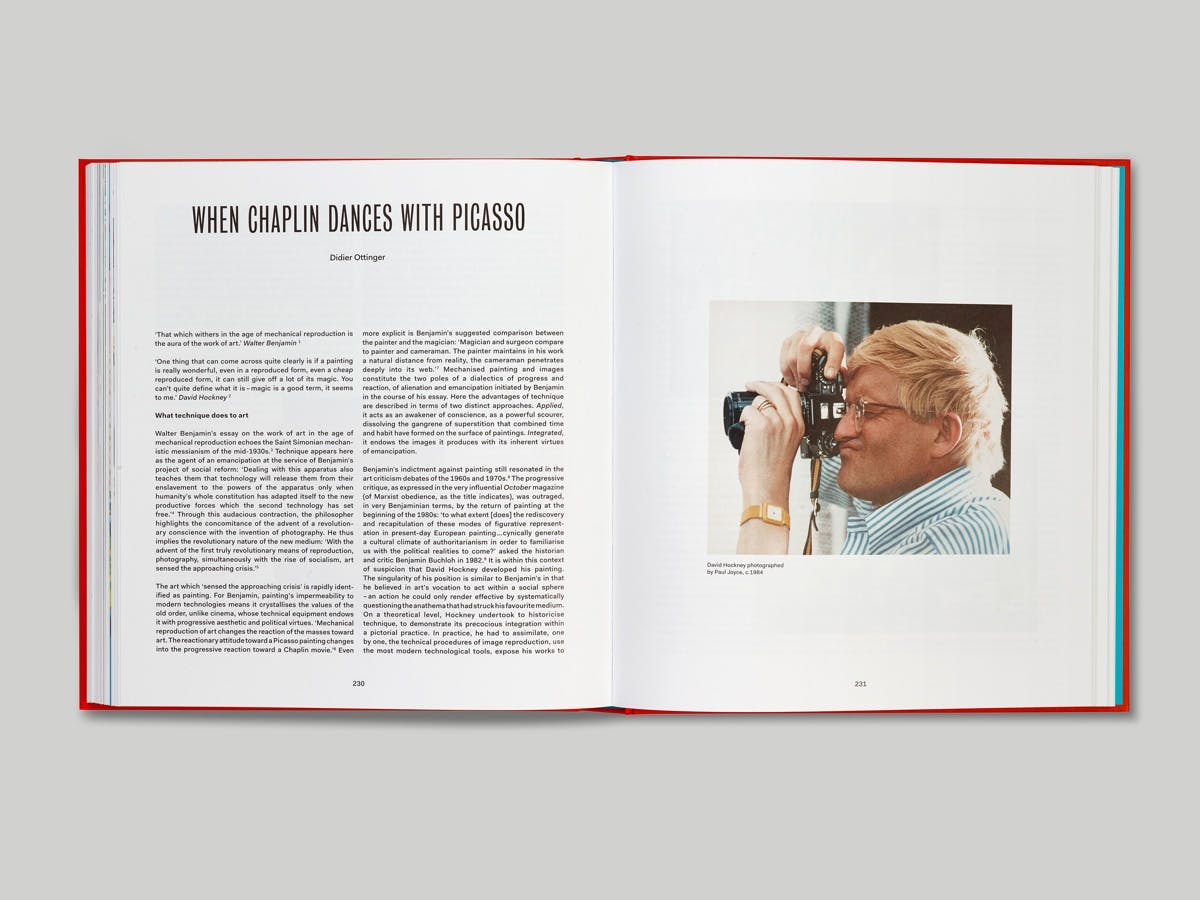
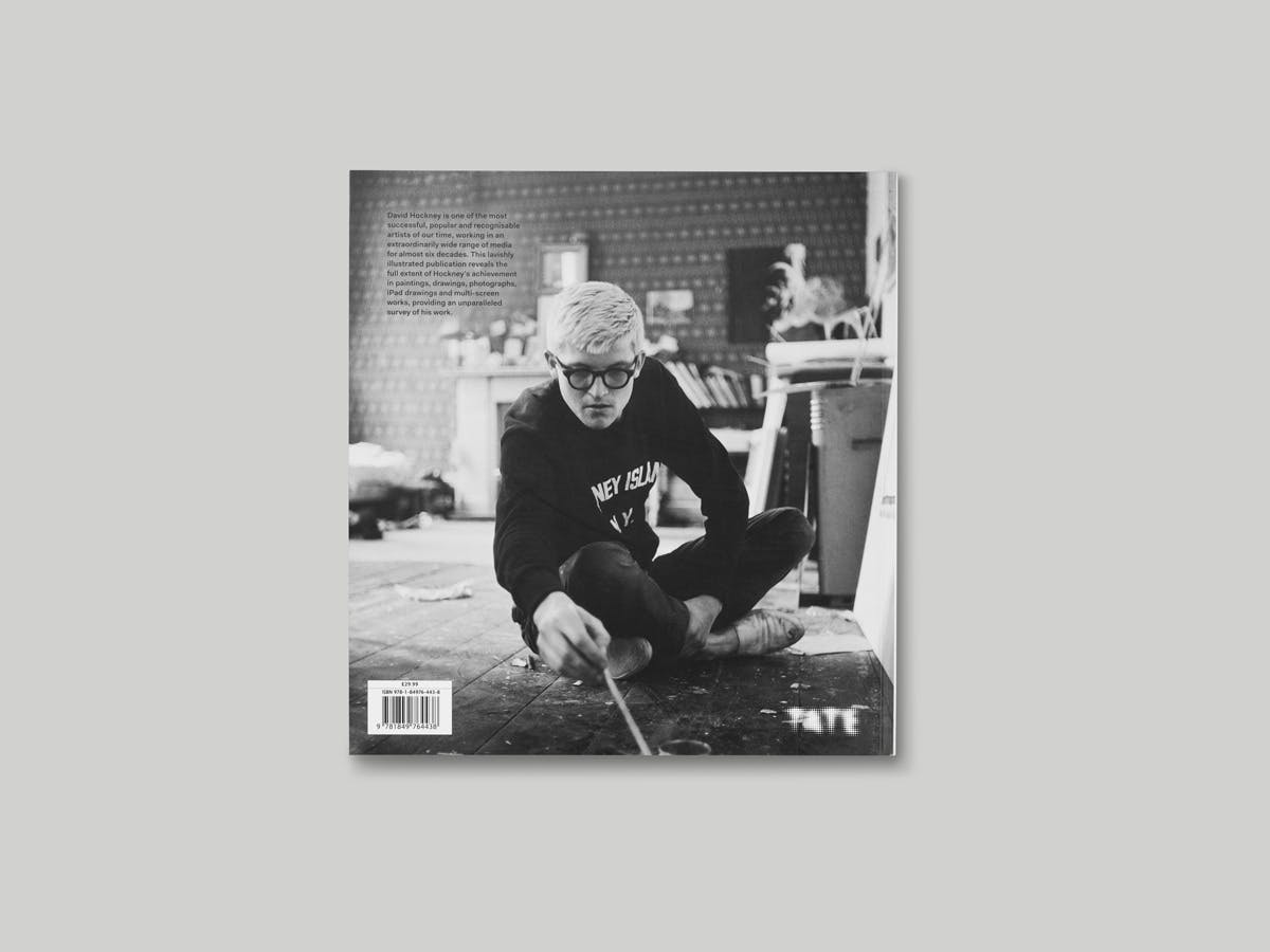
According to APFEL, initial ideas for the design approach to the publications came from the familiar black and white portraits of the artist from the 1960s. “He was and is a beautiful man with incredible character and in his portraits you can see the energy that lies within him,” say the studio. “We wanted that to play an important role within the publication, so we put a young Hockney on the back cover and in the first pages of the book, and a more recent portrait between the plates section and the main essays.”
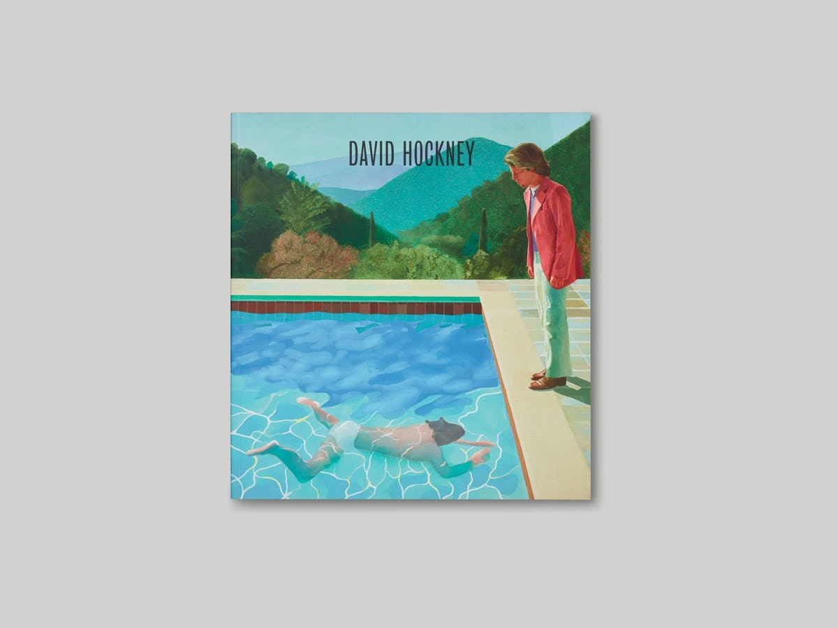
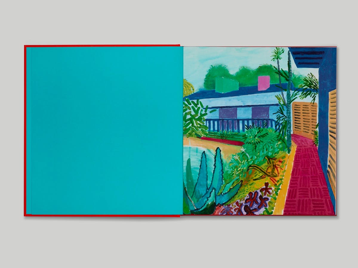
The book contains a range of large, full-bleed images of Hockney’s work and opens with one of his most recent paintings. “We chose this particular work as it had a great circular feeling – the front cover of the paperback is one of his very well-known early works depicting California and a swimming pool, and we liked the idea that the next image you see when you open the book is a much more recent depiction of a similar subject.”

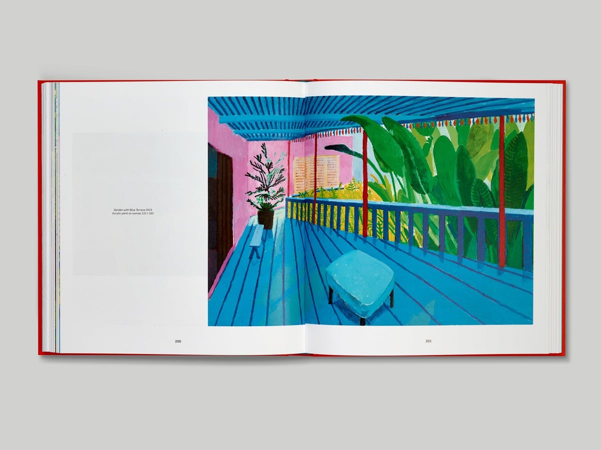
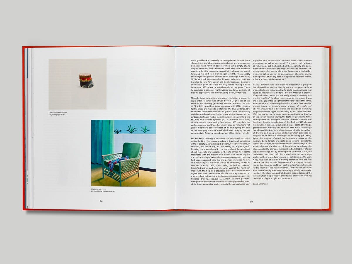
Each chapter opens with a close-up detail of a particular work, while all the artworks featured are laid out to scale. “In practice, this was sometimes hard to achieve, due to the extreme difference in size between Hockney’s enormous paintings and smaller drawings,” say APFEL.
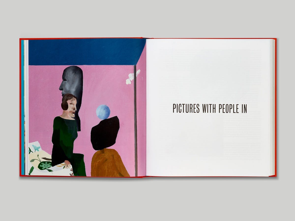
Typography is at the forefront of the project – chapter headings have their own page, giving some breathing space to the publication and contrasting with the large images on display. Bureau Grot Compressed is used for all the titles and on the cover of the hardcover, “which we thought would never get approval from the publisher; a type-only cover for such a big blockbuster exhibition catalogue is virtually unheard of,” say APFEL. “Thankfully, everyone fell in love with it, so it stayed.”
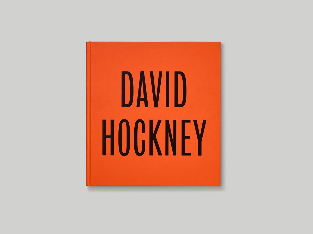

According to the studio, Bureau Grot is based on Stephenson Blake grotesques from the 1800s and “it felt appropriate to celebrate Hockney’s largest exhibition to date with a typeface made by one of England’s most prestigious foundries. The typeface feels so English to us, and with Stephenson Blake having been based in Sheffield, the connection to Hockney’s home county of Yorkshire made it an even more appropriate choice.”
The body copy is set in Thomas Thiemich’s Fakt typeface. “It’s a functional, humanist face that revisits archetypal sans serifs of earlier decades,” say the studio, citing examples such as Miedinger and Hoffmann’s Neue Haas Grotesk/Helvetica from the 1950s and Renner’s Futura from the 1920s. “We have been big fans of Hockney’s work for a very long time and have always wanted to work on a book for him,” APFEL add, “so this project was an opportunity for us to fulfil a long-held ambition of ours.”
David Hockney is at Tate Britain until May 29. The catalogue is available from Tate Publishing in hardback (£40) and softcover (£29.99) via shop.tate.org.uk. See apracticeforeverydaylife.com


