WORK: Fortnum & Mason biscuit packaging by Design Bridge
Design Bridge has created new packaging for Fortnum & Mason’s core biscuit range inspired by decorative ceramics.
“We were inspired by the very Fortnum’s, and also very British, institution of having tea and biscuits, especially the designs of the special china used to serve them on,” says Chloe Templeman, Design Director at Design Bridge.
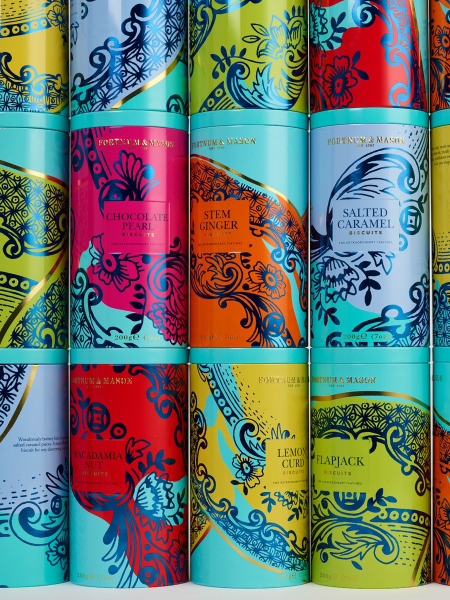
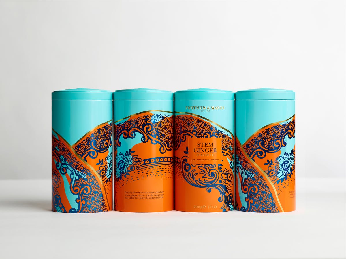
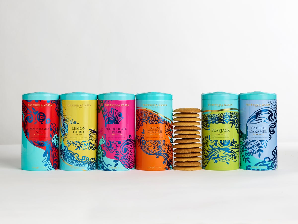
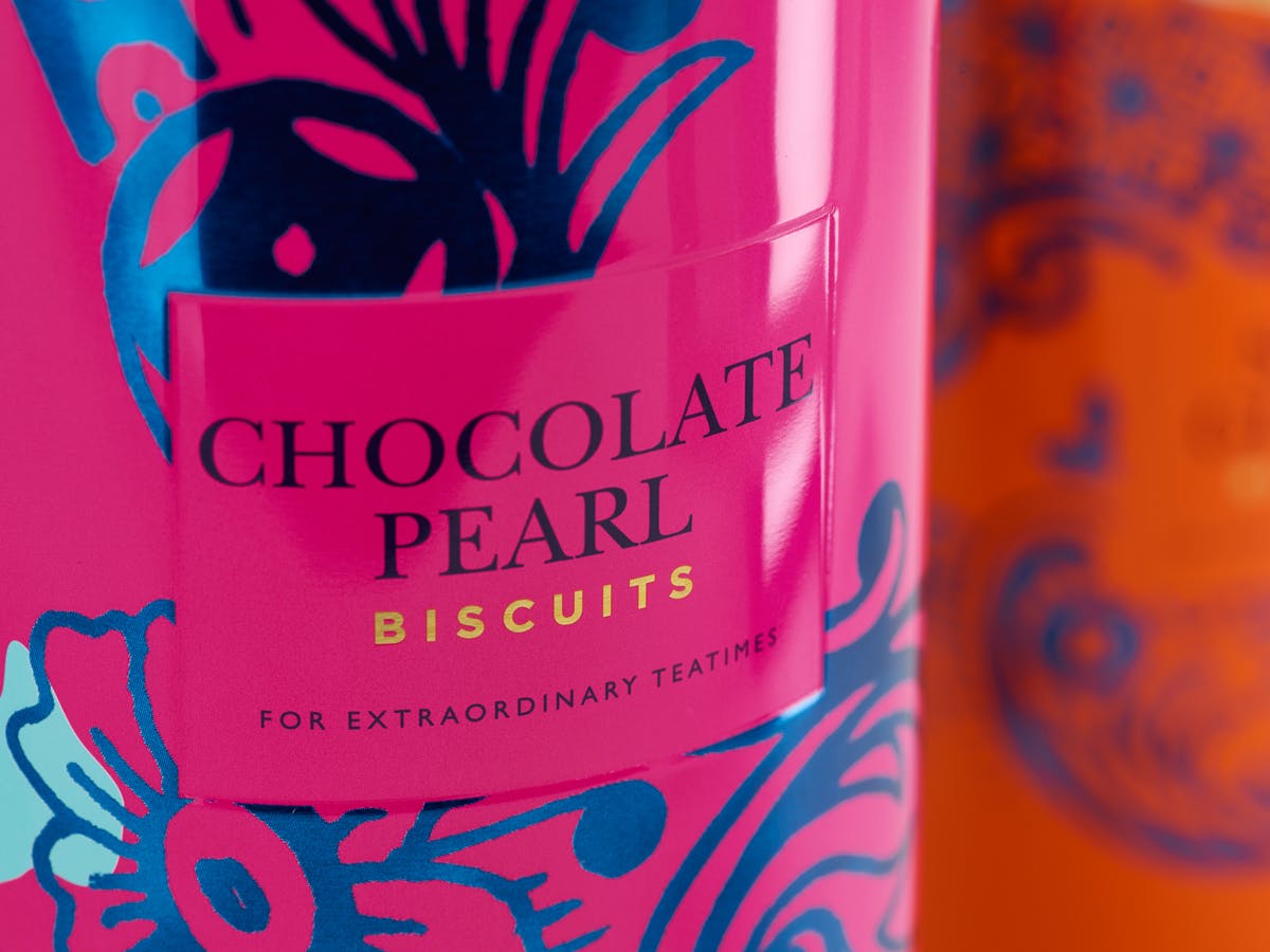
The studio referenced the Fortnum & Mason archives, architectural details of the Piccadilly store, and fine Georgian ceramics to create their own decorative plate design. From that, they were able to take six unique crops to use at varying scale on the tins.
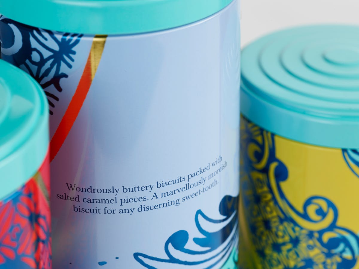
“Combining metallic and non-metallic colours adds even more depth, while a de-bossed square in the middle of each design works as a consistent and calm focal point, displaying the flavour of the biscuits and the new tagline created for the range: ‘For extraordinary teatimes’,” Templeman says.
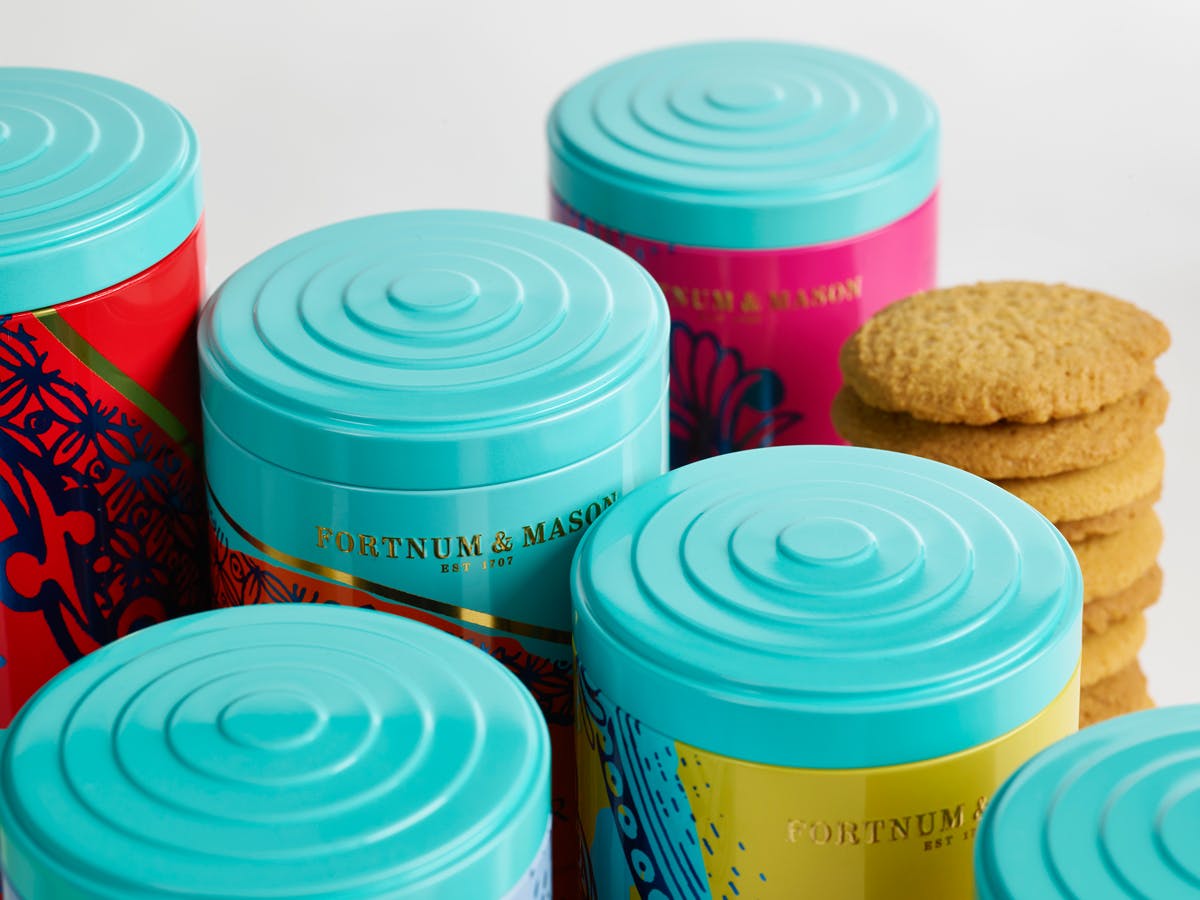
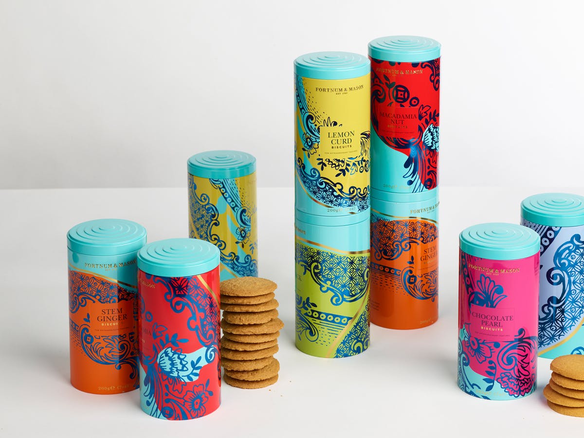
A new tin design allows them to be stacked one on top of the other on shelf.
Read our interview with Zia Zareem-Slade, Customer Experience Director at Fortnum & Mason here


