Matty Matheson’s new branding embraces the basics
The chef, TV personality and The Bear actor has launched a line of pantry staples that lovingly references classic food packaging design
Most audiences will know Matty Matheson’s face from The Bear, where he plays the well-meaning handyman Fak – probably the last person you’d want to cook your food.
But back in the real world, Matheson is an established chef (he’s also the show’s culinary consultant) and personality who rose to the limelight in the 2010s while fronting YouTube videos and cooking shows on Vice offshoot Munchies. He rode the crest of the internet foodie content wave that transformed the way people engage with cooking before ‘content creator’ was considered a viable career path.

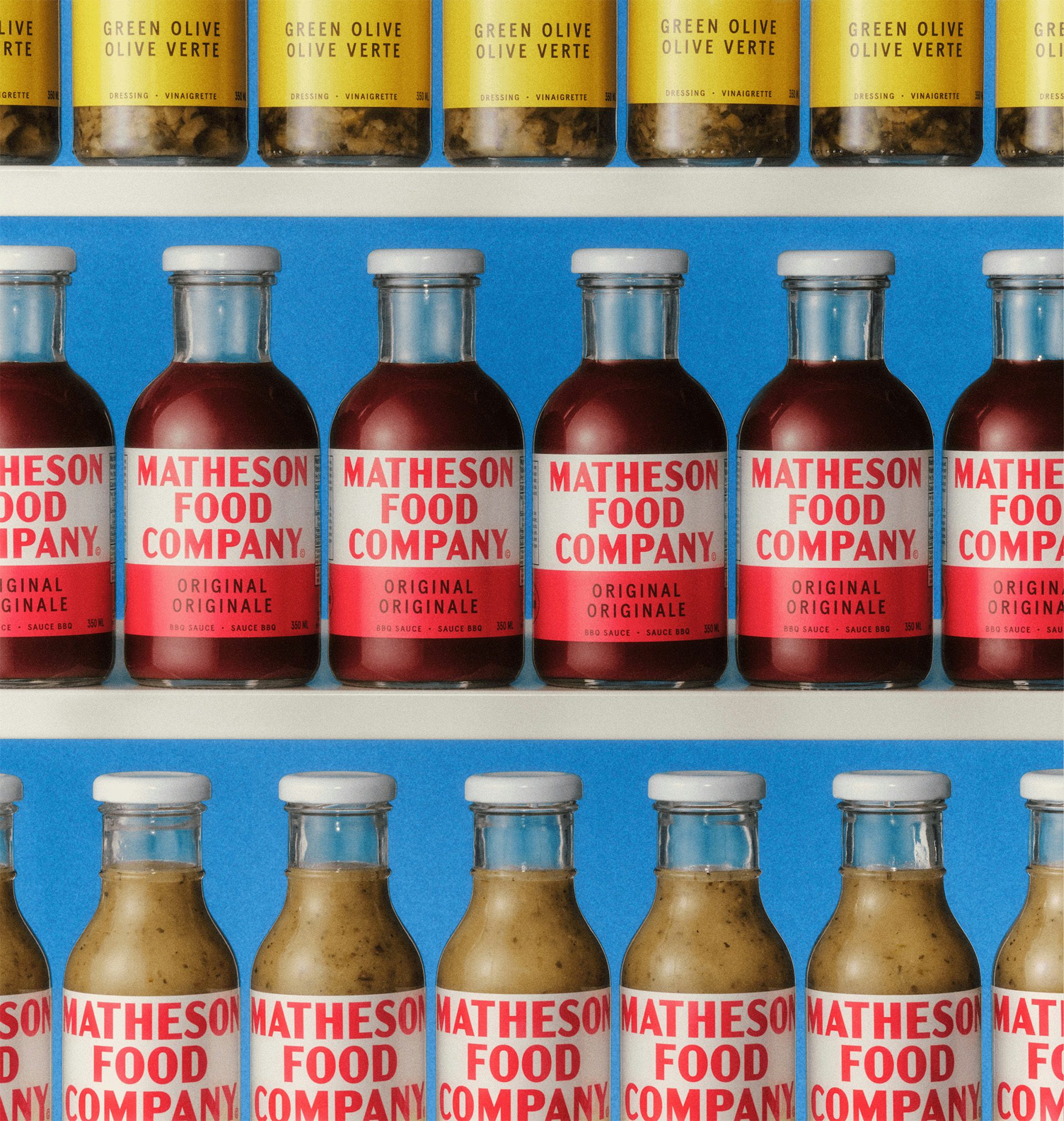
Now, the Canadian chef has created his own cooking provisions brand, Matheson Food Company, which has launched with BBQ sauces, salad dressings, and boxed mac and cheese. The range is rooted in “creating a new legacy of nostalgic classics reminiscent of Kraft or Heinz as the go-tos back in the day”, explains Sarah Di Domenico, co-founder of Wedge Studio, which worked on the packaging and identity design.
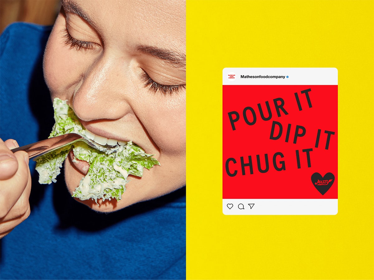
The design language – and the brand name itself – aligns with Matheson’s warm yet no-nonsense personality, while embracing the classic simplicity of the heritage brands that inspired him. This is matched in the vintage feel of the photography style, which has a light grain and a gentle glow that conjures ideas around memory and nostalgia.
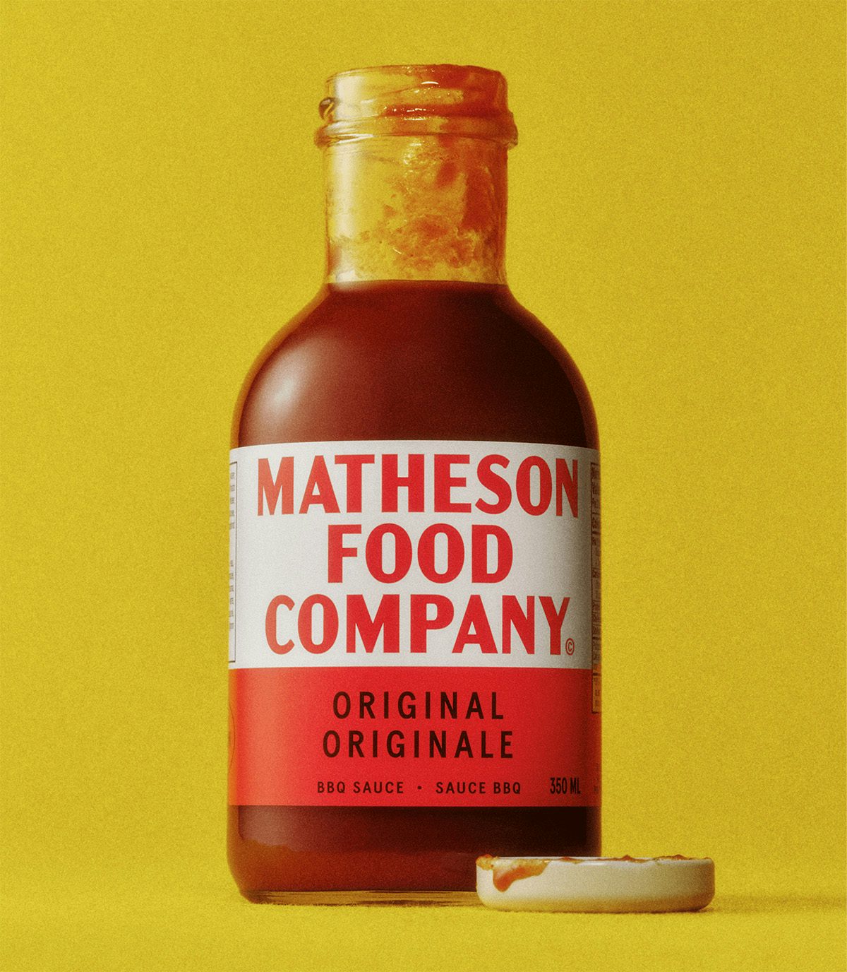
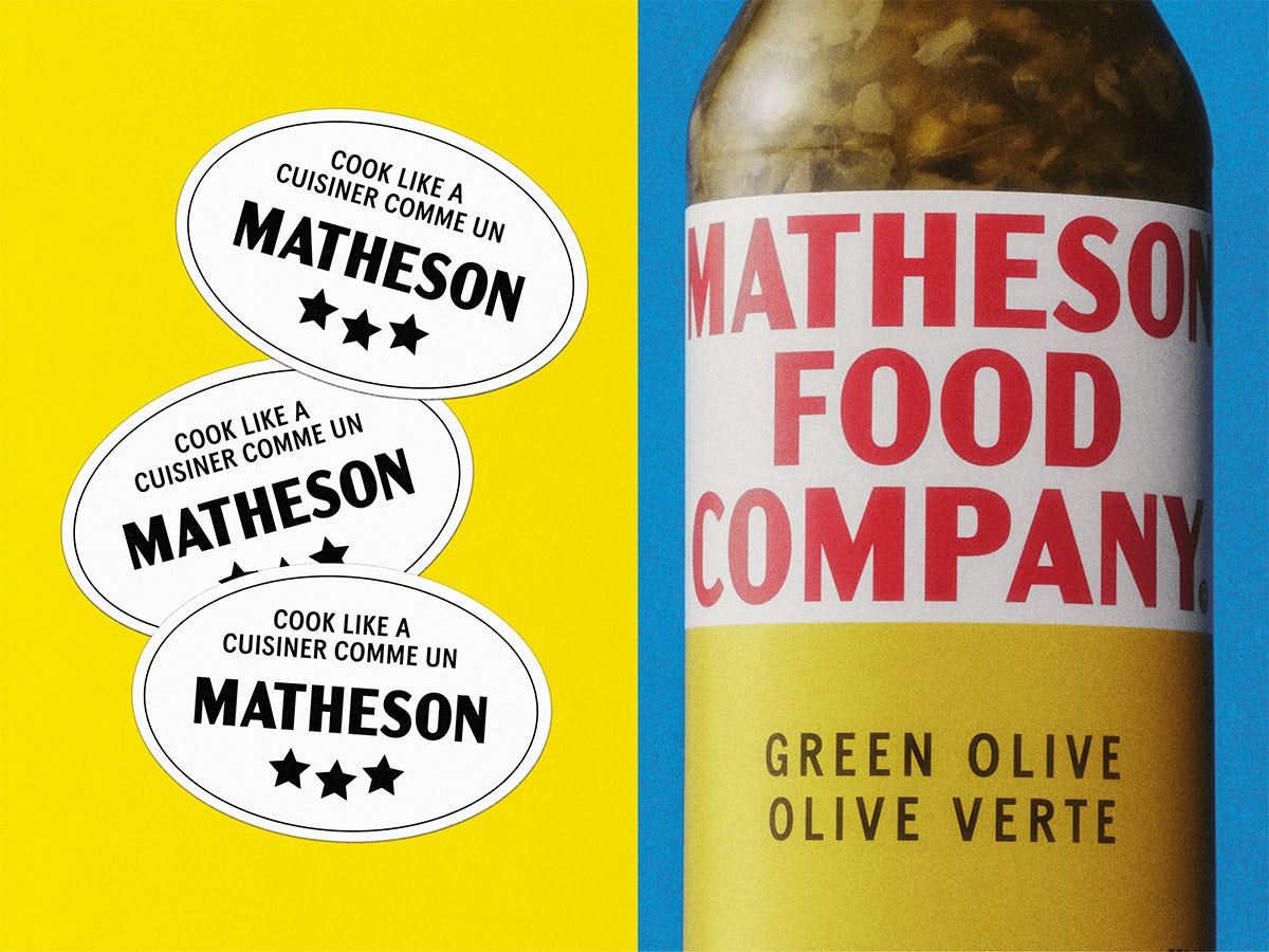
“Matty didn’t want anything trendy, contemporary, or superfluous. For him, it had to be classic, lasting, and pull the primary coloured vernacular, which is often seen across the vernacular of convenience goods popularised across the 30s, tied to an American origin,” Di Domenico says. “Hereford Corned Beef was the north star reference that Matty brought to the table, a food that he ate often as a kid.” The logomark is a direct nod to the tinned corned beef brand.
The approach speaks to the ethos of the line-up itself. For example, the “functional” typeface channels the “straightforward nature of a product that focuses on flavour”, explains Di Domenico. It also allows breathing space on the dual-language packaging, which features product names, copy and ingredients in both English and French to cater to its audience in Canada, where it is launching before plans to expand to the US. While the typography is stripped back, the tone of voice is packed with the vibrant flavour of Matheson’s food and personality.
While most new brands have a blank canvas to work with, Matheson has already built a world around him that many people are familiar with. The design approach needed to take this into account, while ensuring Matheson Food Company could carve its own path. “With Matty, his personality is so clear but it doesn’t mean the design is. Matheson Food Company is a new chapter for Matty. Our role was also in part about defining a visual language that is consistent with his world but also transcending it,” Di Domenico says.
“We saw this as more of an opportunity to make people feel that they are a part of Matty’s life. Giving the opportunity for fans at home, who might have been watching him over the last ten years in a virtual world, to use and taste an actual product he created. The intention is for the brand to outlive the man and be loved for generations.”
