
Record sleeves of the year 2022
Hairy soap, intimate moments, and an intricate diagram of the universe rank among our favourite designs from the last 12 months
The embrace of vinyl showed no signs of slowing down in 2022. While the influx of major labels pressing on wax has caused a frustrating backlog for independents, the overall shift towards physical formats can only be read as a good thing for album designers in the battle against thumbnailification.
This year, we also saw some of the world’s biggest pop stars deliver albums. Beyoncé introduced Renaissance, her most club-ready album yet, with what seemed to be a nod to the iconic image of Bianca Jagger riding a horse into Studio 54. Elsewhere, Harry Styles welcomed listeners into Harry’s House with a topsy-turvy shot of him in a sparse living room, satisfying fans of the singer and mid-century modern aesthetics alike.
Of course, there was plenty more for music fans to sink their teeth into, and some truly evocative album artwork and record sleeve designs to go with it. Below, we take a look back at ten covers that stood out to us in 2022.
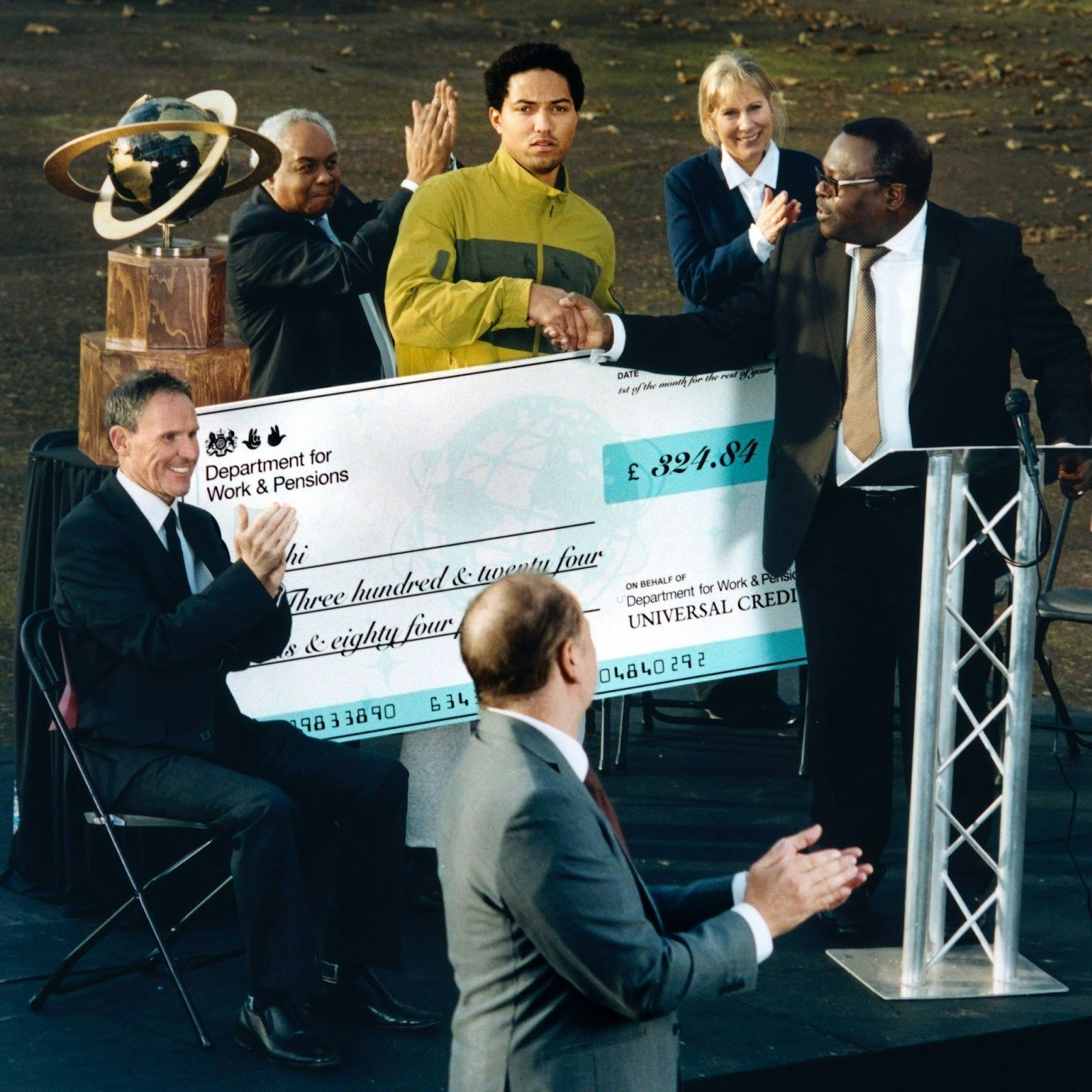
Jeshi – Universal Credit (Because)
Jeshi’s incisive debut album, Universal Credit, plunged deep into the reality of many people in Britain. Across 13 tracks, he weaved stories about life on the breadline, restoring humanity to the conversation as he reclaimed the words ‘Universal Credit’ in all their many meanings.
The cover image, photographed by Francis Plummer, shows the north London rapper wearing a serious expression as he receives an oversized novelty cheque made out to him for the figure of £324.84 – the amount that the monthly Universal Credit allowance dropped down to back in 2021 for individuals over 25. The reverse of the sleeve features the tracklist scribbled on a P45 form.
“The artwork for Universal Credit was an extension of the video I’d directed for Jeshi’s single Sick,” Plummer tells us. “They feel like they exist in the same world. A heightened caricature of life in London for Jeshi.” Jeshi called the album his “grand satirical reappropriation” of the term Universal Credit, and that tongue-in-cheek attitude is perfectly embodied on the cover, which is practically drowning in sarcasm.
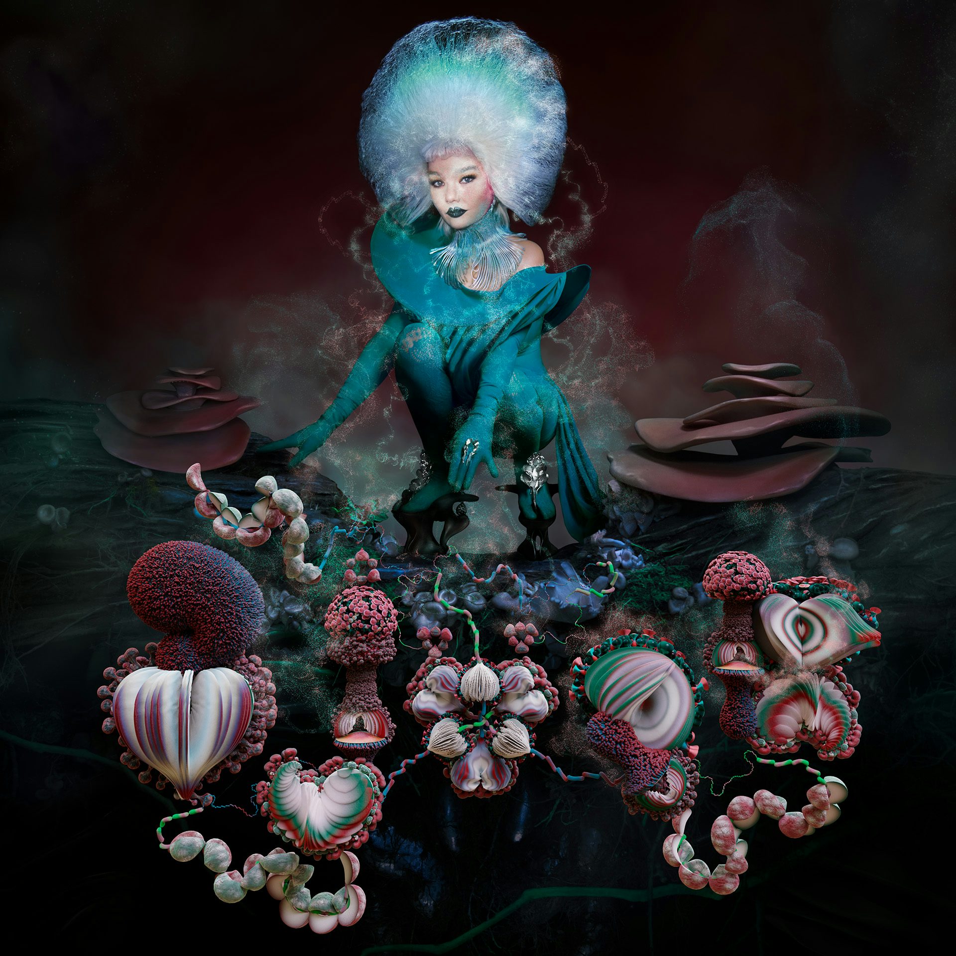
Björk – Fossora (One Little Independent)
By now, Björk’s albums come with the expectation of a unique visual universe to go with them. Her latest record, titled Fossora, was brought to life by a number of repeat collaborators, including Andrew Thomas Huang and James T Merry, as well as long-time friend and fellow Icelander Viðar Logi, who shot the album artwork as well as other visuals for the campaign.
In the album, Björk reflects on ancestry and motherhood, and the visuals help to conjure a certain earthy rootedness, albeit through a magical, fantastical lens. The songs are filled with unconventional textures and time signatures, which fed into the artwork. “With all of those very unique, new combinations in the music, it was quite effortless to weave the tapestry of the image,” Logi told us.

Daniel Avery – Ultra Truth (Phantasy)
For his latest album, Ultra Truth, electronic music producer Daniel Avery enlisted Berlin-based artist Claudia Rafael to create the artwork. Rafael regularly works with burgeoning technology in her pieces, and here, she made use of a generative adversarial network (GAN) released by Nvidia called StyleGAN3, which involves machine learning.
The fluid, misshapen outline of a face on the cover almost resembles an x-ray, evoking the psychological depths that Avery mined in making the music: “This is an intense fever dream of a record and one that draws influence from every experience I’ve had over the past decade. Things that have been in the back of my mind forever – warped, distorted and pushed to a new place.”
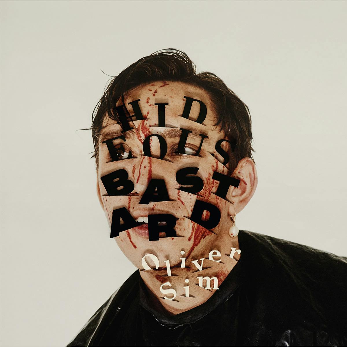
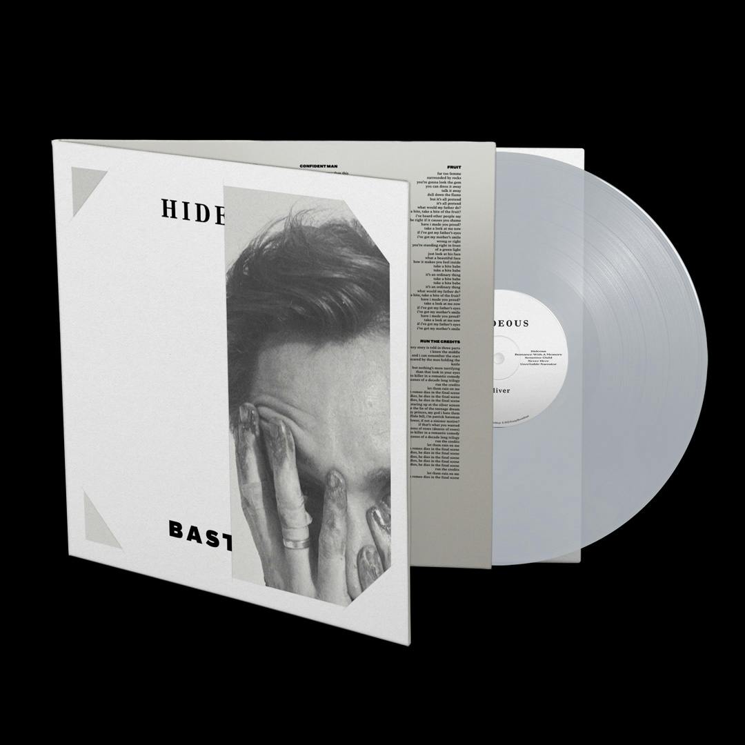
Oliver Sim – Hideous Bastard (Young)
Oliver Sim’s album Hideous Bastard was his first record outside of The xx, the British band with which he made his name, and saw him jump headfirst into his personal experiences with fear and shame.
The creative direction for Hideous Bastard leaned heavily into queer horror, including the cover, which features Sim’s portrait bloodied and skewered with the album title and his own name. The artwork is based on an image shot by Casper Sejersen, which was then manually manipulated by designer Vasilis Marmatakis, known for his work on film posters for Yorgos Lanthimos. His instinctive use of negative space on those film posters carried through to the deluxe edition of Hideous Bastard, which featured a cut-out cover design, where “instead of the having the typography penetrating his body, it’s him penetrating the typography”, the designer explained.
View this post on Instagram
Severance OST (Mondo/Deathwaltz)
Apple’s mystery TV series Severance follows a group of employees at a company called Lumon Industries who have all signed up to its ‘severance’ programme. It involves a surgical operation that ultimately separates their work lives from their personal lives – meaning that, while they’re at work, they have no memory of the outside world, and vice versa.
Theodore Shapiro’s score for season one has been brought together in a vinyl release packed with playful references to the show, led by Greg Ruth and Spencer Hickman. Ruth said that the premise of the show was “a great visual and design cue to play with and afforded the opportunity to be able to completely design the soundtrack package twice in two completely different ways”.
Housed in an office accordion file, the release comes with portraits of the main characters which have been spliced together to represent the different versions of themselves, a map of the ‘severed’ floor of the office building, and plenty more curious artefacts.
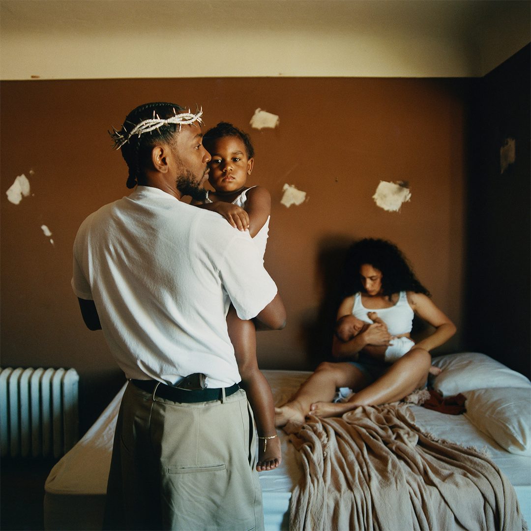
Kendrick Lamar – Mr Morale and the Big Steppers (TDE)
As with all of his albums, Kendrick Lamar’s final record with Top Dawg Entertainment was bound to make a statement. This time, it dealt with introspection, betrayal, redemption, and hero worship. He seemed intent on tearing up his reputation as some kind of saviour with an unflinching moral compass – a tension that plays out through the messianic references in the album artwork, photographed by Renell Medrano.
On the cover, the rap artist is seen wearing a barbed crown, a gun protruding from his waistband. His partner and two young children are also in the frame – the eldest holds the viewer’s gaze while her father stares off camera – in a surprisingly intimate moment for one of music’s most guarded figures. “I think Kendrick was pretty much just trying to capture the rawness and where he’s been in all these years of music. Being able to shoot his family, it just made sense,” Medrano told us.
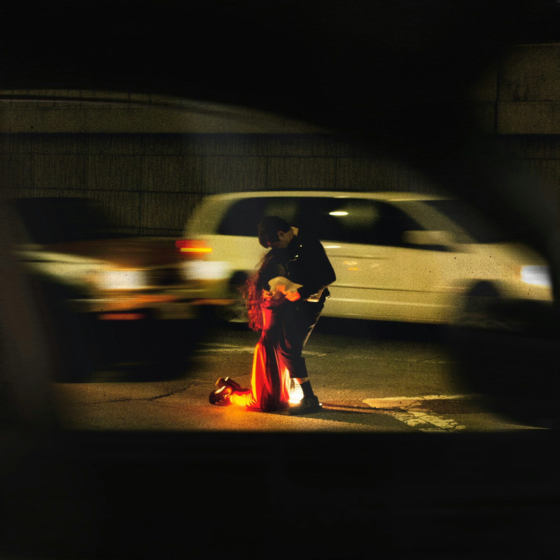
Rachika Nayar – Heaven Come Crashing (NNA Tapes)
Producer and composer Rachika Nayar’s sophomore album Heaven Come Crashing swells with emotion. It’s described as a soundtrack to “a luminescent space between 5am warehouse raves and the urban freeways of its cover image – romantic, nocturnal, and reckless in its velocity and emotional abandon”.
Shot by Yulissa Benitez Amaro (Yu-Lez) from the perspective of a passing car, the album cover shows two people embracing in the middle of a busy road, seemingly unaware of the motion-blurred traffic swirling around them. At a glance, the orange lightbeam cast onto one of the figures resembles a flame, further adding to the intensity of this moment in which nothing else matters.


Dry Cleaning – Stumpwork (4AD)
Dry Cleaning’s most recent album was bound to turn heads before it was even played. It’s largely thanks to the singular image of the album name, Stumpwork, artfully laid out in pubic hair on a bar of soap, which was proudly blown up on billboards in the run-up to the launch.
The album art was the work of creative duo Rottingdean Bazaar (James Theseus Buck and Luke Brooks), who teamed up with photographer and regular collaborator Annie Collinge, and Studio Claire Huss, who worked on the graphic design. “James and I have been working with pubic hair since we got together in 2015,” explained Brooks. “It was one of the first materials we used and we made badges which spelled out words and people’s names. We still make them sometimes. This is the first time, however, we have used pubes to make a photograph.”
Continuing with the bathroom theme, the rest of the artwork also features tiny vintage soaps sourced from eBay and other vintage sellers. Even the vinyl itself was carefully considered. The white colour was chosen to resemble an enamel bathtub, and the round centre label was designed to look like a plughole, so that when the record spins, it evokes the image of water going down the drain.
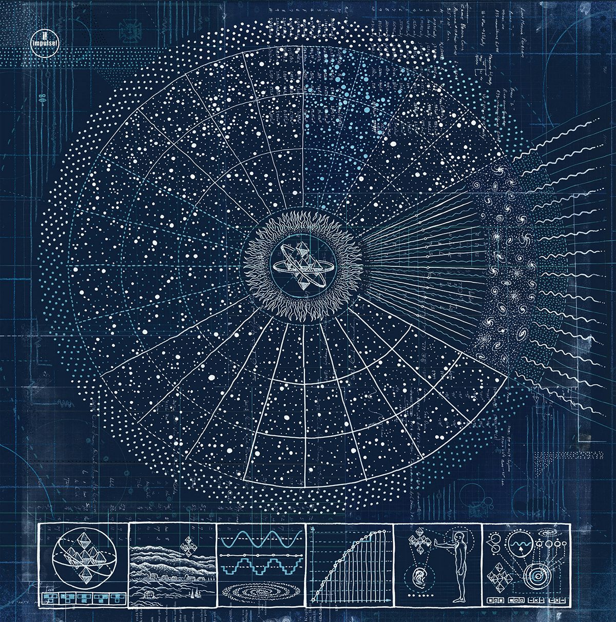
The Comet is Coming – Hyper-Dimensional Expansion Beam (Impulse)
As the name Hyper-Dimensional Expansion Beam suggests, the latest album from electro-jazz group The Comet is Coming takes listeners on a boundless journey through experimental music.
The cover art was created by Daniel Martin Diaz, whose artistic practice deals with life, philosophy and humanity in the form of complex scientific diagrams. Drawn by hand in pen and ink, the artwork illustrates a “computer supersystem operating our universe,” he explains. “If a computer system is running our universe and we live in a simulation. Then there has to be an advanced computer system at its core.” The remarkably intricate design for the album is the perfect accompaniment to what he calls “apocalyptic cosmic jazz”.

Bonobo – Fragments (Ninja Tune)
Bonobo’s latest album, Fragments, was made in the stillness of lockdown, but it spoke to the general turbulence of the times we live in. “If there is any theme or overall feeling to the record it’s transience. The temporary nature of everything,” Bonobo, real name Simon Green, told us.
These ideas were brought to life by photographer Neil Krug, who captured crashing tides in neon hues and obscure desert landscapes. It was a challenging process that involved careful timing of the sun’s position in the sky, and, according to the photographer, “a lot of holding your breath underwater! I didn’t rent scuba gear for this which I probably should have for a few of the shots.”
The record sleeve was designed by Mat Maitland at Big Active, who also worked on the special edition lenticular cover that cleverly enhances the feeling of fluidity in the images.


