
Mother Design gives Radio 1 a new graphic language
A new system for the BBC radio station brings together its various sub-brands and adds new assets for video and live events
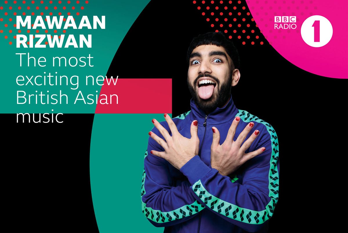
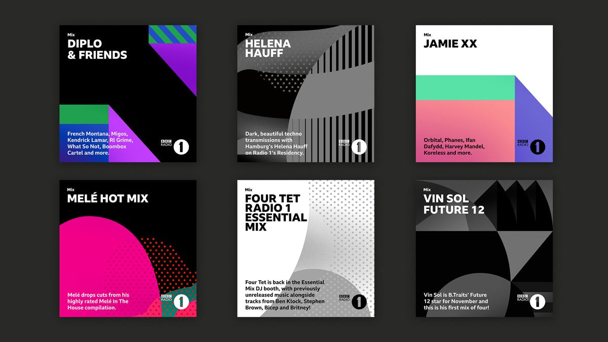
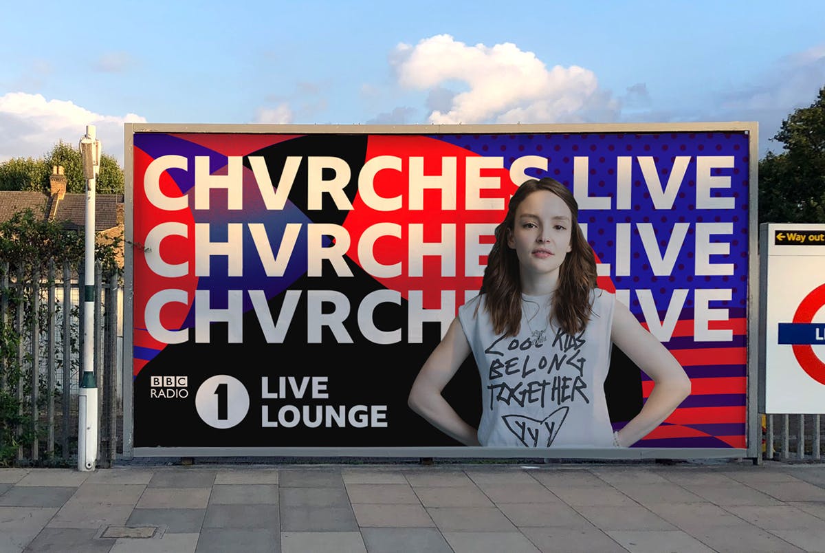
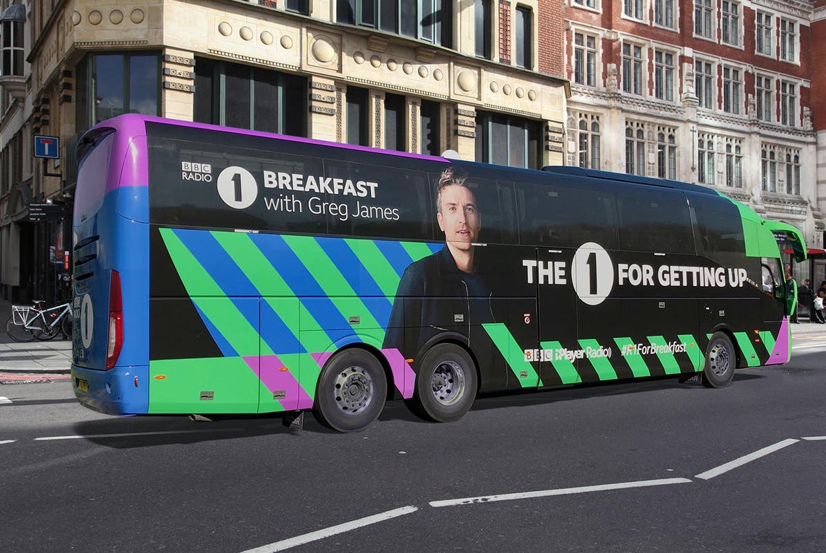
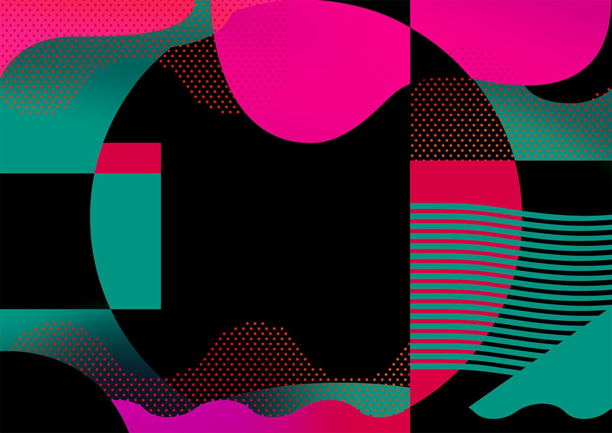
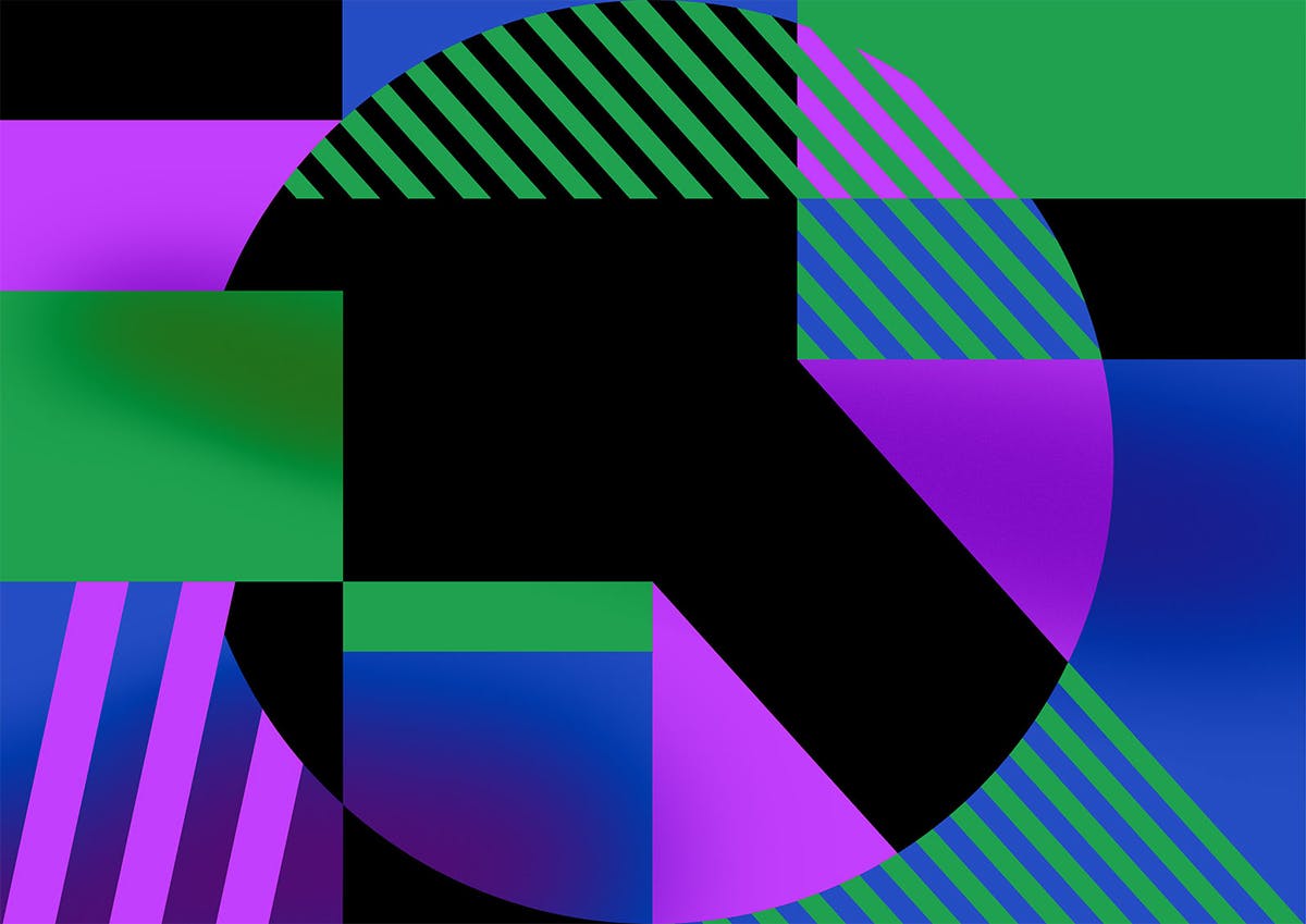
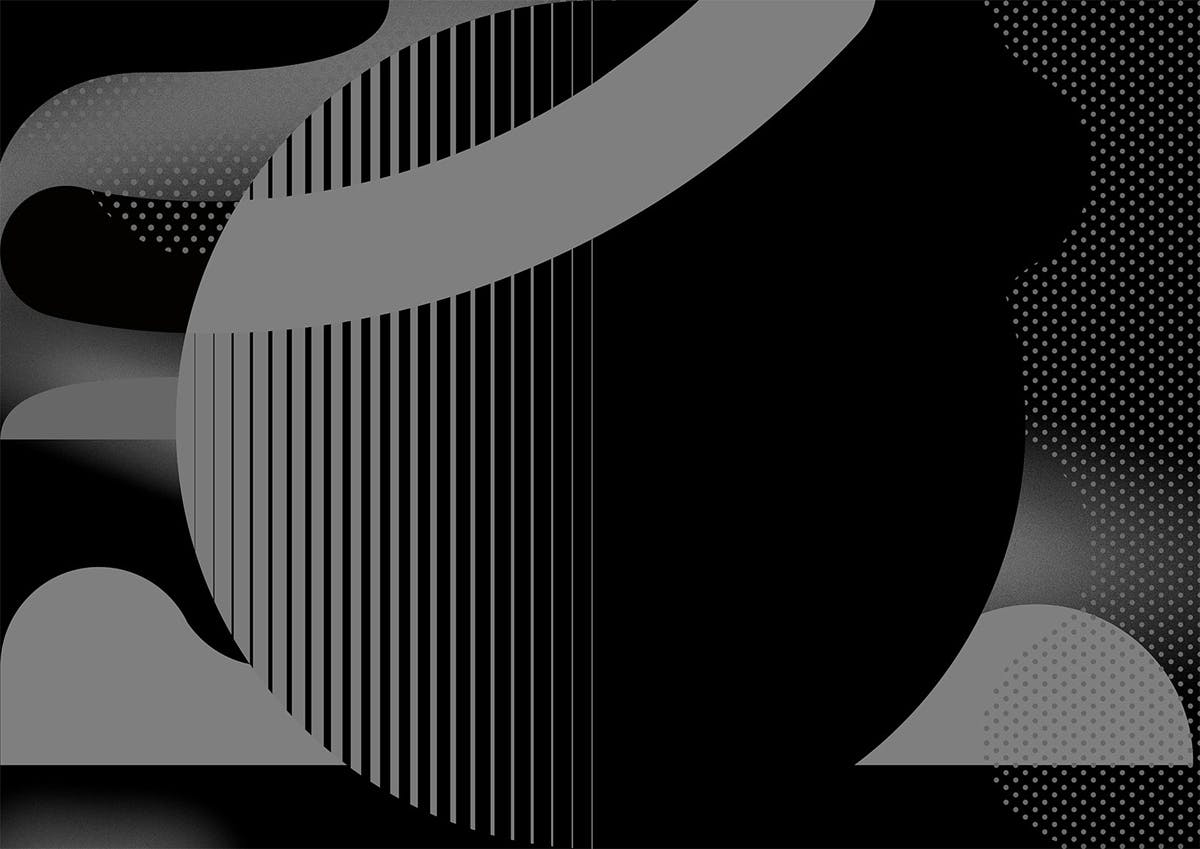
Like many media brands, Radio 1 has grown beyond its core broadcasting role. Sub-brands such as Live Lounge, Biggest Weekend and Teen Awards sit alongside its programming creating a complex branding challenge.
Mother Design has created a new branding system for the station in which all its elements share a coherent, youthful look. The BBC’s Reith typeface is used throughout, with sub-brand names set in the font sitting alongside the pre-existing Radio 1 logo.
Applications were developed to use across all platforms, including mobile, events, out of home advertising and downloads.
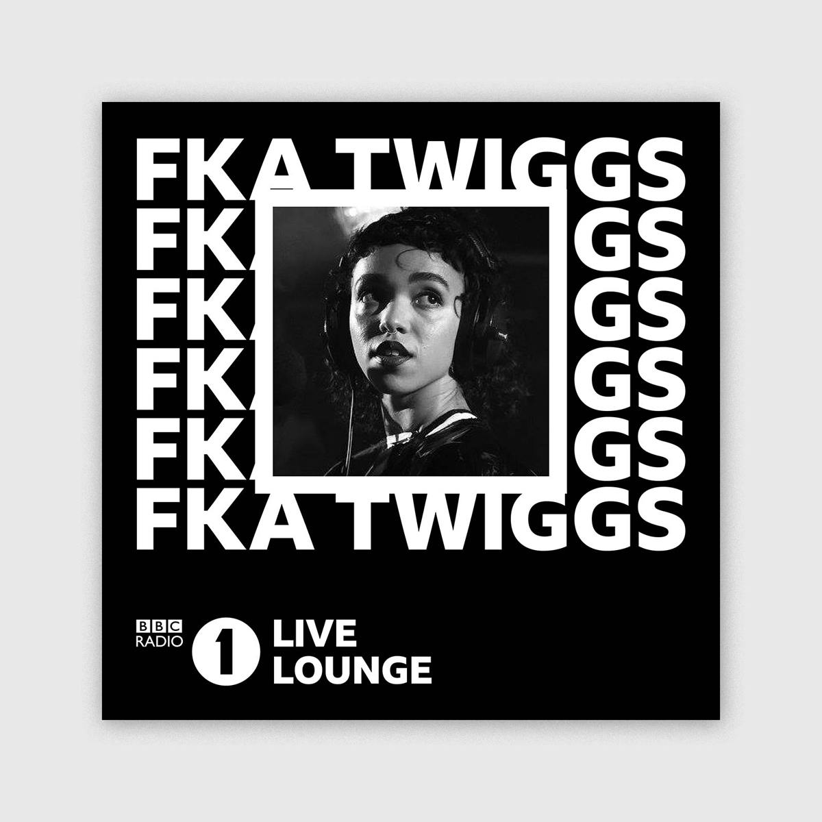
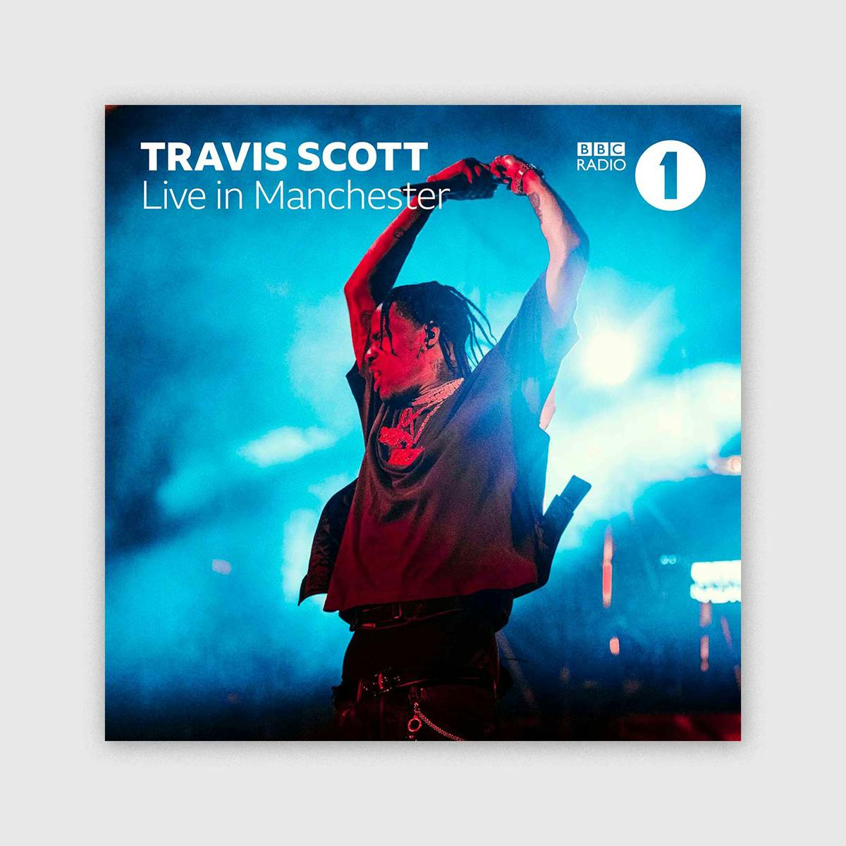
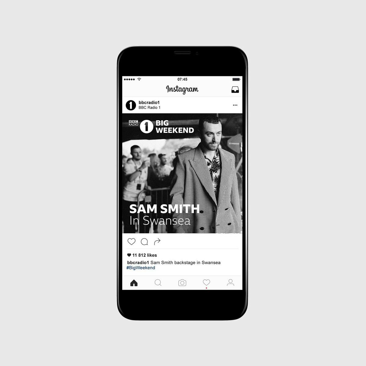
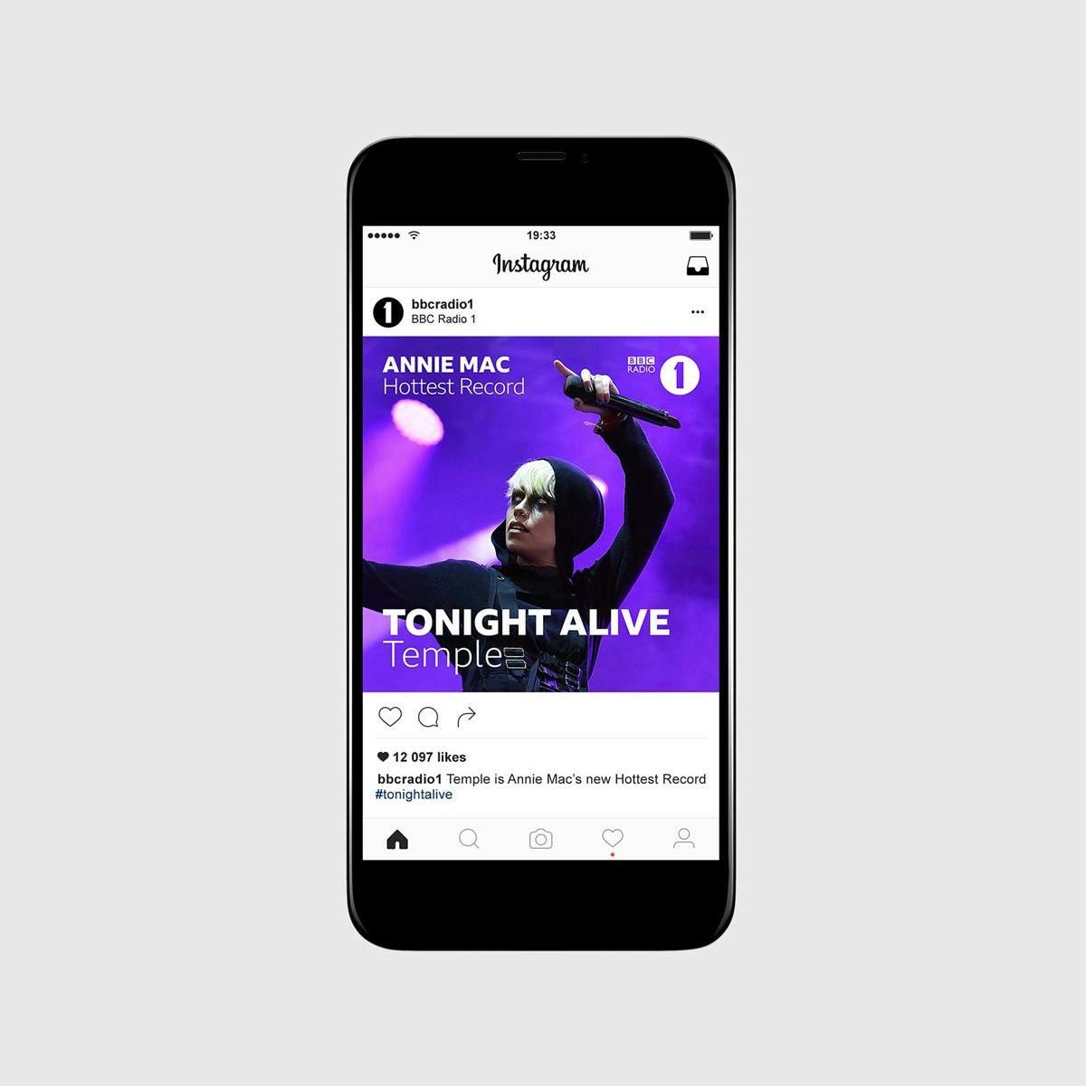
“We created in-depth rules for the key brand elements, providing a simple yet effective solution that the BBC teams could rollout internally,” say the team at Mother Design. “We also created an array of illustrated graphics to give the identity a contemporary twist, as well as developed a suite of dynamic/punchy animations for video content and live events.”


See our in-depth case study on the design and development of BBC Reith here
Latest from CR


