
Pentagram work for The National takes wry look at corporate branding
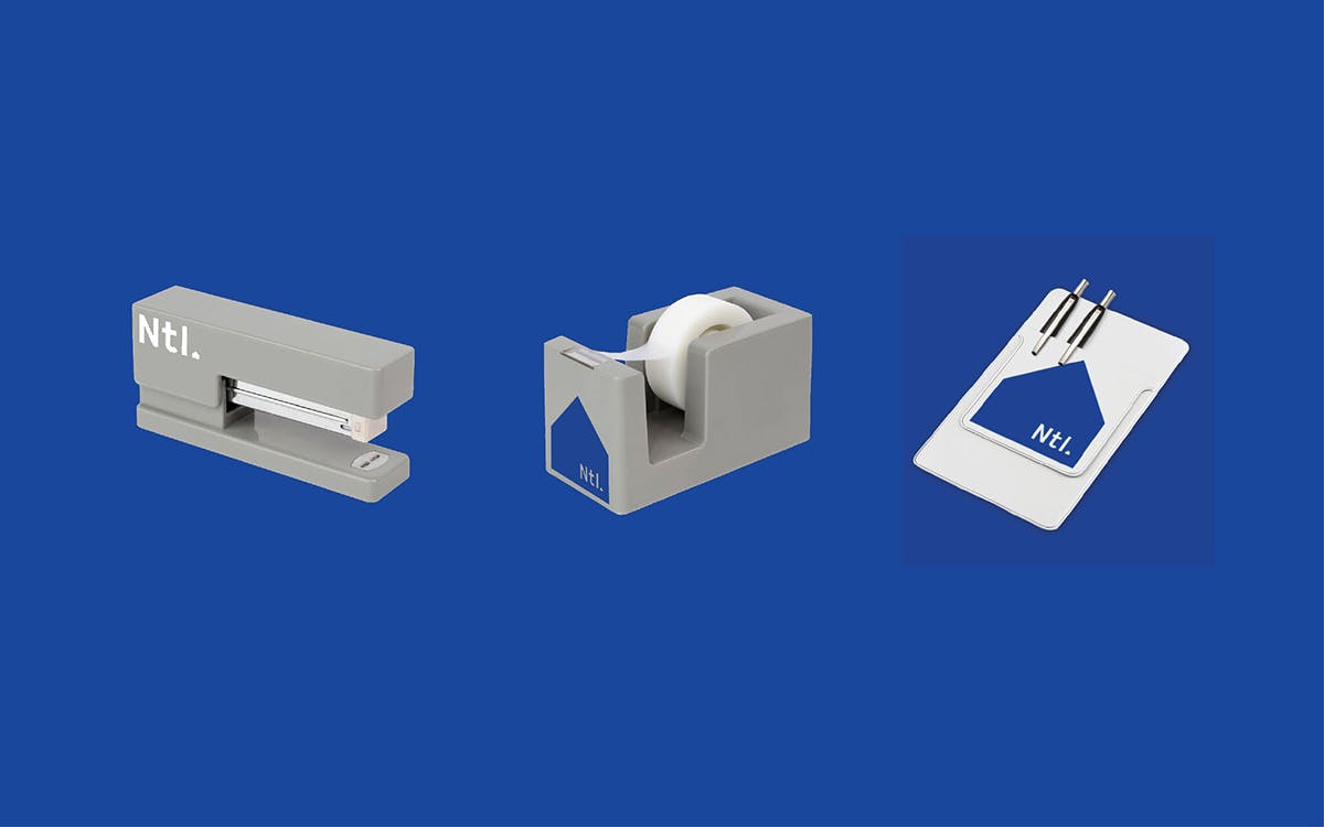
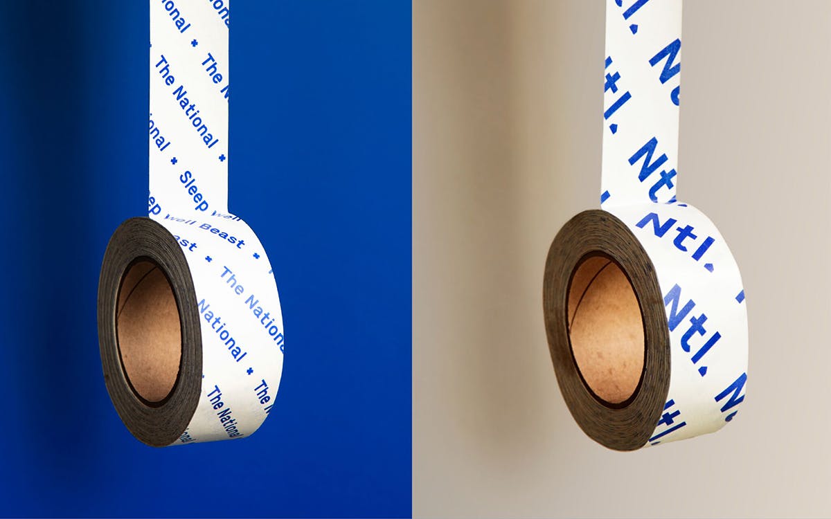
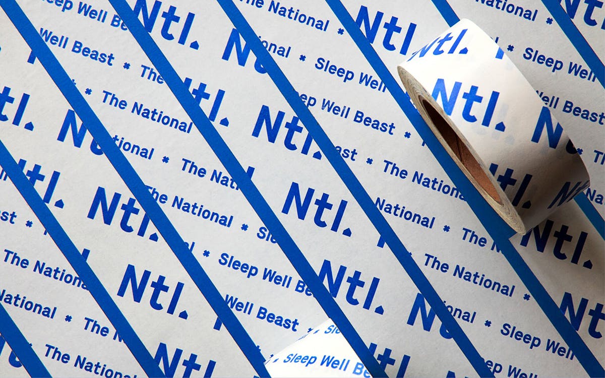
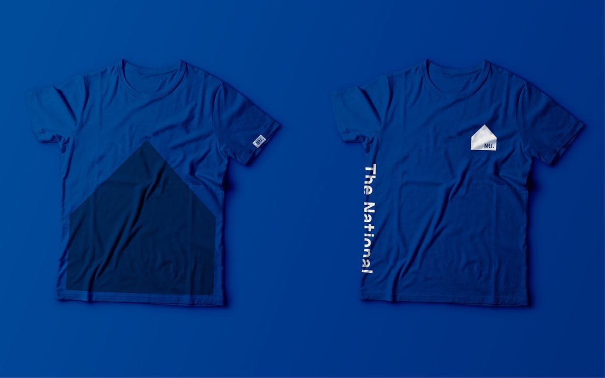
New York-based Pentagram partner Luke Hayman has collaborated with The National on designs for their new record Sleep Well Beast, working across the sleeve design and promotional materials ranging from t-shirts to more unexpected items, like staplers and sellotape dispensers.

The band counts not one but two members with graphic design-related backgrounds, with bassist Scott Devendorf having worked at Pentagram’s New York office with Abbott Miller from the late 1990s until the early 2000s.
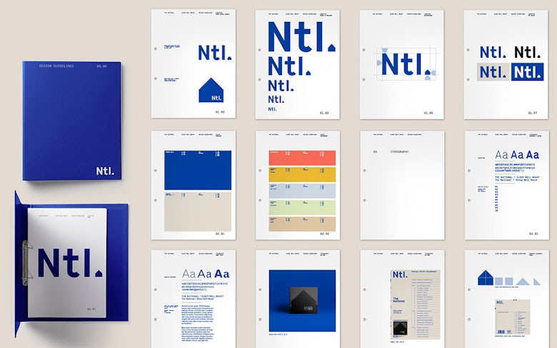
According to Pentagram, The National “were amused by the appearance of hiring a large, grown-up branding agency to do their campaign. So there’s a bit of irony in the idea of an indie band having a full-on corporate identity, even going so far as to produce a corporate standards manual.” It’s a cheeky, wry and slightly punkish gesture that feels more befitting to a post punk band, or something from the Factory Records stable; a departure from The National’s usual more sensitive rock stylings.
Hayman had known Devendorf from his days working with Miller, and the two had been in touch over the years leading up to this project – the first on which The National had brought in a formal agency to work on such a wide-ranging suite of designs. “They’re a very smart band and were very self-aware that they were working with Pentagram to do an identity,” says Hayman, “so one thing led to another, and they found it quite amusing to push the idea of making it ‘corporate.’”

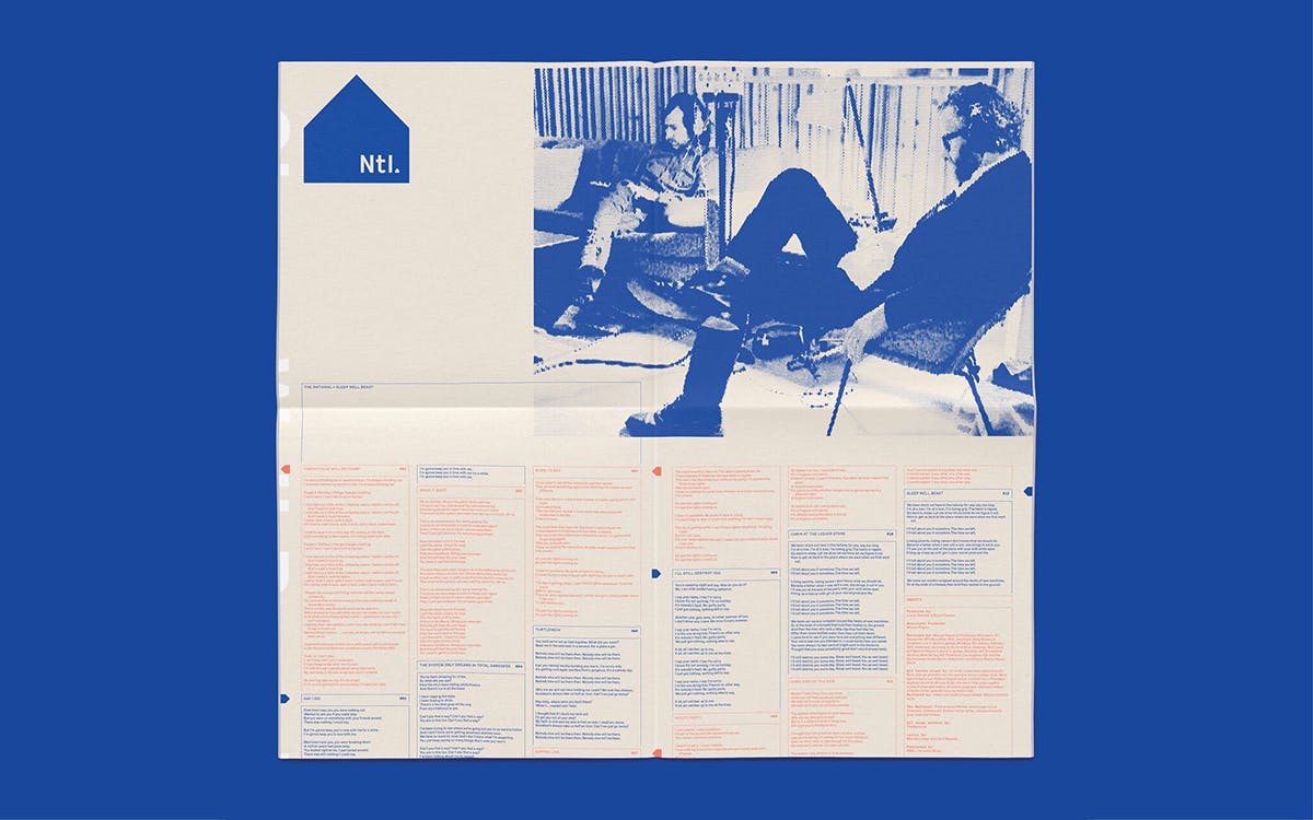
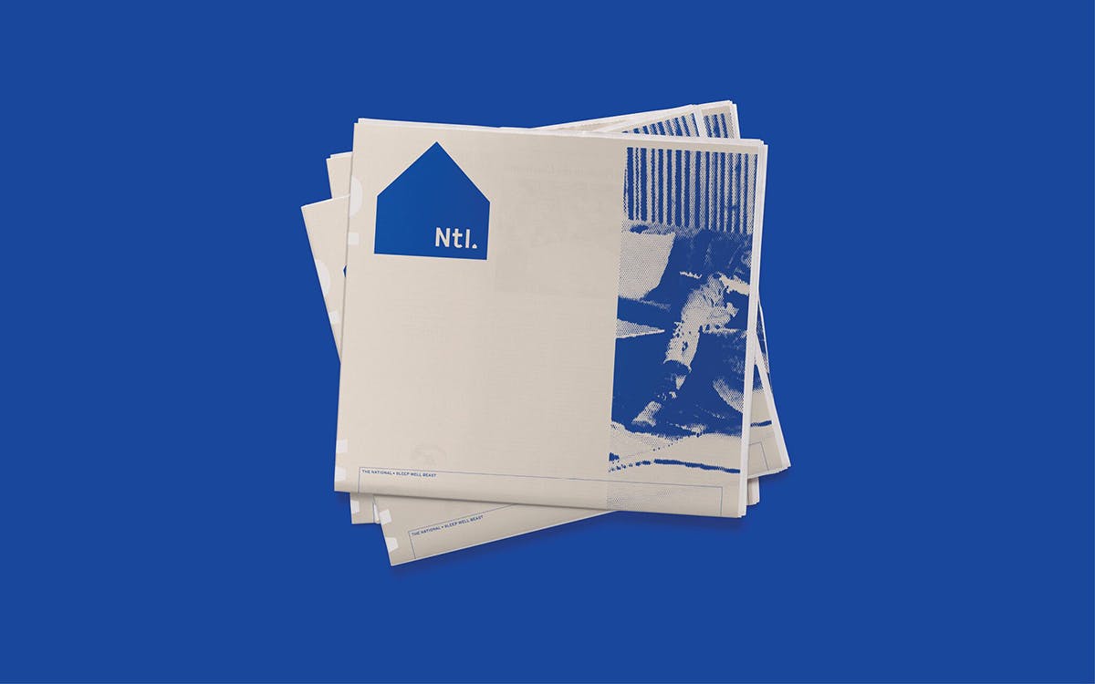
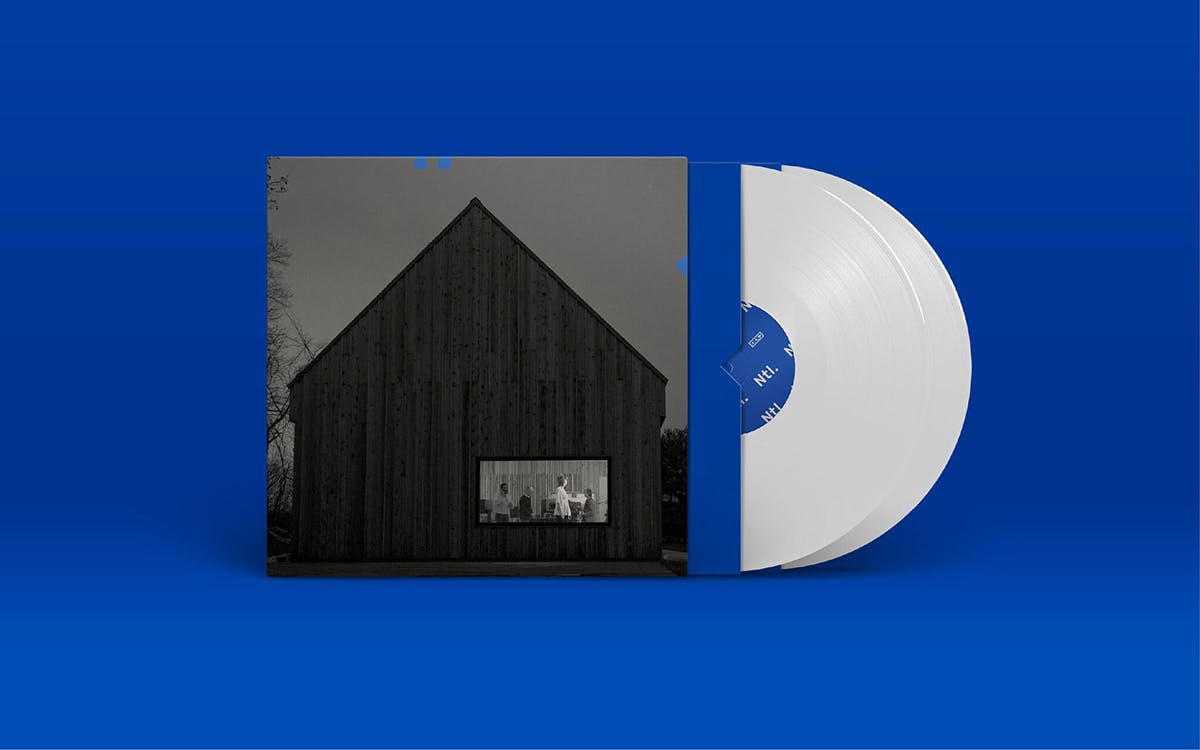
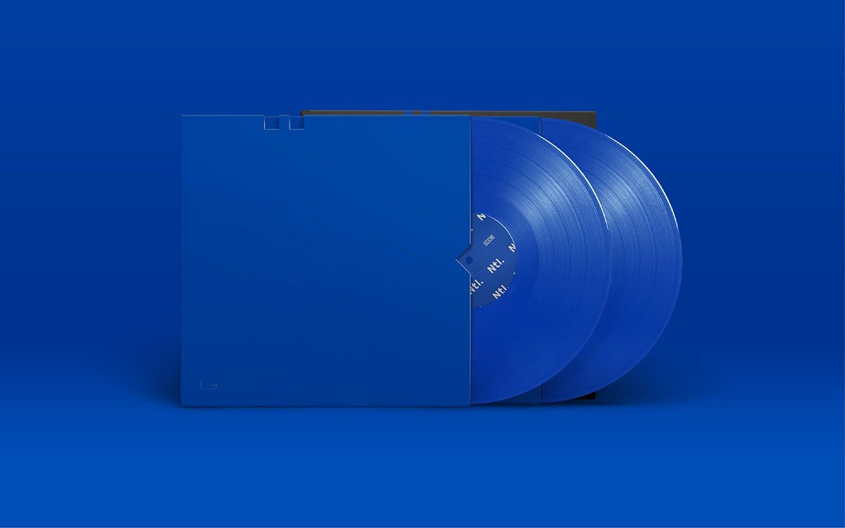
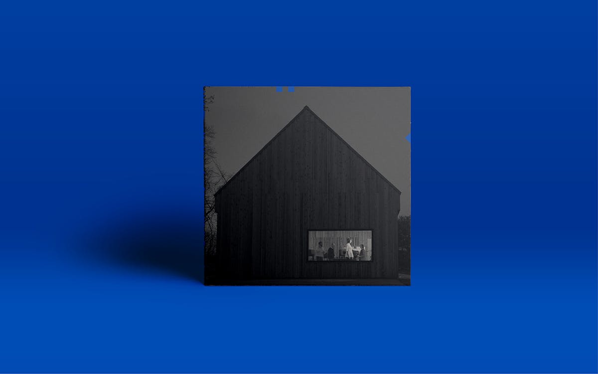
The designs are based around a five-sided house-like shape, inspired by the barn built by the band in Hudson, New York, where the album was recorded. The symbol can be broken down into three shapes – two squares and a triangle – which can be “rearranged like code.” For the sleeve itself, the symbol is die cut onto the cover, while the record and CD insert feature photographs by Graham MacIndoe, processed to give a “zine-like feel to add a bit of warmth and soul into the visual language,” says Pentagram. The barn became the site of a lot of ideas that informed the final designs, with the band and designers imagining it as a sort of political headquarters, from which propaganda, music and merchandise were pumped out into the world.

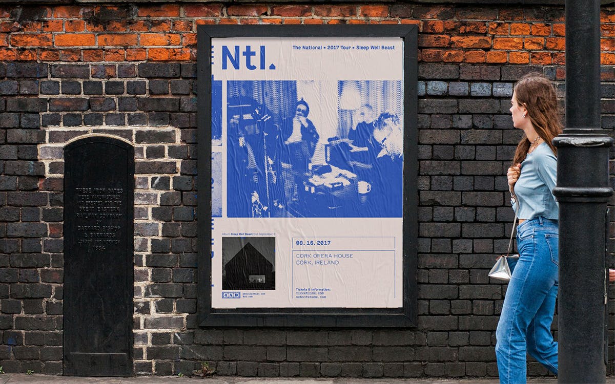
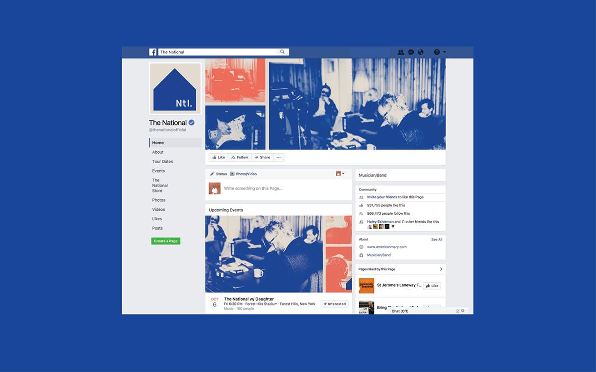
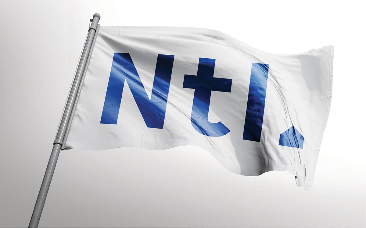
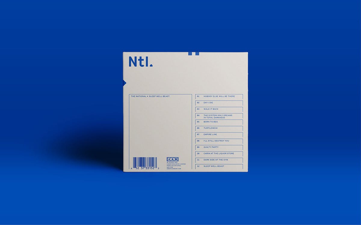
The agency created a corporate “Ntl.” logotype used across all brand merchandise, sending up the idea of corporate branding in the development of the stationery items alongside the logo’s placement on caps and clothing.
According to Hayman, Devendorf and The National frontman Matt Berninger were “very involved” in the design process throughout the project. “They have a background in design so they care a lot about these things,” he says. “I got a lot of emails, Scott would be taking pictures of a Beat poet show he’d seen at the Pompidou and send those over, or Matt would do a sketch and email it over very apologetically saying ‘I know I shouldn’t really do this!’ But they’re designers – they’re very aware of things like fonts.”
In the end, Maison was used as the main font for the identity, against a blue and white colour palette chosen for its sense of a “retro, slightly monotonous” 1970s corporate identity.

Alongside this series of graphics and poster designs, the campaign saw “transmission-like” videos appear on monitors played in New York’s Times Square, London and Copenhagen. A bespoke website was designed by New York studio The Collected Works.

Pentagram says: “On the more serious side the band are very active in social and political causes, including what’s going on right now in the US, and wanted something that was not obviously political but riffed on the idea of propaganda, a society/cult, with its own symbols,” though it adds that the record “is not a protest album, per se.”
Sleep Well Beast was released by 4AD on September 8 2017


