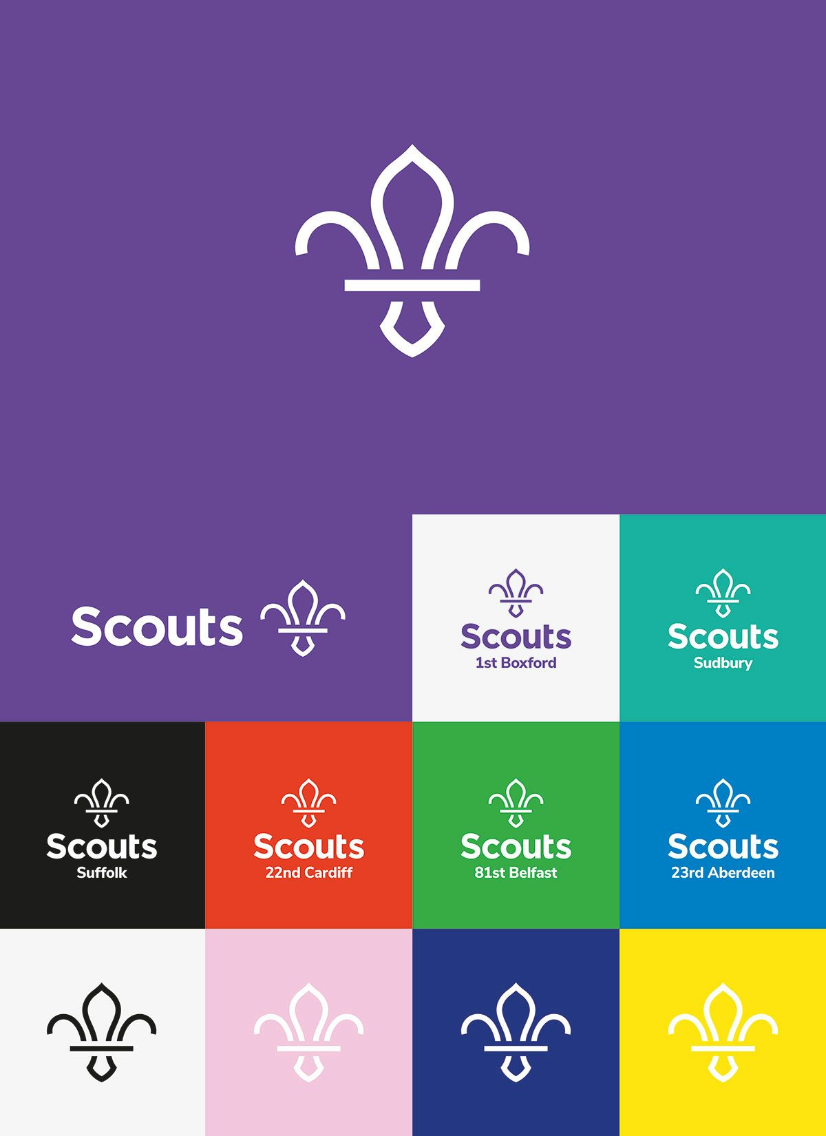
The Scouts rebrand by NotOnSunday
This project has been selected in the Design – Brand Identity category in The Annual 2019, CR’s award scheme celebrating the best in commercial creativity

Founded in 1908, the Scouts’ reputation is intrinsically linked with its longstanding heritage. In 2018 the organisation announced a new five-year plan and switched its focus to entice more potential young Scouts, as well as more adult volunteers. NotOnSunday was tasked with creating a brand identity that would nod to the Scouts’ history while also making it fit for purpose in a digital world.
Its distinctive fleur de lis logo had become particularly outdated, according to NotOnSunday founder Trevor Townsend. “The overall shape was important, so we stripped it back as far as we could so it’s still recognisable. The idea was to keep it bold, fresh and exciting, but simple and easy to use for everyone,” he says.
The studio also introduced a more vibrant colour palette and approachable-looking font, Google’s Nunito Sans. A year on, the organisation has managed to broaden its reach, in part thanks to a new identity that makes it more relevant than it has been for a long time. Its overall membership grew by over 3% in 2018, and it now has more than 160,000 adult volunteers – its highest ever number.

Credits:
Design Studio: NotOnSunday. Brand & Visual Identity: Trevor Townsend, Mike Willows. For The Scouts, Head of Creative: Kevin Yeates. Director of Communications & Marketing: David Hamilton. Brand & Ambassador Manager: Chris James. 3D Logo Creation: Moonjam. Brand Film: 3AngryMen.


