
Violaine & Jérémy’s dramatic Art Deco-inspired typeface
The Paris-based studio has released its first full family typeface in three different weights. Full of impact and graphic shapes, the studio speaks to CR about what went into designing it
Paris-based studio Violaine & Jérémy is a multidisciplinary creative studio that typically works across identities, poster design, illustration, typography and more. Made up of Jérémy Schneider and Violaine Orsoni, the studio believes in “beauty, refinement, delicacy and timelessness”. As a result, Violaine & Jérémy’s portfolio is bursting with projects that are not only beautiful but are executed with precision and finesse.
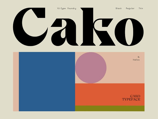
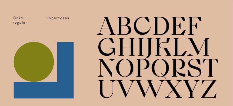
The latest project from the studio is a typeface called Cako, originally designed by Schneider for a brand identity that was never presented to the client. “We design many custom fonts for our projects, but we only use 20% of what’s produced,” the studio says. “We began designing Cako with the G and the K. The shapes are inspired by Art Deco, but we transformed the shapes to make them more contemporary with a lot less decoration.”
Another reference for the pair was a typeface from the 70s, designed by Austrian graphic designer Othmar Motter. Called Motter Ombra, the typeface is beautifully dramatic like Cako, and was distributed by Berthold Fototypes as film type and Letraset.
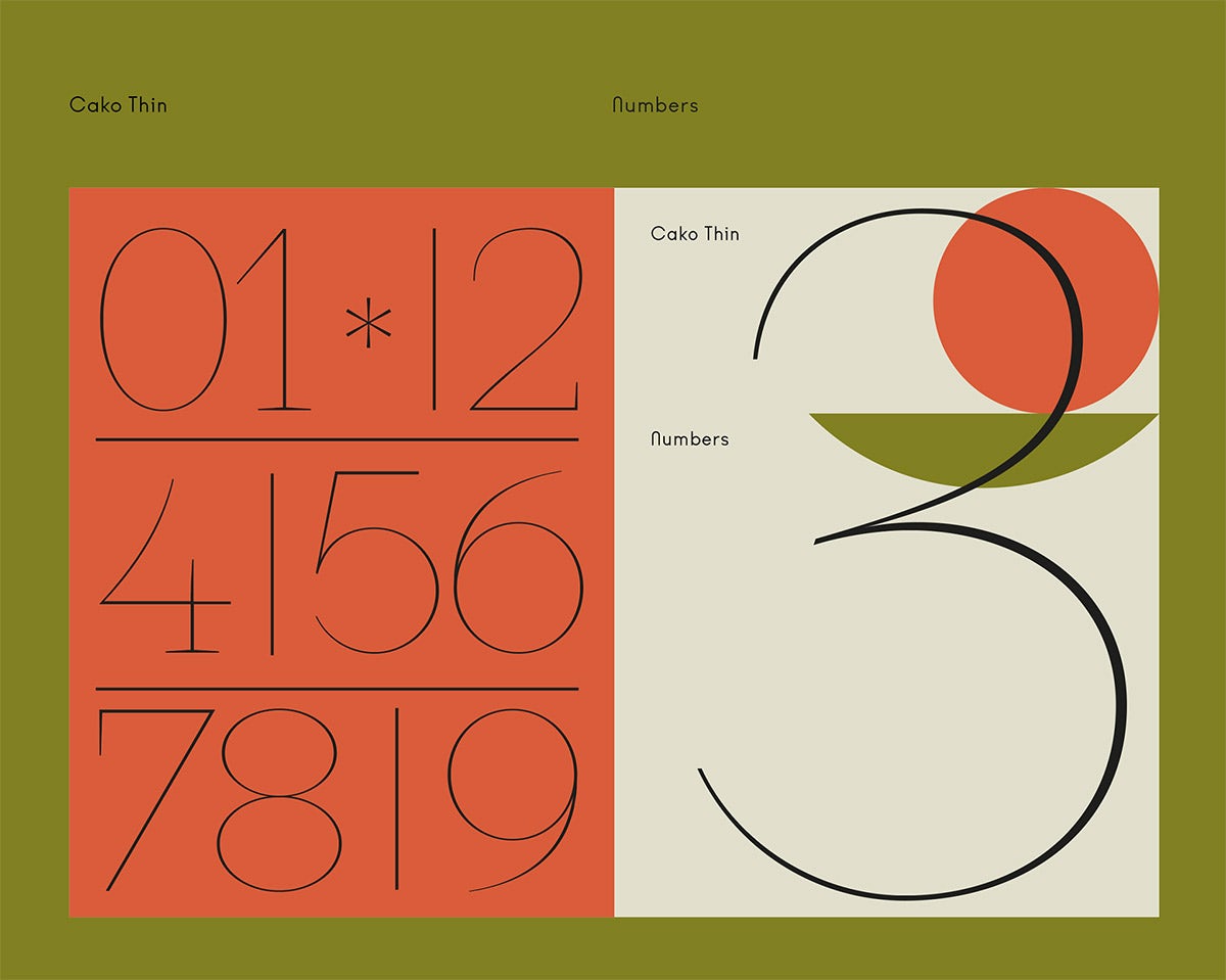
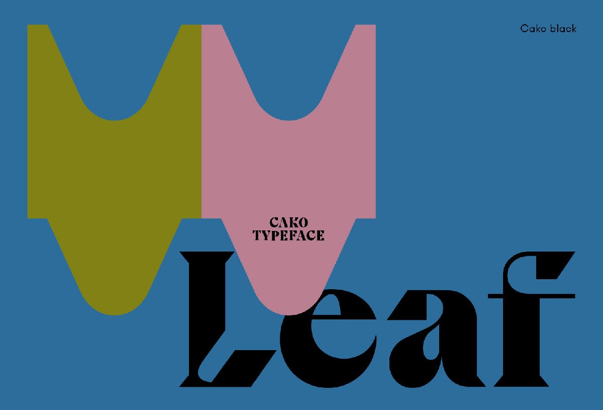
Cako is Violaine & Jérémy’s first full family typeface, having previously only designed what they needed for a project, and it comes in three weights plus an italic iteration. “We learned while doing,” says the studio of its approach. “We feel a typeface has to be perfect to be sold on the market, so it took some back and forth to get there as it’s a precise and long process.”
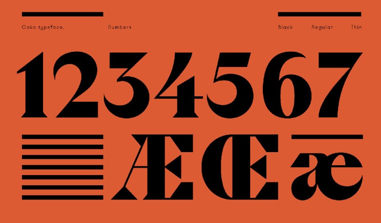
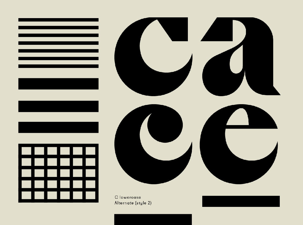
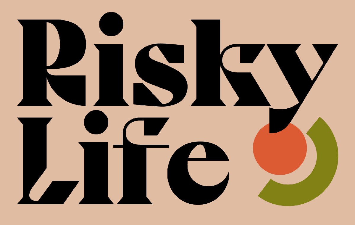
The beauty of Cako is the contrast between thick and thin, the chunkiness to the typeface is offset by the delicate serifs. This elegance is emphasised by the way Violaine & Jérémy has presented the font, with gifs that emulate the simple graphic shapes all in muted colour palettes of olive greens, rusty oranges and rose pinks.
With a broad range of clients including a French burger company, a magazine all about the brain and a 140-year-old theatre, creating a typeface from scratch offered the studio a change of pace. “Creatively speaking, it’s much easier to work on a typeface because we are our own client,” says Violaine & Jérémy. “We are just driven by achieving what we love. Our typefaces are our personal projects.”


It’s refreshing to for busy studio like Violaine & Jérémy to value the benefit of working on personal projects in between client-driven work. Not only does it keep the studio’s passion alive, but we also get an insight into what makes them tick creatively.
Latest from CR


