Po-faced no more: An unusually playful identity for fin-tech brand Tink
Stockholm-based agency Kurppa Hosk has created a playful identity for fin-tech company Tink; a deliberate stance against the po-faced seriousness of the finance world

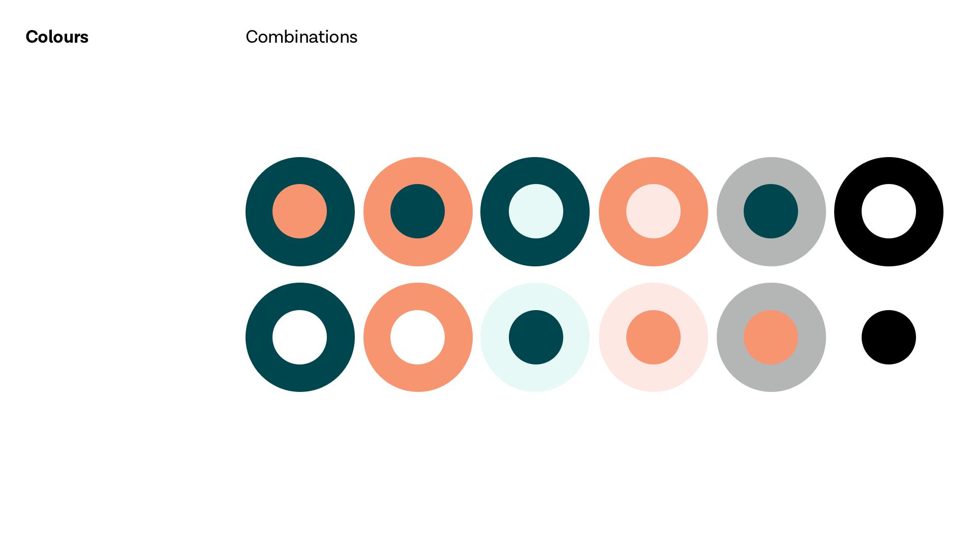
With its millennial pink, cheeky name, playful type and cute illustration style, Stockholm-based agency Kurppa Hosk’s designs for fin-tech company Tink take a deliberate stance against the po-faced seriousness of what we might usually associate with financial management.
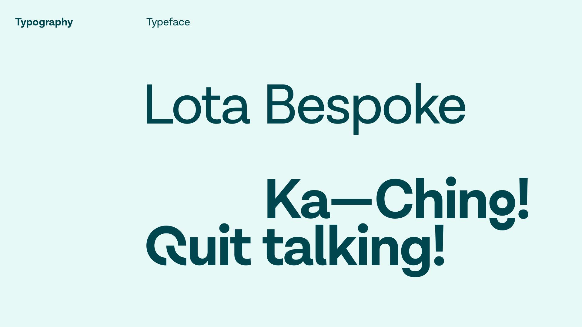
Working with the in-house team at Tink, also based in Stockholm, Kurppa Hosk developed a new visual identity and strategy that aims to bring a little refreshment to a realm the agency describes as often viewed as “something unattractive, boring, time consuming and far too complex.” Briefed to “manifest Tink’s ambition of bringing financial happiness to millions at all touchpoints”, it created a new logo and typeface called Lota Bespoke, based on the Lota Grotesque typeface designed by Daniel Hernández. The typographic style sees certain characters broken up in unusual configurations across the identity for its bolder applications, giving a modern and more youthful-seeming, dynamic edge.
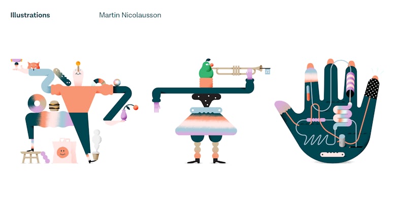
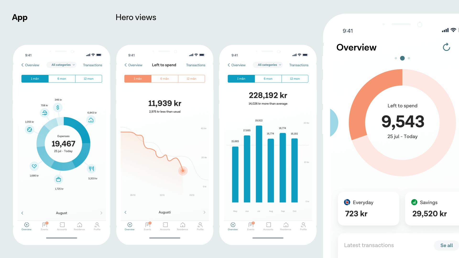
Stockholm-based illustrator Martin Nicolausson was commissioned to create a series of surreal illustrations, showing oddly long-limbed characters engaging in things like paying a trombone, or balancing things like burgers, a fox or a vase across atop themselves; as well as smaller more abstract elements. These illustrations are used across stationery, a new app and other collateral.
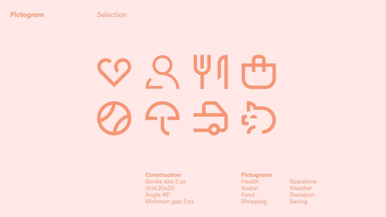
“The new visual identity goes beyond just a logotype, and is more of a scheme composed of a number of core elements that come together to create a distinctive visual language,” says Kurppa Hosk, which also designed a number of pictograms distilling categories like health, food, shopping, transport and saving.
The Tink symbol, formed of two curves, appears across various touchpoints such as badges and business cards, and even on a jacket, shot as part of a wider campaign of lifestyle-led shots by Cecilia Magnusson.

Latest from CR


