18. London Underground (1919)
Edward Johnston
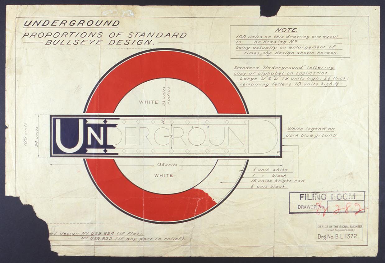
 The London Underground roundel, designed by Edward Johnston in 1919, has transcended its function as transport signage, and in many ways become a symbol for London itself. Its simple design, of a red circle inter‑ cut with a blue bar, has inspired many imitators around the world: versions have been spotted in destinations as far away as India, while a plethora of ‘underground’ bars have adopted the design as signage.

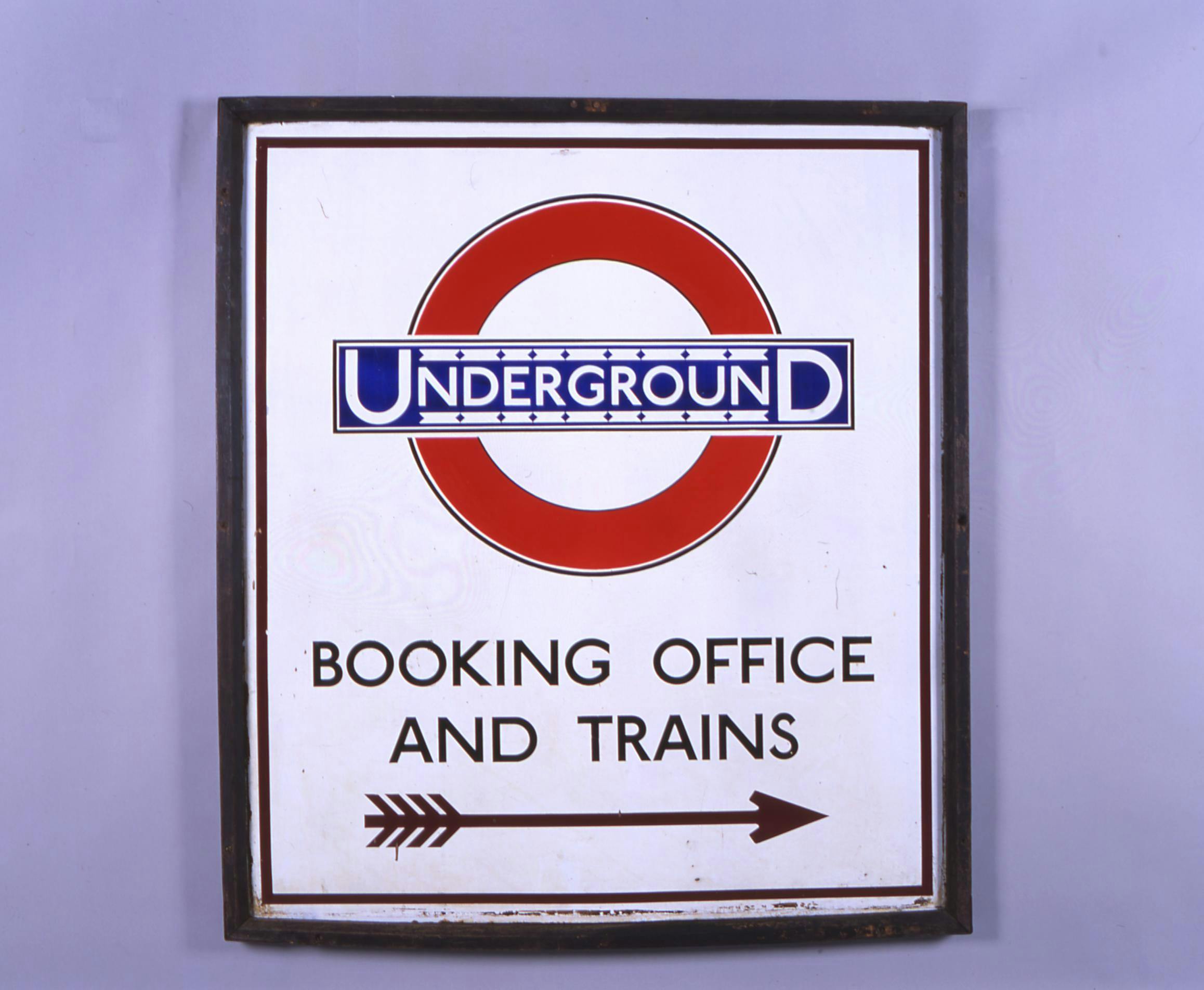


The roundel shape first appeared on station platforms in 1908. These early versions consisted of a solid red enamel disc and horizontal blue bar and served to highlight the station name amongst the surrounding ads.
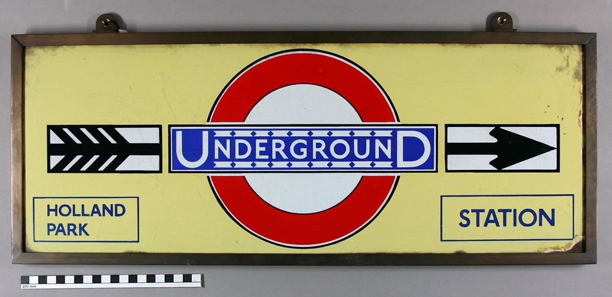
Johnston’s version was commissioned by LU’s publicity manager Frank Pick, who realised that a standardised version of the logo would strengthen the brand in the public’s mind. It certainly did, and the roundel is now used for all aspects of London’s transport system. The symbol has experienced several subtle changes over the years, but in essence has stayed true to Johnston’s iconic, and much loved, design.
London Underground images © Transport for London; courtesy Transport for London/Collections of the London Transport Museum.
More on our Top 20 logos here.
-
Post a comment


